Battlefield V

|
Developer: DICE (Stockholm & LA Studios)
Publisher: Electronic Arts End User: Online First-person Shooter Players Platforms: Playstation 4, XBox One, PC Released : November 2018 Tools : Adobe XD, Confluence Services Provided:
|
Overview: The blockbuster Battlefield first-person shooter video game franchise returns to the World War II theater.
|
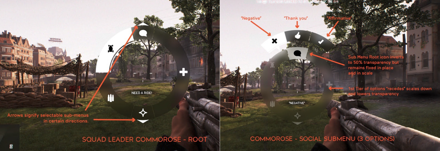
Brief: The UX team at DICE’s main Stockholm studio delegated a design refresh of a non-verbal chat wheel interface or “Commo-Rose” to DICE LA to avoid it looking like a “cut and paste job” from Battlefield 1 (shown here).
|
Role: Provided UX mockups and concepts for a variety of multi-player online gaming interfaces including lobbies, matchmaking screens, scoreboards, in game heads up display (HUD).
|
Method: I started by gathering anecdotal feedback from highly experienced members of the team (100+ hrs of experience w. Battlefield).
|
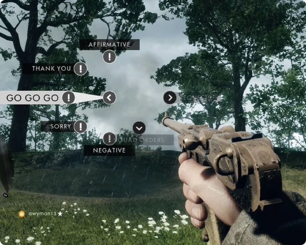
Battlefield 1 Commorose: Chat Wheel
|
While using this interface for the first few times, I immediately noticed the following usability issues.
|
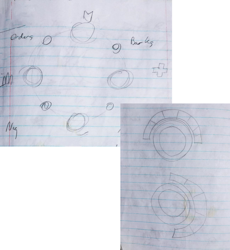
Initial Sketches
|
Based on playing around with the interface, I also started to formulate some initial goals:
I also knew I had to validate my assumptions about the Commo-rose redesign with data. I led gameplay engineers, producers, and business intelligence analysts to gather usage analytics from the current Battlefield playerbase. The collection process would take some time to schedule and run, so in the meantime the team monitored Twitter, Reddit, and community forums for anecdotal feedback during Battlefield V’s public beta.
|
Insights
|
Experienced BF players on the team said they would easily get lost in the existing Commorose UI and found it clunky and confusing. For an interface requiring split-second reaction times, any effort to reduce friction and improve usability would help.
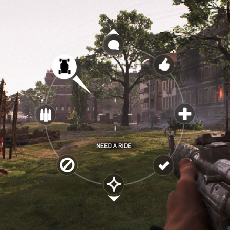
One of the big pieces of feedback from social media and forums during the public beta was the omission of the “Go Go Go” option. Apparently it was kind of a fun custom for players to use this when starting online battles BF1. The usage data validated the popularity of this option once the experiment completed. Fortunately the modular design of the Commo-rose also made it easy to accommodate the vocal community requests for the “Go Go Go” option, which we were able to get back in before the final localization/translation deadlines. |

|
Illustrator Concepts
This initial concept is the most similar to BATTLEFIELD 1’s Commo-rose (with the literal number and organization of functions that DICE Stockholm suggested) but does leverage iconography and a consistent reading location (below the crosshair) to fulfill some of the initial design goals. |
This design abandoned the “node” motif in favor of a thicker ring of segmented backplates. It also does reduce the number of labels to read at once but places them in variable locations closer to the function selected (as in BATTLEFIELD 1). |
My preferred design embodied all of the goals of the previous concepts but gave up the literal organization DICE Stockholm requested. Instead, it favored fewer functions with larger backplates to add visual weight based on importance to promote faster split-second decisions and input.
Results
The DICE Stockholm team chose the final design and were impressed that I went above and beyond just a simple visual redesign to improve usability and UX.
Battlefield V currently holds “Metacritic” ratings of 81% (PC), 78% (Xbox 1) and 73% (Playstation 4) and has sold over 14 million copies world-wide.
Battlefield V currently holds “Metacritic” ratings of 81% (PC), 78% (Xbox 1) and 73% (Playstation 4) and has sold over 14 million copies world-wide.
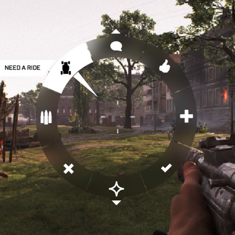
Commo-Rose Before and After
