Lost Planet 3
|
Published by: Capcom, August 2013
Developed by: Spark Unlimited Platforms: Playstation 3, XBox 360, PC Languages: English, French, Italian, German, Spanish, Japanese, Polish, Russian, Portuguese Tools & Tech: Visio, Photoshop, Illustrator, Unreal Engine 3, Flash, Scaleform Services Provided:
|
MULTIPLAYER GAMEPLAY VIDEO
|
PRESS TO WATCH |
DESCRIPTION AND CREDITS
This video presents a good holistic snapshot and flow of all the multiplayer UI features in the final product, including menus, HUD, Progression Sphere, and the pre/post-game lobbies. (It's not me narrating, BTW!)
"RESEARCH LAB" MAP DESIGN: Jordan Smith
"RESEARCH LAB" ART: Sam Wey, Tom Nguyen "CONTACT" MAP DESIGN: Roy Orr "CONTACT" ART: Alden Fillion, Andrew Harrington |
COMPETITIVE & COMPARATIVE ANALYSIS
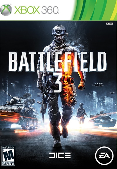
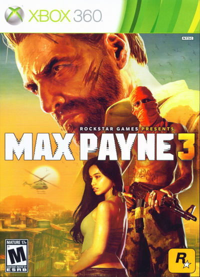
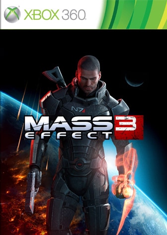
The Online Shooting Games Researched for Lost Planet 3
|
A major part of heading up both the UX and general multiplayer game design effort was to understand the modern console competitive "shooter" landscape. This included not only the previous LOST PLANET titles, but also numerous games across both the first and third person shooter categories. Through playing and analyzing these titles for strengths and weaknesses, a picture started to form of what type of UX we should create for online players.
|
|
"PROGRESSION SPHERE" METAGAME DESIGN
|
PRESS TO WATCH |
PROGRESSION SPHERE CREDITS
ART DIRECTION: Daniel Cabuco
FLASH ART & SCRIPTING: Chris Stuart ADDITIONAL ART: Stuart Kim PROGRAMMING: David Forhan ADDITIONAL DESIGN: Greg Wondra, Roy Orr AUDIO: Ricardo Hernandez, Brian DiDomenico |
|
WHAT IS THE PROGRESSION SPHERE ?
For the online gameplay modes, a key objective was to create an innovative unlockable system or "metagame" interface to increase player choice and long-term engagement. The design team looked to similar, successful systems in Japanese Role-Playing Games (JRPGs) like FINAL FANTASY and SHIN MEGAMI TENSEI for inspiration.
|
HOW DOES THE PROGRESSION SPHERE WORK?
A matrix of hexagonal cells mapped onto the surface of a sphere represents the set of purchasable weapons, upgrades, abilities, and characters. Players begin in the middle of the sphere with their basic gear, then in between battles, they purchase items and reveal more cells in the grid.
|
|
|
PROTOTYPING THE PROGRESSION SPHERE
This progression system went through a wireframing and physical prototyping phase using laminated tokens so that we could write and erase details from the cards. Images of the physical prototype materials, wireframes, and final concepts can be seen here.
|
|
|
HANDLING RESISTANCE WITH RESEARCH
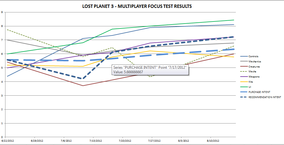
During development, some teammates felt the Progression Sphere UI was too complex. The usability research showed that users thought it was cool and unique, and this gave the design team the data to stand behind the concept. However, the team refined the design with additional elements, such as the Tutorial Splash and Class Overlay shown here, and changed some of the metagame "rules" in response to these internal concerns.
|
USABILITY RESEARCH CHART
|
CONDUCTING UX RESEARCH
Usability research methods included regular focus group studies (consisting of in-person observation, written surveys, and recorded roundtable discussions), and "mock" reviews. To track progress, the team collected, tabulated, and graphed survey results. This helped validate design and tuning decisions and inform next steps. Fun fact, in mock reviews, the UI was the only aspect of the game that earned a score of "9."
|
D-PAD MAPPING CONCEPTS
|
MAPPING FUNCTIONS TO BUTTONS
This gallery depicts several interface design concepts for mapping functions to a set of console controller directional "d-pad" buttons. The intent was to let users specify which buttons activate special "deployable" items or abilities.
|
NAVIGATION CHALLENGES
The hex-based nature of the cells presented some navigation issues, as did choosing a direction button to map, followed by using the same button to navigate options. While the concepts explored category filters to reduce the number of options to choose from, as well as horizontal and vertical cells, the team didn't pursue this design.
|
EMBRACING CONSTRAINTS
In the final interface design, the team backed away from giving players four "D-Pad" options to customize and settled on just two. While this reduced player customization, the gameplay impact wasn't as great as anticipated. In fact, it streamlined some of the decision-making processes and allowed the team to reuse pre-existing interfaces for weapon selection. It's a good example of how embracing constraints can result in a win.
|
COntroller CONFIGURATION MOCKUPS
|
|
UX STRATEGY FOR MULTIPLE PLATFORMS
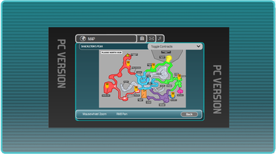
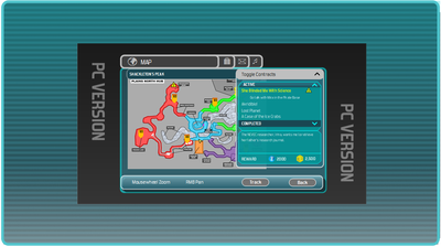
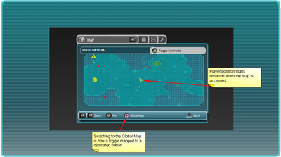
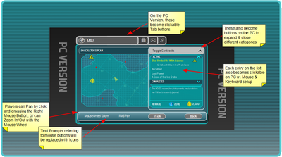
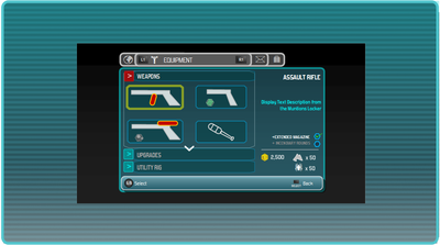
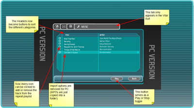
There are versions of LOST PLANET 3 on Playstation 3, XBox 360, and PC. While the console versions were largely the same, the PC version required special case UI features (mouse and keyboard support, graphic options, etc...). In many cases this more than doubled the amount of up-front UX work and UI implementation, as every part of the UI had to be evaluated to support the three platforms, as shown with this controller configuration screen.
|
UTILITY RIG COCKPIT
|
|
COCKPIT FEATURES
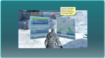
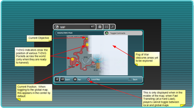
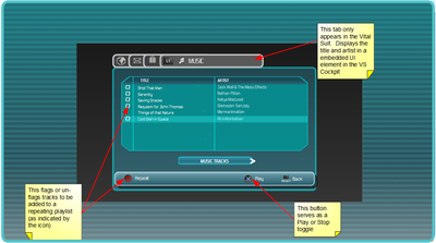
These are some very early wireframes for the vehicular mech cockpit. Maps, objective tracking, player status, and even a Music Player were all feature requirements for this interface. The requirements for the Cockpit UI changed significantly over time. Eventually, many aspects were removed, built into the actual cockpit geometry, or represented as "sprite" overlays.
|
|
PRESS TO WATCH |
COORDINATING WITH MODELERS
Because many of the "holographic" UI elements were projected onto the "glass" of the cockpit (using Scaleform) designing this 3D UI had to be coordinated with the character team modeling the Utility Rig geometry. Check out the video to see how the Utility Rig Cockpit turned out in the final game.
|
Job Log Mockups
