Stacks! Live Streaming Game Show App
Overview
STACKS! was a live-streaming game show app where multiple contestants can either audition to be a live, on-air contestant and get a chance to win a cash prize, or follow along off-air to fill their golden Stack and eventually redeem their winnings for retail gift cards.
STACKS! was a live-streaming game show app where multiple contestants can either audition to be a live, on-air contestant and get a chance to win a cash prize, or follow along off-air to fill their golden Stack and eventually redeem their winnings for retail gift cards.
|
Brief
The client, SeeWin Technologies, had an existing version of the app, called Swoopz, but their analytics indicated that primarily teenage girls were engaging with the app. They wanted to appeal to a broader audience, so they rebranded both the show and the app as a cheesy, glitzy, tongue-in-cheek 70s retro TV game show. |
Role
I was brought onto the project to address numerous UX issues with the existing front-end interface and to integrate a light gamification and engagement strategy. During the engagement, I also helped out on the product management side, sourcing UI artists, and sound design contractors as well as driving the stakeholder review and approval process for nearly 130 screen layouts. |
Method
I used Adobe XD to develop a fully interactive prototype of the app. I also used Google Sheets to track the reviewing, revision, and approval process with a distributed team of stakeholders on both the east and west coasts of the United States. |
|
Multiple Choice Use- Cases & Mockups
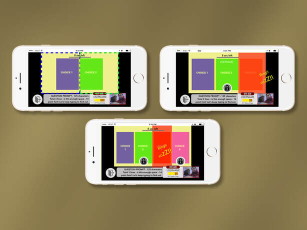
This series of mockups is an excerpt from animated Adobe XD flows depicting two, three, and four response multiple-choice use-cases would work. The blurred yellow tint delineates the live video stream from the app-based interface elements. In the Swoopz version of this screen, there were UX discrepancies between the video feed from the live studio having more visual weight than the actual interactive buttons in the UI, so I resolved this by proposing invisible triggers (dotted lines) that better matched the studio graphics representing user choices. The other interesting UX constraint was the fact that the app UI had to update in real-time to the selections of other on-air contestants. If you were also an on-air contestant, the interface had to "lock-out" choices for you, even auto-selecting the last choice for you if no other options were available. The constraint didn't exist for "off-air" contestants, who could follow along and make any choices they wanted. |
|
Gamification Chart
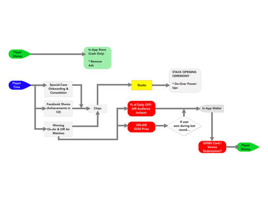
This chart illustrates a strategic overview of the final gamification plan for Stacks. Charts like this are useful for conveying to clients how user investment (whether time or money) interacts with the various moving parts and systems within the app, and results in progress, goal fulfillment, and rewards that drive user engagement. The original gamification strategy was more ambitious and involved a wider array of "power-ups" to drive interesting user choices, randomized prizes, and more robust engagement loops. We also explored some potential "gambling" elements where users could place wagers during the live show using in-game currency. Due to scheduling and legal constraints, as well as some differing points of view amongst the team, most of these ideas were pared down. Ultimately we settled on an MVP plan depicted here that would allow users to only win "do-over" power-ups to undo mistakes in the multiple-choice rounds. The monetization plan was based solely on in-app ad revenue (with users paying to remove them). While on-air users would get a chance to win a $250 cash prize, off-air users could redeem their "Stacks" for a portion of the "off-air jackpot" which they could eventually redeem for real-world gift cards. |
|
Off-Air Contestant- Final Round- Score Progression and States
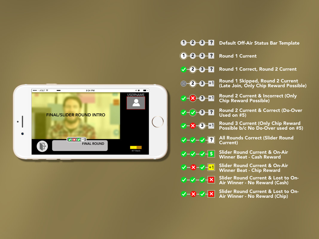
This less-than-pretty UX mockup depicts the template frame interface around the live video feed from the studio. A small timeline interface below the video frame depicting the off-air user's track record in the previous multiple-choice rounds. The list to the right illustrates all the possible use-cases of this element, illustrating a number of potential outcomes for off-air users, including illustrating where "do-overs" were used. This would maximize off-air users' potential to win a larger portion of the off-air jackpot. |
|
Gift Card Redemption Mockups
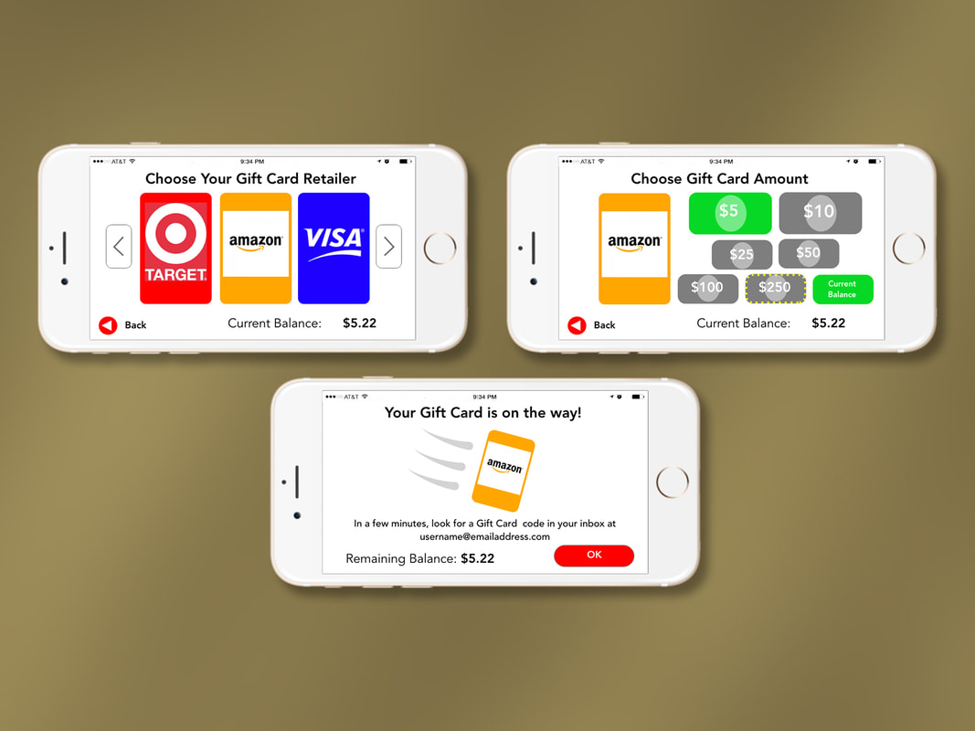
This is a brief series of mockups depicting how users would redeem currency from a virtual "wallet" into real-world gift cards. Users would select from available online retailers, then choose an amount based on how much was in the wallet. After a confirmation step and some error checks (not shown), there would be an animated sequence to confirm that the digital gift card was on its way to the user. |
|
Mockup Approval and Stacking Sheet
This project was unusual for many reasons. The overall direction and requirements shifted priority from trying to be a modern, MVP free-to-play monetized app to being an illustrated use case of Seewin's multi-user 2-way streaming technology. Resources and schedule on the project were tight, and many of the stakeholders were in different time zones. I developed this spreadsheet to track the progress of each of the 128 screens needing review and approval using a "traffic light" system so that we could start making commitments, note issues requiring further attention, and firm up different parts of the app. There was critical to keep the development team fed with approved screens to implement, avoiding costly downtime, and building momentum. After UX design approvals were obtained, we also used this spreadsheet to coordinate the final illustration and visual design process with a UI art contractor. |
|
UI Art/Illustration courtesy of Benjamin Liska.
|
Stacks Show in Progress Final Comp
This is a UI screengrab from the close-to-final promotional video that illustrates many of the core concepts of the Stacks game show. * A video feed from a live studio show with a host interacting in real-time with up to four "on-air" contestants (similar to the American TV game show "The Price is Right"). * A video window in the top right depicting the local user's mobile camera feed. * A stack of gold bars that indicates a user's progress. A variety of activities can award chips to build the stack, and when it's full, users can redeem it for in-game items and power-ups. The format of each game show consisted of several multiple-choice rounds, followed by a final "slider round" where the winners of the previous multiple-choice rounds would try and guess the price of one or more on-screen items. A $250 prize would go to one of the four on-air contestants who had the closest guess. "Off-Air" users could follow along with the on-air action with the chance to win a portion of an "off-air jackpot," or they could win chips to fill their stack. |
Stacks Final XD Delivery Snapshot
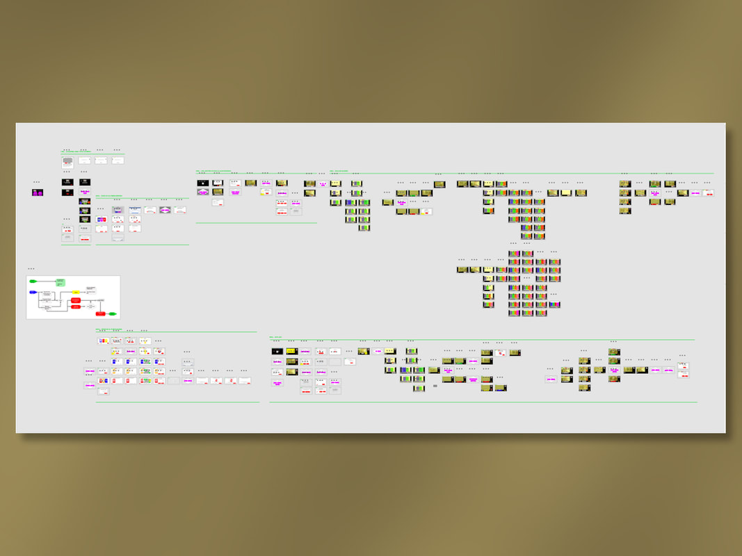
This is a snapshot depicting the scope of the final XD file that was delivered to the client. Although there were almost 130 "screens" requiring mockup and layout revisions, over 300 artboards in Adobe XD were necessary to convey many animated screens and flows, as well as illustrate logic branches and potential use-cases. This was all put together on a part-time basis over a four-month span (December 2018 - March 2019).
This is a snapshot depicting the scope of the final XD file that was delivered to the client. Although there were almost 130 "screens" requiring mockup and layout revisions, over 300 artboards in Adobe XD were necessary to convey many animated screens and flows, as well as illustrate logic branches and potential use-cases. This was all put together on a part-time basis over a four-month span (December 2018 - March 2019).
