Vyndica - Mobile Trading App
|
|
Developed By: Vyndica, LLC
Tools and Tech: Adobe Illustrator, Pixate Studio, Phonegap Platforms: iOS, Android Services Provided: UX Design, Visual Design, Prototyping, Gamification |
|
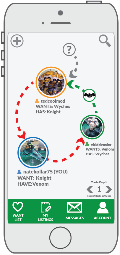
This project is a iOS/Android app billing itself as a 21st Century solution for users to barter or trade items (in this case, targeting the Warhammer 40K miniature figurine market). The main UX feature that differentiates this project is the "graph" user interface.
|
Instead of having to browse through archaic lists and forums (like Craiglist or Reddit), users simply use the app to find items they want, list items they are willing to trade with others, resulting in an auto-generated graphical network of potential "trade-nodes" for users to browse.
|
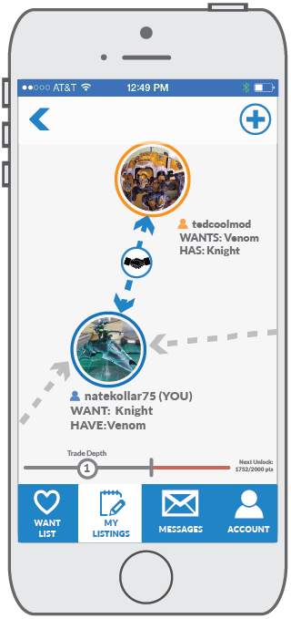
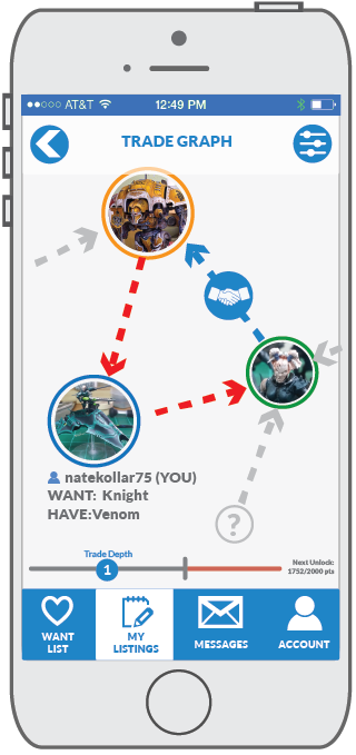
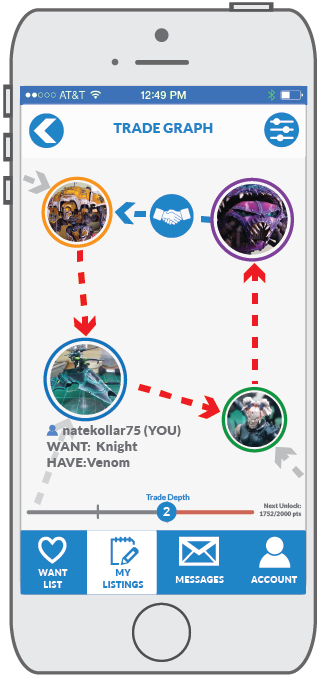
In addition to direct one-to-one trades, the Vyndica app also supports multi-party trades. Users adjust the "trade depth" slider, which expands the set of users included in the graph, allowing users to "suggest" trades with one another and close multi-party trade loops. Everybody wins!
|
FIRST DELIVERABLES - PROVING OUT THE GRAPH
The first client goal was to create an interactive prototype on mobile to facilitate testing of the concept with users who fit the target market (Warhammer 40K table-top gaming hobbyists). To start, we had to do some quick visual concepts around the graph and how it might work and look.
VYNDICA NODE GRAPH VISUAL MOCKUPS
|
|
|
|
These initial concepts helped establish conventions for layout and visual design. Normally on a larger team, the UX design phase would precede this and there would be dedicated, separate resources for UI & Visual Design, but since this was a small startup, I had to generate assets as well. In this case this proved to be helpful as it provided us with a base of assets to plug into our prototyping tool, Pixate, which I suggested to my client based on some good recommendations from other UX Designers at Los Angeles-based meetups and networking events.
COMPETITIVE & COMPARITIVE ANALYSIS
|
After the encouraging results of the PIxate prototyping, we turned to evaluating the landscape of online trading and bartering tools. Craigslist was a large and obvious competitor, but mostly as a general target for disruption and functionality, not for actual UX design.
|
To create a full competitive & comparative (C&C) analysis, we evaluated several existing mobile user-to-user trading apps. To drive this effort, I downloaded each of the apps and captured screengrabs on iOS, which I uploaded to Dropbox for further review and discussion with the client. Here's the general findings:
|
|
VINTED
A clothing and apparel app for women to buy and sell secondhand clothes online. Vinted impressed us with a UX design tailored for its target demographic, good onboarding design, and an attractive, staggered, Pinterest-style item list with large images. |
SWAPDOM
Swapdom was another popular online trading app that seemed to have clunky layout and buggy navigation, less unpolished visual design, and didn't seem targeted to the needs of any specific demographic or category of products. |
MATCHTRADE
MatchTrade's key feature was matching users to goods with a swipe-left, swipe-right, Tinder-style interface to accept or decline trades . Although not quite as elegant or targeted as Vinted, it offered solid visual and UX design. |
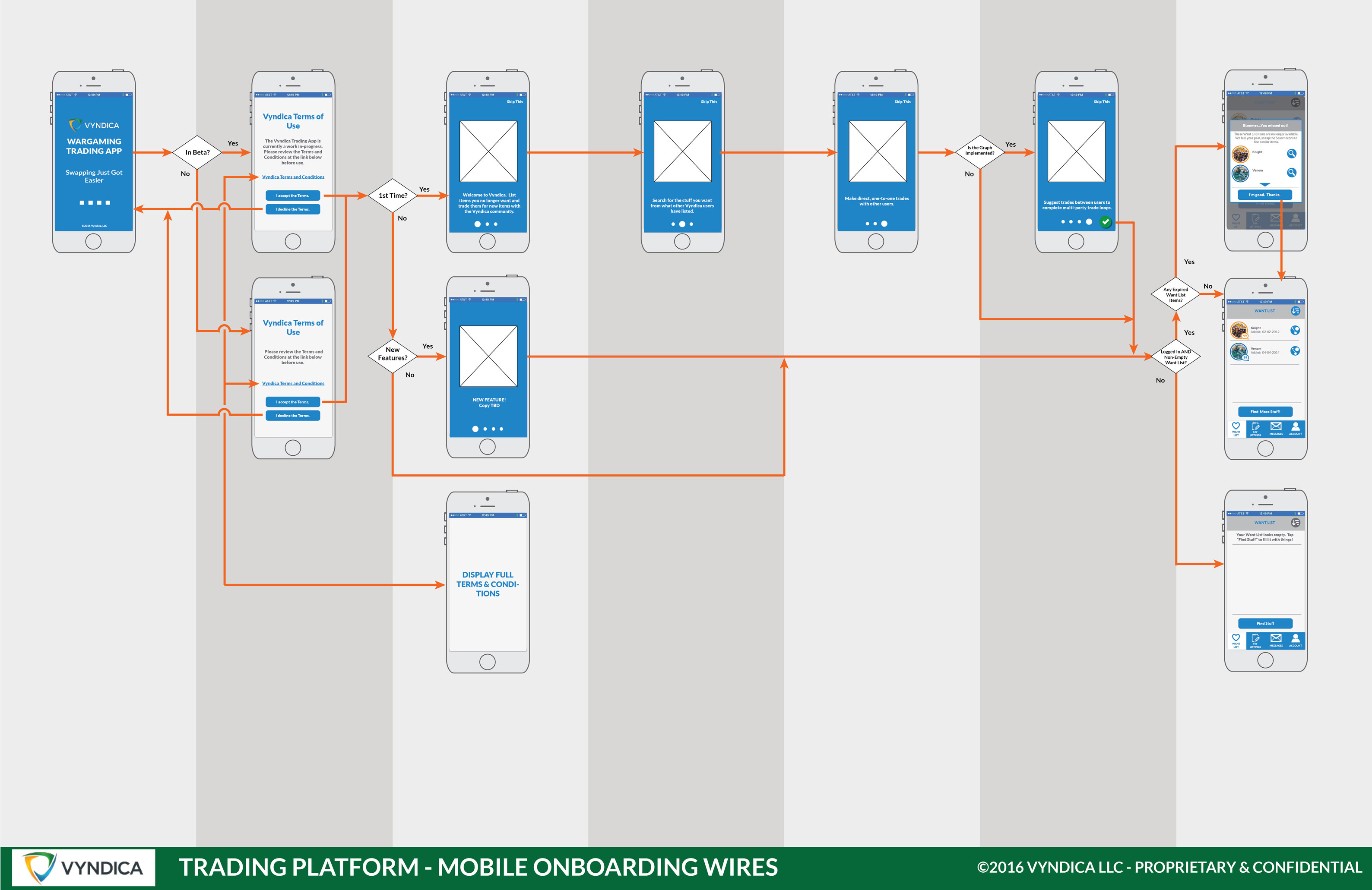
OVERALL UX DESIGN FLOWCHART
|
Once I completed the initial usability testing on the Pixate prototype and the C&C analysis, it was time to focus on a larger UX artifact. The features we needed to illustrate with this next UX Design phase included the following:
|
|
ONBOARDING FLOWS
|
Later in the project, we started to focus on user onboarding flows. To achieve this, two UX Design options were generated for the client.
The first, more intricate onboarding flow would walk first-time users through a streamlined version of the node graph. This would acclimate users to the visual node graph and functions through touches and swipes, communicating the value proposition of the app through direct interactions. 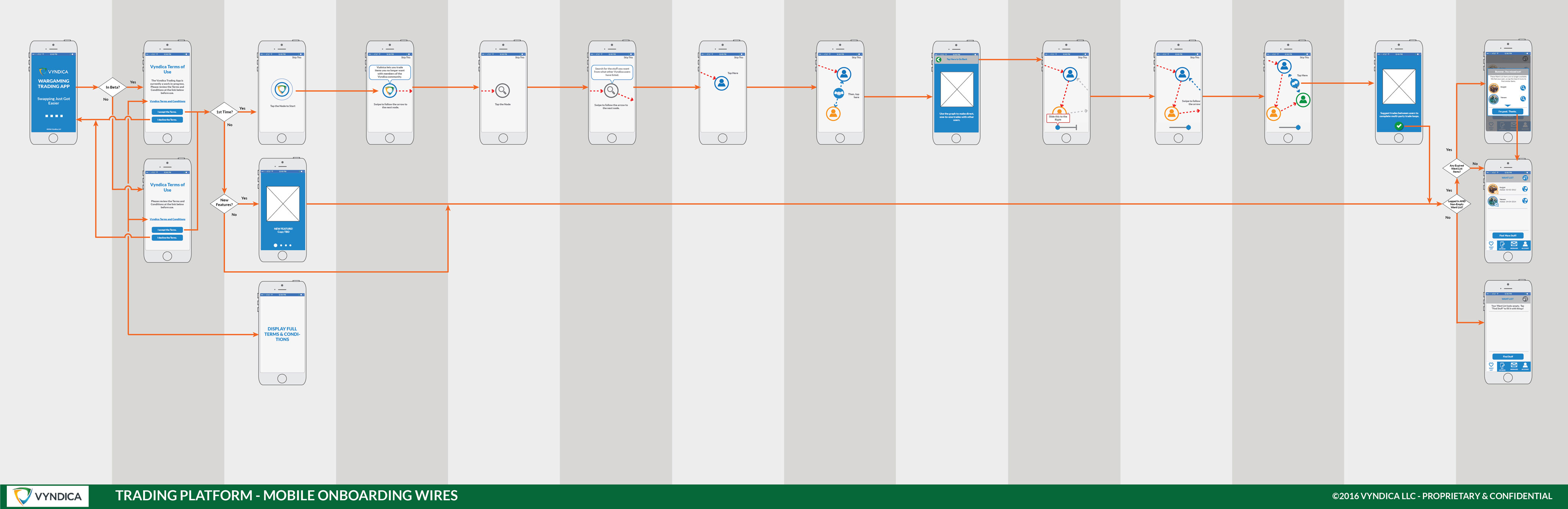
|
A more streamlined onboarding flow simply displayed three pages of images and copy. While the client appreciated the intent of the previous, more interactive onboarding flow, this flow was deemed less technically intensive to implement and easier to execute.
|
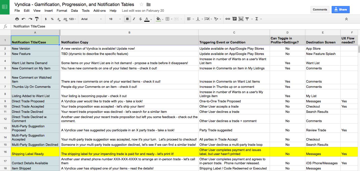
GAMIFICATION DESIGN PROCESS
This excerpt from Google Sheets illustrates the gamification process for a mobile UX design. It includes the name of unlockable badges or trophies, text copy, and details about triggering conditions and what variables it would affect on the back end for the developer to implement.
|
When approaching gamification design, it's necessary to clarify the end-user emotional needs and goals are, and where they overlap with the business goals. In this case, users want to be able to obtain painted Warhammer 40K figurines, so the client wanted to craft the gamificiation systems around encouraging user-to-user trading. The major behavior categories were:
|
It's also important to specify if a given badge or achievement is repeatable, as well as to describe the size of the reward (in this case, experience points or XP). When crafting gamification cycles, it's more important when establishing the gamification strategy to not get hung up on the specific numbers of the reward. Instead, its better to just give a general size (small, medium, large, etc...) so that the team can understand the reward in broad strokes.
|
HOW DOES GAMIFICATION AFFECT UX DESIGN?
|
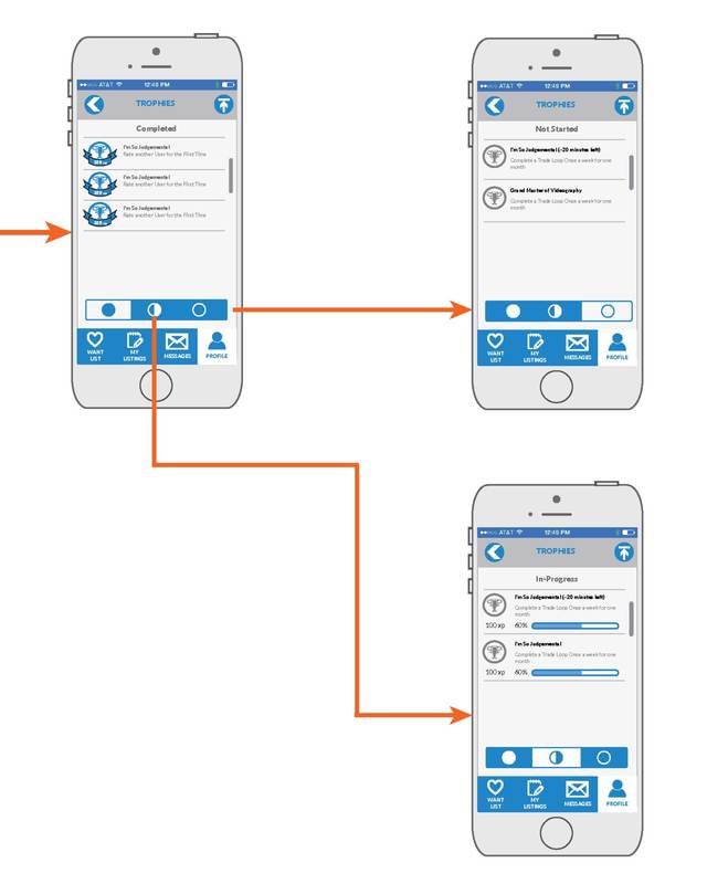
Before layering in the gamification design, some understanding of the underlying UX design is also necessary. This is because gamified elements, such as badges, achievements, or user choices, are triggered by moment-to-moment user interactions. Gamification design works best as a parallel, iterative process with the UX design. While you need a basic understand of what users will do, it can also inform the UX design of other elements , such as what information is shown in the user profiles, such as a "trader level" or recently earned badges, or progression elements, like how far a user is away from their next reward.
The following selection of mockups from a larger user profile UX artifact illustrates how the Gamification design manifested itself in the UX design of specific screens and progression elements. 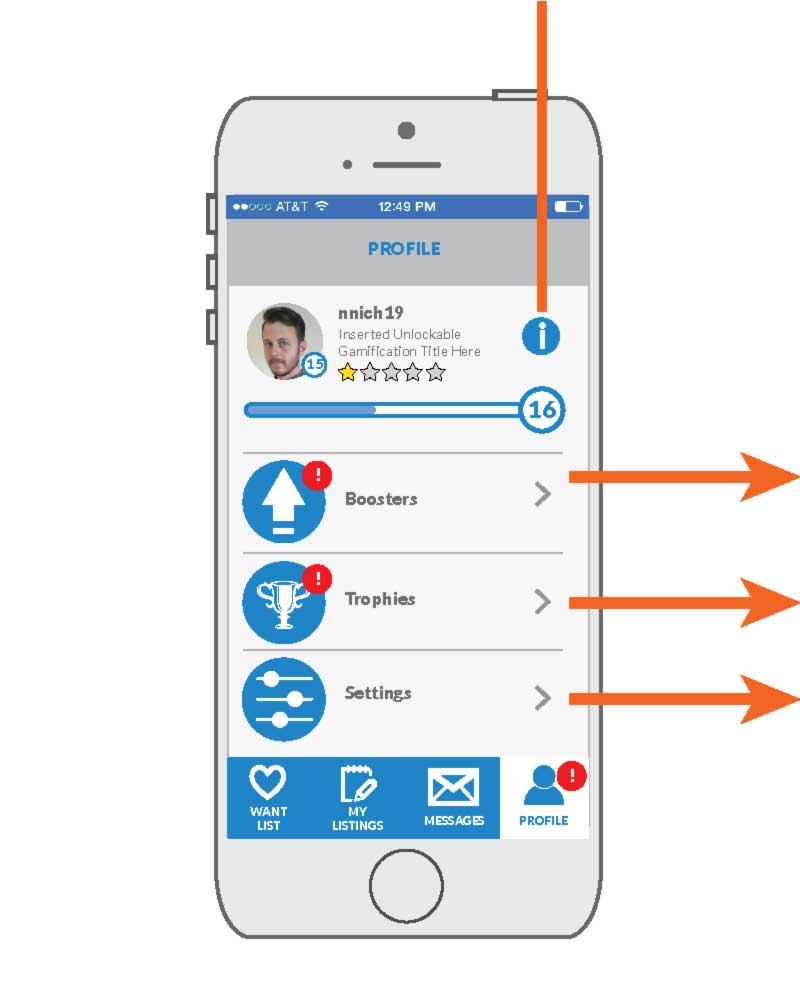
|
|
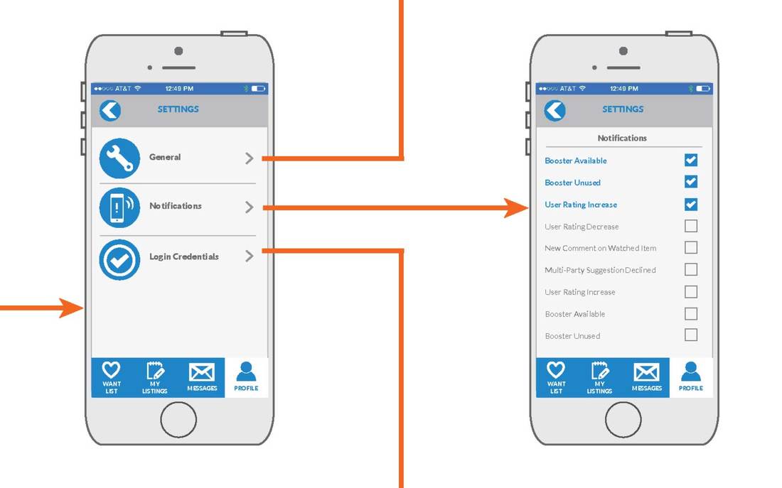
MOBILE NOTIFACTION USE-CASES AND SCENARIOS
One of the later deliverables was to clarify mobile notification use-cases and flows. This involved thinking and documenting all of the following factors:
- The instances that a mobile notification would pop-up.
- Succinct and meaningful text copy & feedback to inform and build user interest.
- Specific back-end triggers for the notification.
- Where users are taken within the app if they accept the mobile notification.
- Whether or not users can disable the specific notification in an options screen.
- If a particular notification would require a separate UX wireframe or flow to illustrate the moment-to-moment UX.
|
UX DESIGN WITH A SPREADSHEET?
Approaching the Notification Use-Case design via a spreadsheet was a more efficient way to brainstorm and communicate the big picture strategy for Mobile Notifications than getting mired in numerous flows and mockups. It allowed the client and stakeholders to assess the scope of the effort, get a sense of the tone and voice of the text copy at a glance, and understand what back-end events or conditions would need to be programmed. It also enabled us to assess what gaps were potentially missing in the high-level UX design strategy, or find ways to reduce user friction by taking users directly where they needed to be within the Vyndica app to accomplish goals and have meaningful and immediate interactions with the service. |
NOTIFICATION OPTIONS MOCKUPS
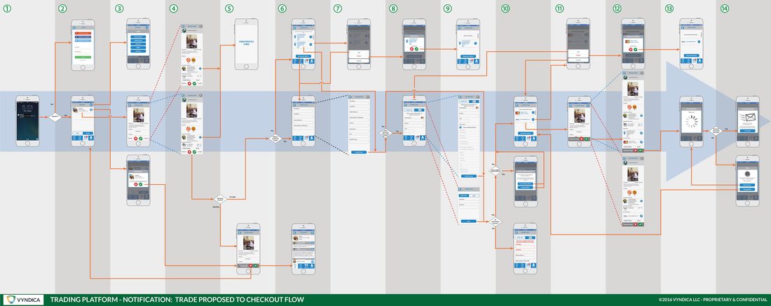
NOTIFICATION TO CHECKOUT FLOW
This was a more targeted UX flow artifact intended to highlight how users would get a trade proposal (via mobile notification) and what steps they would undertake to proceed to checkout to complete the transaction. The large blue arrow indicates the most common or critical path users may take to complete a trade under this use-case, but it also shows other conditional flows and logics to handle errors or other edge-cases. Since the Vyndica app would also facilitate both in-person trades and remote trades involving shipping costs, this flow highlights how the UX supports both use-cases.
FINAL RESULTS
So what happened with the project? The client started developing a minimum web/desktop front-end to iterate on the back-end functionality. As time went on they rolled out this product to live users with the intention of revisiting the mobile UI development at a later point.
During these initial release phases of the web/desktop-based trade marketplace, the client wasn't able to achieve sufficient volume to begin development of the mobile UX. This required a pivot from the initial concept of users trading Warhammer 40K figurines, to matching users who did custom paint jobs to clients looking for people to paint their figurines. This necessitated changes in how to approach the mobile UX design.
So while I didn't get to see this project through to completion, my friends at Vyndica continue to leverage the findings in the UX artifacts, diagrams, and flows to inform feature development.
