Precision Digital Health
Overview
Precision Digital Health is a web/desktop based platform providing "big data" analysis and visualization services for corporations in the pharmaceutical and healthcare sectors.
Precision Digital Health is a web/desktop based platform providing "big data" analysis and visualization services for corporations in the pharmaceutical and healthcare sectors.
|
Brief
The platform consists of several modules, each of which targets the needs of different users. When I joined the project, it was already in a first-pass state using Angular.js and Google's Material Design UI library. Because there wasn't a dedicated UX/UI member of the team, a lot of the engineer-implemented interfaces had functional inconsistencies, increasing cognitive load on a complex UI with a steep learning curve. |
Role
My role as UX/UI consultant was to overhaul the UX for the dashboard and site portal modules. I had never worked on a project in the healthcare sector, so I have to admit to a little intimidation due to the unfamiliar, complex terminology! However, as the engagement proceeded, I asked pointed questions, spotted functional inconsistencies, and proposed workable UX solutions, which built trust and momentum with the client. |
Method
I used Adobe XD and Google Material Design to develop animated, interactive prototypes and mockups to illustrate revisions to both modules, plus Evernote for client call notes and to-do lists. |
|
Site Portal Landing
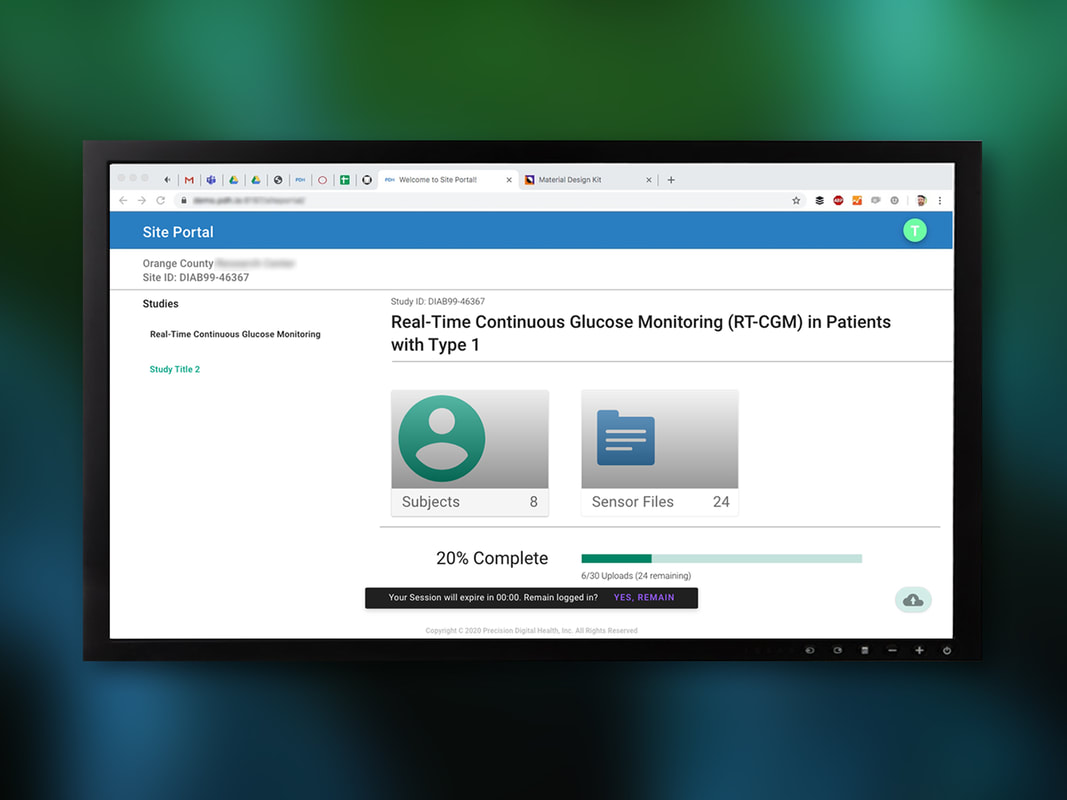
This was the first aspect of the project that I worked on. The site portal dashboard was intended for clinicians who were responsible for logging data over a period of several days to weeks. A specific clinical trial might entail uploading data from multiple users or using specific sensors. This screen was intended to convey, at a glance, how many users or files were aggregated in the study, and how far along the study was in terms of remaining uploads. |
|
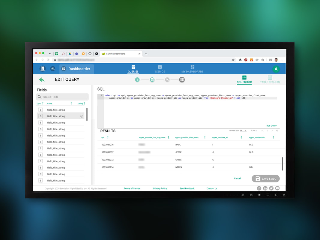
The interface shown here is an "advanced/power user" screen where users could see what fields of data variables were available for a study and could start writing SQL code, seeing a table or the resulting, filtered data in real-time.
Also shown here are tabs to improve the inter-module navigation (switching between dashboards, gizmos, and queries). |
Dashboard- Edit Query
After completing UX revisions on the site portal, we moved onto the Dashboard module. Whereas Site Portal was the part of the platform where data was collected, the dashboard module was where data scientists and analysts working for pharmaceutical companies could distill terabytes of data down into intuitive visualizations and charts (aka dashboards). The dashboard module gives this user the tools to create, manage, and organize three categories of objects to serve this purpose:
|
|
Dashboard- Query Builder
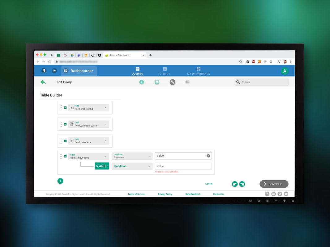
The edit query flow in its MVP would only be useful to users who possessed a certain level of proficiency in writing SQL code. Although I am a programmer too, I had never learned SQL so in order to recommend improvements, I needed to understand how SQL worked and what were some rules and constraints. One design I proposed to get around the technical hurdle associated with writing SQL queries was a graphical query builder that would allow users who might be less proficient in SQL to build some basic queries and start to get a feel for how it might work. This interface illustrates how users could add columns of data to a table, but add in rules to filter or exclude certain types of data. There were a lot of potential use-cases and SQL commands we wanted to support, but this interface concept was deprioritized. |
|
Dashboard- Gizmo Landing with Date/Time Range Picker
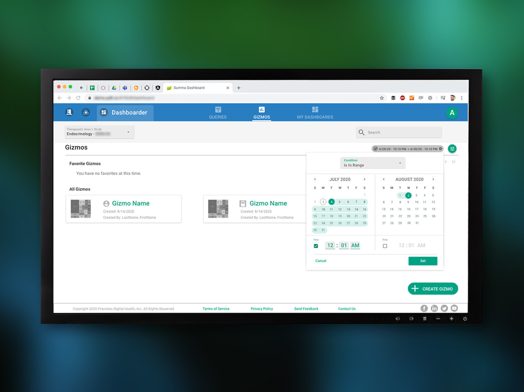
After creating queries, users could start to create and manage gizmos, which are individual charts paired with filtered, query-generated data tables. This screen allows users to see all the gizmos associated with the current study. On this screen, one of the key UX pattern improvements I proposed was leveraging the chip widget from the Google Material Design library (in the top right). By adopting this pattern, we could give users a consistent means of adding and revising filters. In this particular case, we're illustrating a user entering a date and time range. This pattern of adding filter chips to the top right was also propagated across screen and modules, to help promote greater UX consistency. |
|
Dashboard- Edit Gizmo
|
Dashboard- Landing
|
|
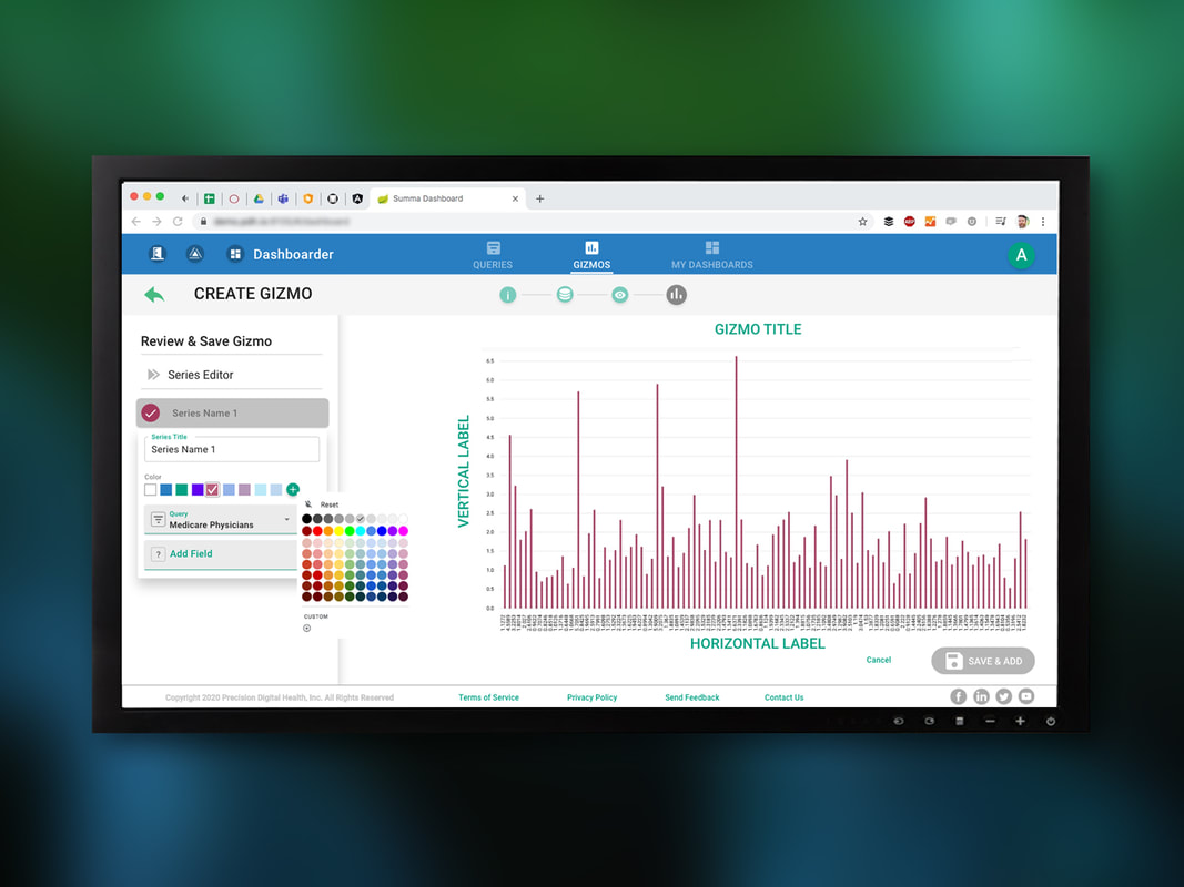
In this screen, users are associating various properties with a gizmo, such as labels and colors. They can also associated a specific query to the gizmo chart, providing filtered sets of data that analysts can start crafting into more intuitive visualizations.
|
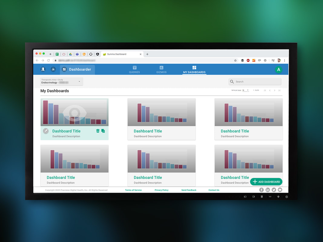
If a gizmo is a snippet or a smaller, more granular object, a dashboard is an aggregate of several gizmos designed to surface patterns, insights, and trends in the data. This screen depicts where a data scientist might be able to see and manage all of the dashboards associated with a client account.
|
|
Add/Edit Dashboard
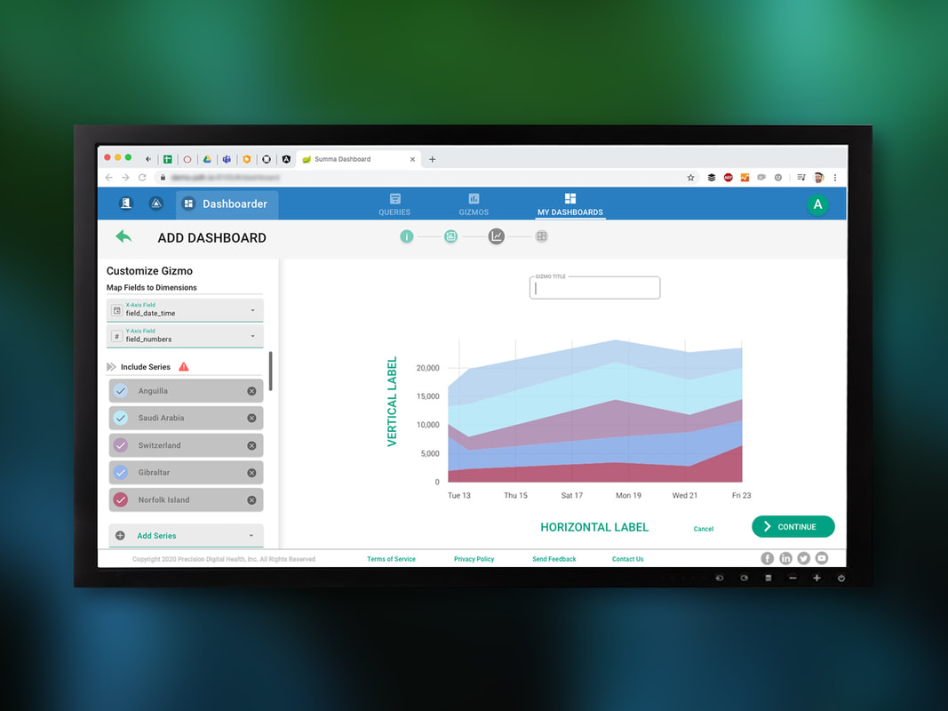
In this screen, users are mapping certain sets of data or "fields" onto the vertical and horizontal axis of the charts. Users can also customize aspects of pre-existing gizmos, and add parallel sets of data or "series" to provide more advanced or robust visualization options, as shown with the layered bar graph. There are a couple of pattern improvements here to call attention to: 1. All headers in green could be clicked to edit (for example, the title of the chart and the x and y axis labels) 2. A stepper widget in the top middle of the screen would allow users to understand their relative progress in complex task flows (such as creating a new dashboard) but would also allow them to step back to previous completed steps to make refinements and edits. Both of these patterns would be leveraged in other parts of the UX. |
|
Filter Data in Dashboard
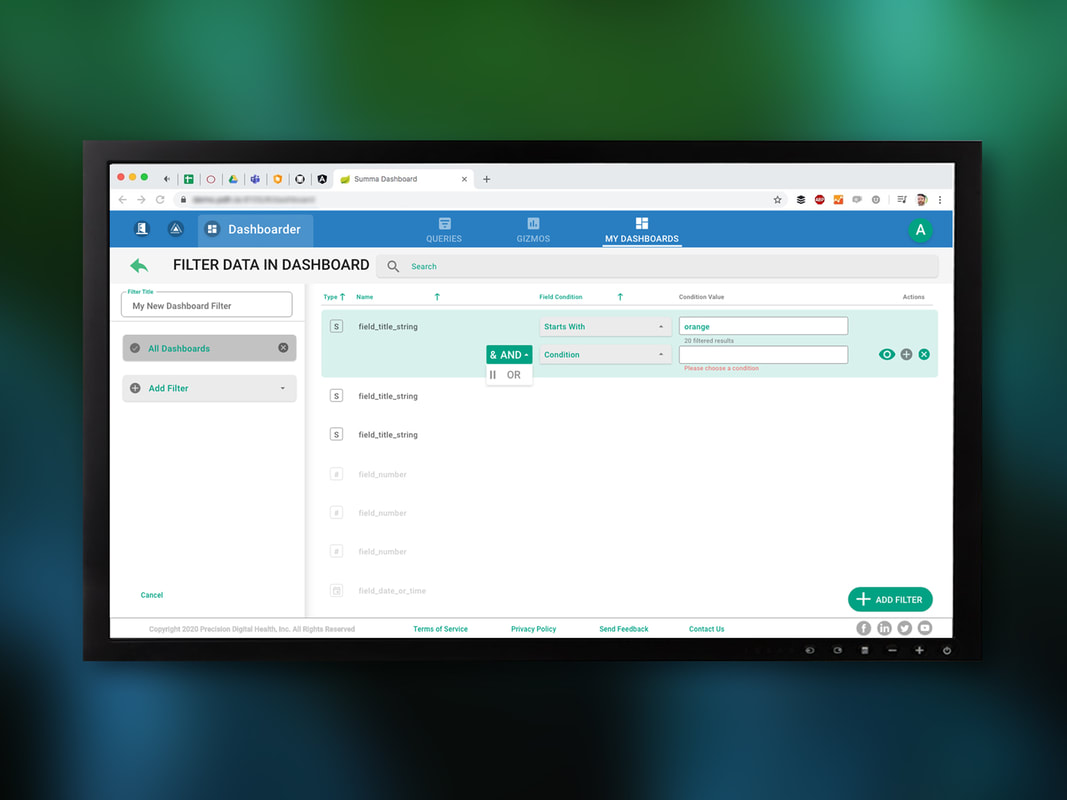
While we had deprioritized the query builder pattern to make the process of creating SQL queries more accessible, much of that thinking was applied towards how users might apply filters to a fully populated dashboard. One of the critiques about the query builder approach was that it entailed too many clicks, which might be prohibitive for more advanced users. This interface took some of the interaction patterns explored in the query builder, but would allow users to type out a desired filter or function type, rather than forcing them to click and scroll through dropdowns. This would appeal to the needs of both beginner and advanced users. |
Final XD Deliverable Snapshot
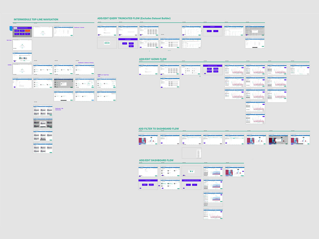
This is a snapshot of the final XD file delivered to the client, illustrating all of the UX improvements for the dashboard module.
This is a snapshot of the final XD file delivered to the client, illustrating all of the UX improvements for the dashboard module.

