Electronic Arts UX Designs
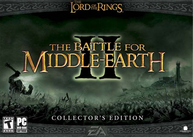
THE LORD OF THE RINGS: BATTLE FOR MIDDLE-EARTH II
|
UX OBJECTIVES
Originally meant as an expansion pack to the original Battle for Middle-Earth (BFME), this project's goal was a superficial UI facelift. However, once EA green-lit the title as a full-blown sequel, the team added new features and addressed usability issues with the pre-existing UI. The executives also tasked the team to keep the UI functional and demonstrable at all times throughout development.
|
|
"WAR OF THE RING" METAGAME VIDEO
A major feature for BFME 2 was the new "War of the Ring" mode. This was a "metagame" of territorial conquest, similar to the classic boardgame, RISK. The team prototyped this mode as a physical board game before development began. Click the video below (originally included on the Collector's Edition Bonus DVD) to learn more about how the "War of the Ring" works as well as some of the "behind the scenes" details on how the team prototyped it and to see the end result.
|
WAR OF THE RING VIDEO & CREDITS
PRODUCER: Amer Ajami
LEAD DESIGNER: Jason Bender ADDITIONAL DESIGN: Jeremy War UI DESIGN: Ed Moore ART DIRECTION: Matt Britton FLASH ART & ACTIONSCRIPTING: Ben Liska ADDITIONAL UI ART: Insun Kang, Cassia Dominguez UI PROGRAMMING: Scott Bowen, David Richey |
BFME 1 VS BFME 2 UX DESIGN COMPARISON
While wireframes and mockups are not available for BFME2 (and official online servers for BFME2 are sadly inactive, prohibiting access to certain parts of the UI), to shed some light onto the process and UX-centric thinking behind certain features, here's a comparison of various, equivalent UI screens from BFME2 (green) and it's prequel, BFME1 (red).
|
|
GRAPHICS OPTIONS
In the original BFME, the Options screen provided only one generic "Detail" setting, with no user feedback on what that really meant. For the sequel, the team expanded the granularity of options and added a "Custom Settings" button and sub-screen., This retained the function of the overall Detail setting, but with a larger and more appealing widget. This streamlined a lot of the busy work of adjusting video settings, while still allowing users to tweak options to suit their preferences, along with improving feedback on what the overall setting really meant.
|
|
|
POST-GAME SCORING
Another significant UX improvement was a post-game scoring screen. In the original BFME, this was just a table of numbers representing overall stats during a match. The team expanded this significantly in BFME2, representing this data as a time-line based graph with several tabs to filter data. This increased the granularity of feedback, and expanded the users' understanding of how their actions and choices fared against both human and AI opponents. This design was reused in subsequent EA real-time strategy games, such as COMMAND & CONQUER 3 and RED ALERT 3.
|
|
|
SKIRMISH SETUP
"Skirmish" mode is separate from the story-driven "Campaign" or "War of the Ring" modes and allows players to set up matches against AI opponents. In the original BFME, some critical player profile functions, such as "New/Delete Profile", were mis-organized under a "Change Player Profile" dropdown, and there was a lot of data crammed into a "Skirmish Profile" panel. Additionally, community members also wanted a greater degree of setting customization for matches. BFME2 addressed these screen "real-estate" issues by adding a "Rules" tab and organizing Profile functions under a pop-up menu button and sub-screen
|
LEGENDS
|
|
LEGENDS UI MOCKUPS
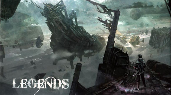
These are UI Mockups from an unpublished sci-fi video game project I worked on at Pandemic Studios in Los Angeles in the 2006-2008 period (Electronic Arts purchased Pandemic in January of 2008). The "Legends" project was intended to merge some of the conventions of "massively multiplayer online" games (MMO's) with third person, console-style shooter gameplay.
The mockups depict a variety of fast travel and quest information screens, and they were created in Visio using a combination of vector art, screenshots, and concept art. |
MEDAL OF HONOR: PACIFIC ASSAULT
|
|
UX DESIGN NOTES
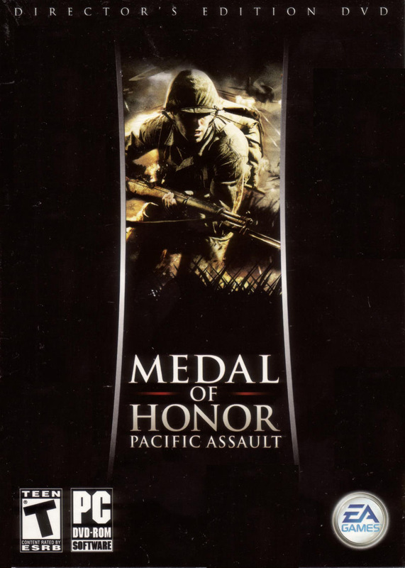
MEDAL OF HONOR- PACIFIC ASSAULT (or MOHPA) was my first project as a UX designer, more than decade ago, before people widely used the term "UX" within the video game industry. Most of the wireframes were done using Microsoft Word.
This gallery depicts the wireframe and final screen shots for player class and equipment selection during Multiplayer matches. Historical research was always a major component of working on any MEDAL OF HONOR title, so for Axis (Japanese) terminology, such as weapon names or other proper nouns, we had to check with our team of historical consultants to make sure all the details were accurate and provided an authentic feeling. |
|
|
UX PERSONA & METHODOLOGY
Our target user was a hardcore PC FPS player, who participated in fansites, played on specialty servers, or used "mods", which were various forms of user-generated content (aka UGC). This oftentimes included things like custom levels, tweaked weapons, or gameplay modes.
UX outreach methods included a private online forum where influential MEDAL OF HONOR community members could give feedback on feature requests, improvements, and requirements to the developers, and on-site Community Days where EA would fly in the fan community to play the game and meet the team. Supporting UGC, the needs of site admins, and other community-centric features requests was important to help drive awareness and early adoption. |
|
|
STREAMLINING MULTIPLAYER
MATCHMAKING While MOHPA supported traditional method for finding and creating online gameplay sessions, the product introduced a convenient "Instant Play" button that would immediately users to a gameplay session, right on the Landing Page.
Another new feature was a "Server Wizard" that would break up the sometimes overwhelming process of configuring a gameplay server into a series of step by step screens. This was inspired by "Install Wizards" that were common for many PC and desktop applications at the time. |


