Virtual & Augmented Reality Projects
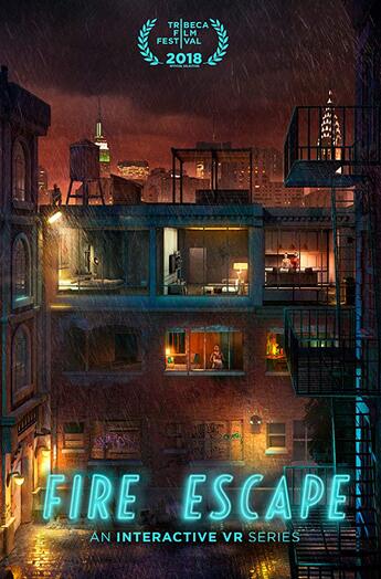
FIRE ESCAPE VR
|
Published By: Google, June 2018 (Daydream release), Ink Stories, April 2020, (PC/Steam Release)
Developed By: Inhance Digital, Ink Stories, Frima Tools and Tech: Unity, Visual Studio, C#, Perforce, Adobe Illustrator Platforms: PC/Steam, Google Daydream VR, Lenovo Daydream Mirage Services Provided:

Download Episode 1 for Free on the Google Play Store Pixel Phone + Daydream Headset Required |
ACCOLADES & SHOWCASES
FIRE ESCAPE SERIES TEASER TRAILER
PRESS TO WATCH
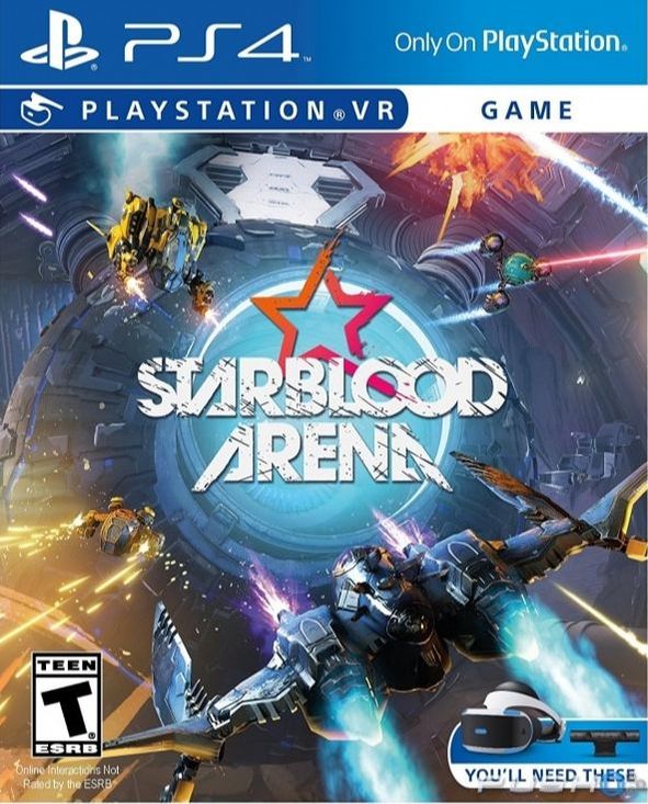
STARBLOOD ARENA |
Published By: Sony Computer Entertainment, April 2017
Developed By: WhiteMoon Dreams, Sony San Diego Studio Tools and Tech: Unreal Engine 4, Adobe Illustrator, Survey Monkey Platforms: Playstation VR Services Provided:
AMPED-UX collaborated with the team at White Moon Dreams to drive UX design and player research for this multiplayer, e-sports-focused combat game. Through mockups , research, and wireframes, we resolved critical blocking issues and improved efficiency by focusing the team's effort on modular and reusable HUD design solutions. We also generated wireframes and flows for longer-term feature development, including player progression and multiplayer lobbies, and clarified UX design strategy for critical trade shows , such as Sony's Playstation Experience (PSX) Convention.
|
COCKPIT HUD REDESIGN
GOALS - DESIGNING A REUSABLE HUD UI SOLUTION
|
A major goal for this 360 degree VR multiplayer shooter was for players to assume the roles of unique pilot avatars with larger-than-life personalities and unique flying combat ships. Each pilot was permanently paired with a ship to reinforce this relationship, and the game would convey pilots' personalities through dialogue and avatar hand animations in the unique cockpits seen in first-person VR.
|
The problem was that the team was struggling with creating a consistent UX Design across all the unique cockpits, resulting in special-case work and duplicated effort to embed UI and feedback elements in the cockpit geometry. This was causing the asset production team to struggle with UI implementation.
|
The initial recommended pivot was to separate out the HUD feedback elements from the cockpit geometry via projecting them within a circle onto the cockpit glass. This would promote visual/functional consistency for users, as well as remove a development dependency between the UI HUD development and the production of multiple detailed cockpits geometry for each unique pilot.
|
FIRST DELIVERABLES - SKETCHES AND MOCKUPS
|
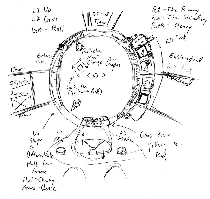
The sketch shown here was the first deliverable. The team had a well-defined idea of what the control scheme should be, as well as all the primary player mechanics and actions. The workable prototype already proved the game was fun to control and mitigated VR motion sickness issues. With this well-defined set of requirements as a foundation, I sketched out a solution based on a circular motif, partially inspired by the HUD in the old GOLDENEYE 007 first-person shooter classic for Nintendo 64.
Spec documents, conversations, screengrabs, and playtests provided by the client's in-house game design and production teams informed this initial sketch. Other UI elements were informed by drawing on prior experiences spearheading UX design for multiplayer HUDs in MEDAL OF HONOR and LOST PLANET 3.
When thinking about how to organize visual information for VR, high priority information, such as shield and ammunition quantities, targeting reticles, and missile lock-on warnings, would be closest to the center of the circle.
Secondary, lower-priority information, such as timers, objectives, or other player status feeds (such as kills, scoreboards, or objectives) would be pushed out into the user's peripheral vision. |
|
ILLUSTRATOR PAINTOVERS & NEW IMPLEMENTATION
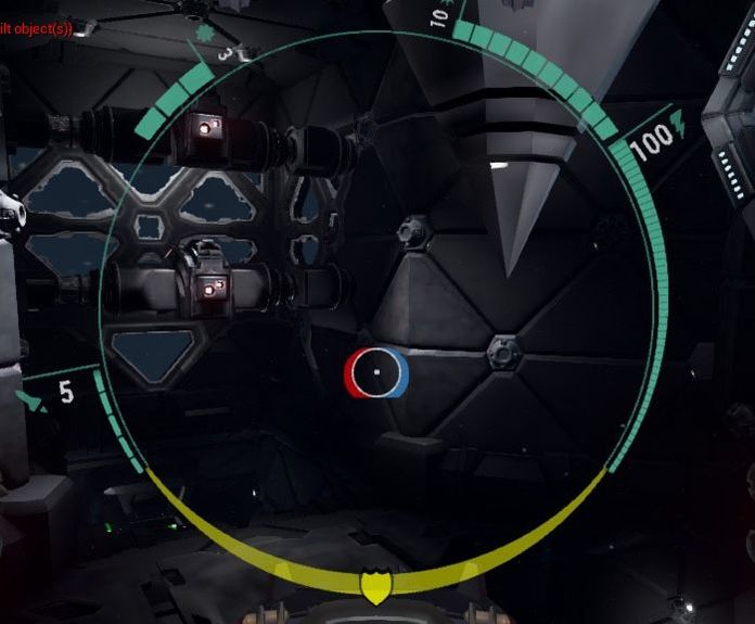
Once the team approved the sketch and suggestion to move the UI elements out of the cockpit geometry and onto the glass, we started developing "paint-overs" in Illustrator to clean up and iterate on concepts presented in the initial pencil sketch.
The guiding priciple was to divide a radial grid/guide up into thirds, with shield UI feedback elements on the bottom third, with weapons on the left and right thirds (to match mappings of weapon types to the left and right sets of triggers on the Playstation controller. edAfter a couple of rounds of iteration, the final asset was delivered as a Photoshop file and exported as PNG's. The internal team imported these into Unreal 4 and implement the redesigned HUD using the Unreal Motion Graph (UMG) framework.
|
|
MINES & HEAVY WEAPON UI DESIGN COMPS
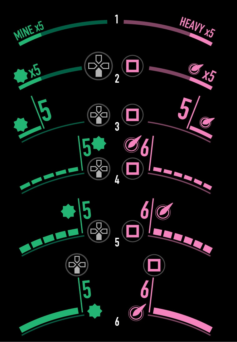
This image illustrates the process of zeroing in on potential HUD UI element designs leveraging iconography, color, text, numbers, status bars, and button image signifiers so players understand what physical button presses do.
These six comps illustrate mines in green on the left (activated by pressing DPad down on the Playstation controller) or Heavy Weapons in pink on the right (activated by pressing the pink Square button). The intent with these comps was to provide the client with explorations of UI element compositions and granularity of feedback for status bars, using both continuous and "dashed" status bars to represent quantities of user resources (in this case, the number of mines or heavy weapons the user has at a given moment).
|
USER CUSTOMIZATION & PROGRESSION UX DESIGN
|
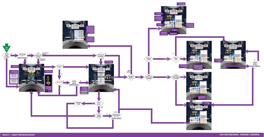
This UX Design artifact illustrates how a user would go through the process of configuring and purchasing upgrade and customization options for their pilots and their ships.
These mockups were created, reviewed, and iterated upon to convey how users would experience longer-term progression & gamification loops, which would keep users engaged by offering them purchasable or unlockable rewards for leveling up or for continued play.
|
|
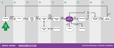
PSX DEMO FLOW UX DESIGN
|
These chart illustrates the process of designing a specific goal oriented user experience, in this case, the flow of a STARBLOOD ARENA player at Sony's Playstation Experience (PSX). User functions include:
|
The first step in the process of designing the UX for the PSX demo was creating the Flow Chart, which outlined in broad strokes the features that the team would implement and support for the show. This approach also allowed the client to see how many steps or interactions various navigations might entail.
Once the broad strokes in the High-Level UX Flow were agreed to and approved, the Mockup flow was created in Illustrator. This would combine existing screengrabs, images, fragments of mockups from pre-existing flows, and flow logic to define a foundational blueprint for the development team to work from.
Once the broad strokes in the High-Level UX Flow were agreed to and approved, the Mockup flow was created in Illustrator. This would combine existing screengrabs, images, fragments of mockups from pre-existing flows, and flow logic to define a foundational blueprint for the development team to work from.
STARBLOOD ARENA FEATURES TRAILER
|
Here's a more recent trailer for STARBLOOD ARENA, showing off the circular HUD elements.
|
PRESS TO WATCH |
|
Looking for VR UX design help? Subscribe to our Mailing List and get your FREE Minimal Viable UX PDF!
Or...
|
RAISING A RUKUS
|
Published By: The Virtual Reality Company, June 2017
Developed By: The Third Floor, Grue Games Tools and Tech: Unity3D, Sketch, Adobe Illustrator Platforms: Samsung Gear VR Services Provided:
|
WORLD WAR TOONS - COMING SOON !
DREAM VR HOMES - GEAR VR ARCHITECTURAL WALKTHROUGH - COMING SOON !
AUGMENTED REALITY IOS APP |
CREATED USING: Adobe Illustrator, InDesign
|
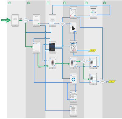
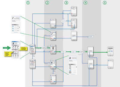
These diagrams are from a project I worked on briefly in late 2014 to propose an overall UX design for desired functionality for a Augmented Reality (AR) mobile app that featured in-app purchasing (IAP). With this hybrid "mockup-flow" approach , I used numbered columns to indicate how deep or how many interactions "in" a given screen or feature is. The features and conventions of this diagramming approach offer both the development team and the client a number of benefits:
- You can see, at a glance, what features were the most immediately and conveniently accessible to end-users (left most columns)
- You can see features that are more complex or de-prioritized placed deeper in the UX to the right side columns.
- You can follow through each step and interaction, screen-by-screen, to understand the moment-to-moment user experience, using the decision logic gates (diamonds) to understand how users are guided to different features within the app's UX.
- The thicker green line highlights the "primary flow" or "critical path," representing the series of interactions that most users are expected to make or experience.
- Pop-outs" illustrate the complete scroll for certain screens that have more content "below the fold" of the mobile app frame.
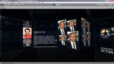
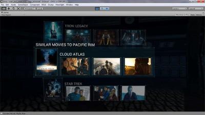
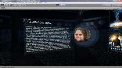
MGo ADVANCED - VIRTUAL REALITY (VR) THEATERThis project is best described as a "VR DVD Menu." Using an Oculus Rift or Samsung Gear VR headset, users can explore virtual, holographic movie theater where they can pause a 3D movie and look to the sides to interact with supplemental information panels depicting actor and director bios, or similar movies. This role involved some layout of 3D UI elements in Unity3D using the NGUI plug-in, as well as collaborating with another programmer (in the earlier phases of the project) on some C# interactive UI programming and to pull image assets from a JSON-based back-end.
|
Developed By: BackCode, LLC
Tools and Tech: Unity3D, NGUI, Sourcetree (Git) Platforms: Samsung Gear VR, Oculus Rift |
