UX Design for Video Games is tricky business. Typically, “friction” in UX design represents obstacles between what users want to do with your software, versus what the user interface permits them to do. For most software development projects, friction is bad and should be removed. For video game UX design, you need the right amount of “good” friction to provide challenging obstacles so players feel satisfaction from victory or from figuring things out (here’s a neat article from UX Magazine that goes into more detail on this).
| "Once you take off the powerful nostalgia goggles, UX design flaws emerge...The systems seem designed for smaller numbers of objects...Once developers inflated the inventory...cracks in the UX design start to show..." | Recently, I purchased and completed TRANSFORMERS: DEVASTATION (TF:D), a new character action video game developed by Japanese action game developer Platinum Games and published by Los Angeles-based publisher, Activision. It’s an incredibly fluid yet carefully crafted love letter to the iconic 80’s cartoon era of the franchise, complete with the same voice actors, musicians from the 1986 movie, and subtle nods and references. Once you take off the powerful nostalgia goggles, UX design flaws emerge with the weapon fusion, inventory, and crafting systems. These underlying systems provide a surprising amount of depth and tools for customization. Using these systems to overcome the obstacles of the game (which provides “good” friction) can feel awesome and satisfying. On the other hand, the inventory and crafting systems seem designed for smaller numbers of objects at a time. Once the developers inflated the inventory with tons of randomized weapon loot, cracks in the UX design start to show, resulting in clunky, “bad friction” user experiences, such as fussing around with menus and busywork. This puts a real drag on the pacing. In the first part of this article we’ll analyze what’s not working with TF:D’s user experience and discuss specific UX design improvements for Activision and Platinum to consider for future projects. |
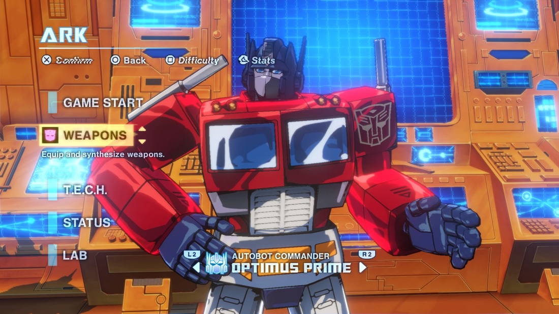
IMPROVE PACING OF ONBOARDING & TUTORIALS FOR THE ARKIn between missions, players return to an in-game base called “The Ark.” It’s here where players can fuse or “synthesize” weapons to create more powerful ones, develop “T.E.C.H” upgrades, and configure gear for the five Autobot heroes. While the first level does a decent enough job of teaching the moment-to-moment gameplay systems and rules, once you get to the Ark, the game dumps several major systems on you at once, and all the handholding goes out the window. A better option would be to temporarily disable some of the systems, then “breadcrumb” or introduce them one-by-one as missions progress with some brief, targeted feedback on how it works or why it’s useful. This reduces the number of new things players need get used to at a time, reducing the potential for overwhelming stress and confusion. |
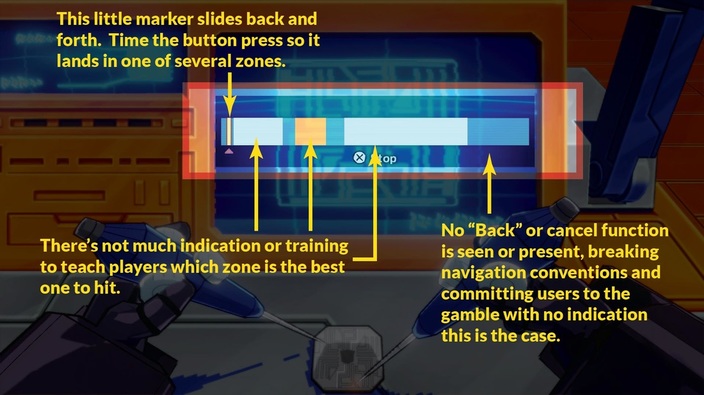
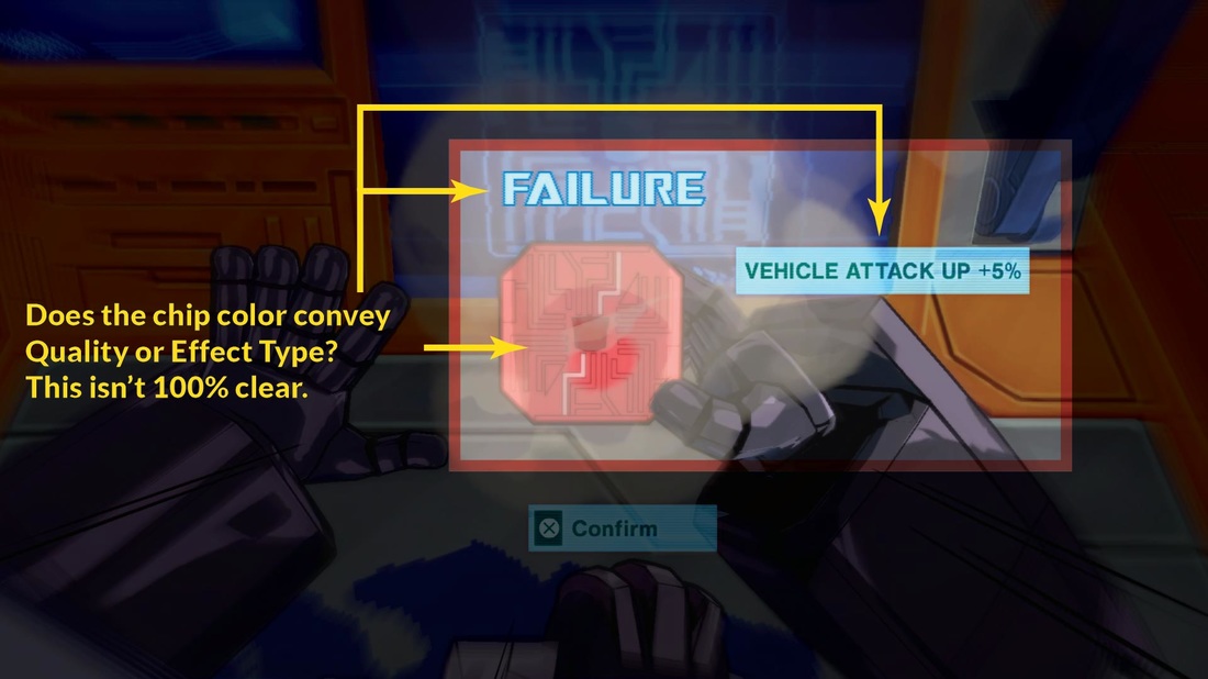
T.E.C.H. SYSTEM UX DESIGN IMPROVEMENTS"Changing the mapping of buttons and functions ... with no visual feedback or prior warning feels like the game is pulling the rug out from under the user." | The "T.E.C.H.” system allows players to invest money into a little timed button input mini-game to develop computer chips to install in the various Autobot heroes. The different “zones” aren’t fully explained the first time you develop a chip, and I put in almost 20 hours into the game before it dawned on me that the look of the T.E.C.H. icons indicates the amount of money you gambled on the chip. This wouldn’t be an issue if not for the fact that the timing-based nature of the mini-game permits you to fail, resulting in low-quality chips with defects. When equipping and selling chips, there’s no immediately obvious visual feedback on the quality of the chip, even though this information is now more relevant than the amount of money you initially gambled on it. Also, once you pick a tier to invest money in, if you decide to change your mind, you can’t back out of the mini-game (by pressing Circle on the PS4 controller which is the standard mapping for cancel). Changing the mapping of buttons and functions like that with no visual feedback or prior warning feels like the game is pulling the rug out from under the user, so the minigame should let you back out of it (as it does with every other screen in virtually every other game) |
Use Consistent Color Coding Across Weapons and T.E.C.H.
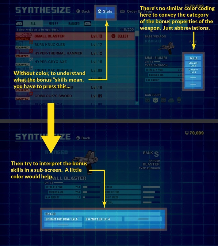
| One of the things I do like about the T.E.C.H. system is that it uses color-coding to categorize some of the perks (Red chips, for example, are attack-oriented). It’s not perfect, however. When creating the chips, the game doesn’t explain that “red equals attack.” In fact, during the mini-game, it’s possible that users may equate colors as a reflection of chip quality, which would be a false association. Also, the game uses both Green and Yellow under the “Support” category (for things like getting bonus experience or money). They don’t explain what yellow means versus green, but even these lapses aren’t the main issue. The issue is that the weapons that you find during gameplay also have most of the same benefits. Because both systems confer almost identical bonuses, the color-coding scheme could be applied equally, but the game only uses color coding for the T.E.C.H. chips. | Instead, they expect you to dig through sub-menus to uncover what the abbreviated bonuses on weapons mean. A more unifying use of color-coding across screens (such as a little tab, line, or splash) and providing feedback to guide color associations would improve usability. |
PROMOTE CONSISTENT BUTTON PROMPTS
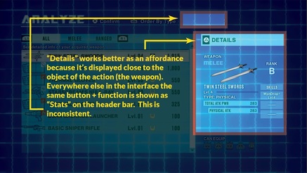
| This is more of global issue then something that is confined any one part of the UX, but many button prompts exhibit consistency issues in presence, position, and terminology. Players switch Autobots in the Ark by pressing the lower shoulder buttons on Playstation 4 controller (“L2” and “R2”). This visual affordance migrates from screen-to-screen, nor is it available in some of the sub-screens, even though it might make sense or aid navigation. Also, when examining a weapon’s characteristics with the Triangle button, on one screen, it describes this function as “Details” and the prompt is in a good position relative to the weapons panel. However, on most screens, the same function is described as “Stats” and is displayed elsewhere. Sometimes it’s really difficult to promote rigor and consistency throughout a UX Design (especially under tight, high pressure development deadlines), but minor deviations like this increase users’ cognitive load and add to perceptions of the UX being rushed and unpolished. |
STREAMLINE RARITY OUT OF THE UX DESIGN
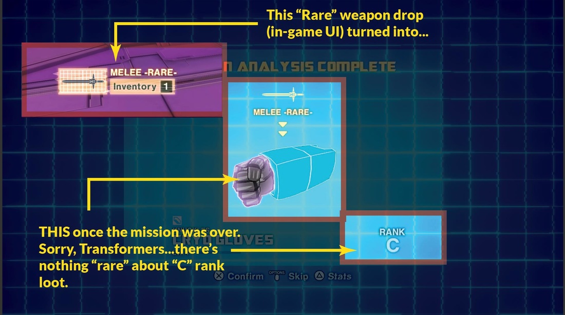
| During missions, the game provides basic feedback on a found weapon’s Rarity (Common, Uncommon, and Rare). Once you return to the Ark to identify your weapons, the whole notion of Rarity becomes meaningless as the game assigns every weapon a Rank (D, C, B, A, S, SS). Often, you can get a Rare weapon, only to uncover that it’s a low-rank (ie - low power) weapon. This creates dissonance between the expectations (“I got a Rare...I bet it’ll be good!”) and the outcome, (“WTF - why do I need another D weapon?”) There’s already a direct correlation between high Rank items being much rarer than low-rank ones, but with only three tiers of rarity with little to no functional significance, the whole concept of rarity could be streamlined out of the design with negligible negative impact to the user. |
REVAMP THE POST-MISSION REWARD SEQUENCE
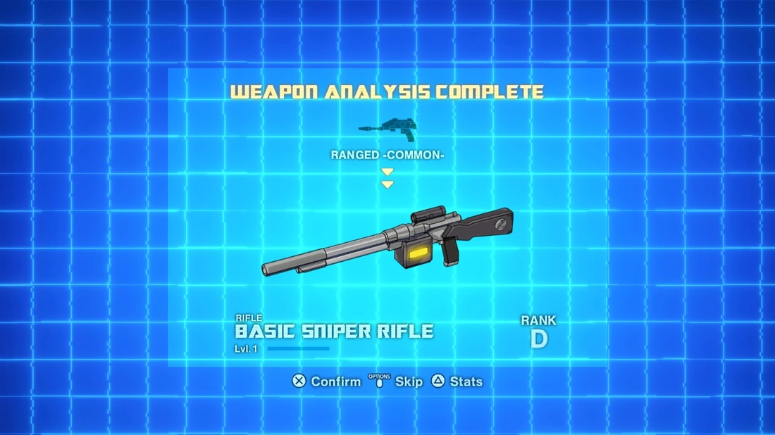
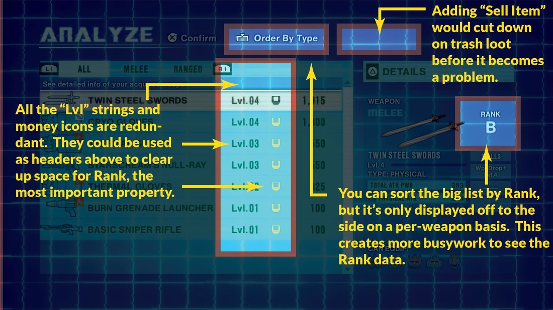
| Upon returning to the Ark, players are inundated with a flood-like sequence of all the weapons they’ve found. While there’s kind of a fun, anticipatory “unwrapping the presents” quality to this sequence, after the first few times, you realize that most of it is C-D Rank trash loot and just mash the button to get through it. Fortunately a "Skip" option will take you to an "Analyze" summary which provides a better at-a-glance view, but even this screen has problems. You can sort by Level, Rank, and Type, but only Level and Value is in the summary list. In fact, there's a whole column that could be used for Rank, but instead it's used for a money icon. These icons and the multiple "Lvl" text strings are redundant; they would be better used as table headers, clearing out space to display Ranks to match the available sorting fucnction. Better yet, this screen could allow players to immediately sell weapons to nip inventory clutter problems in the bud. Losing the overly long presentation, taking users right to the summary, and making these improvements would go a long way to cut down on bad friction. Are there any TF:D fans out there who feel differently? Is this too nitpicky, and should hardcore players just suck it up? What did I miss, or what do you think? Contribute to the discussion by leaving a comment below, and stay tuned for Part Two, where I'll present more UX Design improvements for TRANSFORMERS: DEVASTATION. |

 RSS Feed
