Originally published on theToptal Design Blog and edited by the Toptal editorial team.
Adobe XD’s component system empowers designers with powerful features to prototype digital products. However, it’s not without quirks and needs special care. Utilizing smart shortcuts and following best practices will enable designers to streamline their XD prototyping workflows.
Since its official public rollout in late 2017, Adobe XD has made great strides towards becoming a highly competitive wireframing and prototyping tool for UX designers. In particular, its new component system expands the type of interactions with which designers can experiment. Still, components are not without quirks and drawbacks. When working with XD components it’s helpful to adopt a set of workflow practices to avoid busywork and harness the system’s full potential.
Since its official public rollout in late 2017, Adobe XD has made great strides towards becoming a highly competitive wireframing and prototyping tool for UX designers. In particular, its new component system expands the type of interactions with which designers can experiment. Still, components are not without quirks and drawbacks. When working with XD components it’s helpful to adopt a set of workflow practices to avoid busywork and harness the system’s full potential.

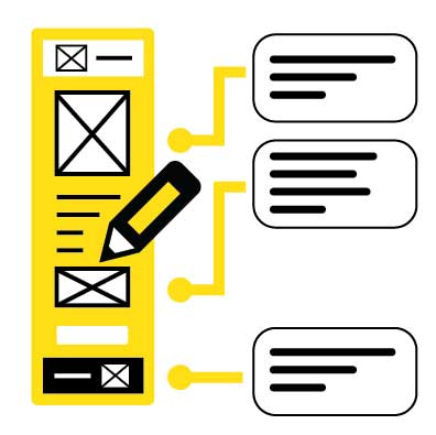
The addition of Components expands Adobe XD’s prototyping capabilities.
Familiarity with Adobe XD Is Recommended
Designers with a fair degree of familiarity with Adobe XD will gain the most benefit from the following tips and suggestions. To get a head start, download the Adobe XD Design Kit from Google’s Material Design home page. The kit will provide an Adobe XD component set to experiment with and deconstruct.
Tip #1- Consider all States Before Creating a Component
When creating a component with states for the first time, designers should understand how potential changes to a component may affect other instances. To illustrate, let’s consider a dropdown menu with several states:
- The default state: the menu is collapsed
- A hover state: the outline color might change when the cursor is over it
- An expanded, clicked state: the dropdown menu options are shown
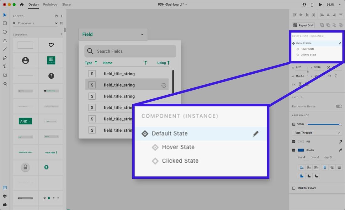
Creation, naming, and selection of component states in the Sidebar.
When editing the default state of a child instance of a dropdown, those changes will not propagate to the hover or clicked states. Changes must be made to the default state in the Main Component to update the hover or clicked states of all instances.
While it can be tempting to jump in and start iterating on Main Components, sometimes unexpected issues happen due to the differences in how parent and child components behave.
A good practice is to consider and anticipate everything needed in the Main Component’s default state before adding other states or instantiating the component—even going as far as laying out the different states side by side.
Designers should also bear in mind that they can add and change elements in non-default states of the Main Component or child instances without affecting the default state, but the reverse isn’t true.
A recommendation for Adobe: Give component states a lock feature so designers can keep non-default states intact and prevent changes to the Main Component’s default state from propagating.
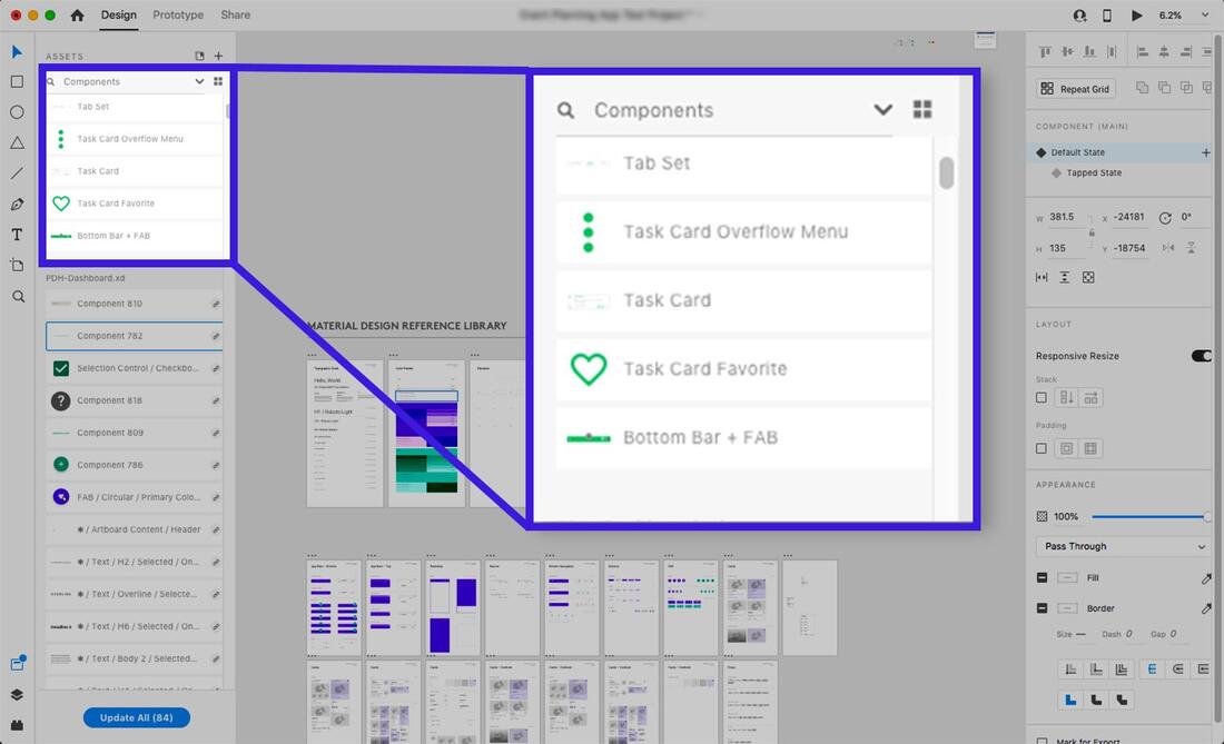
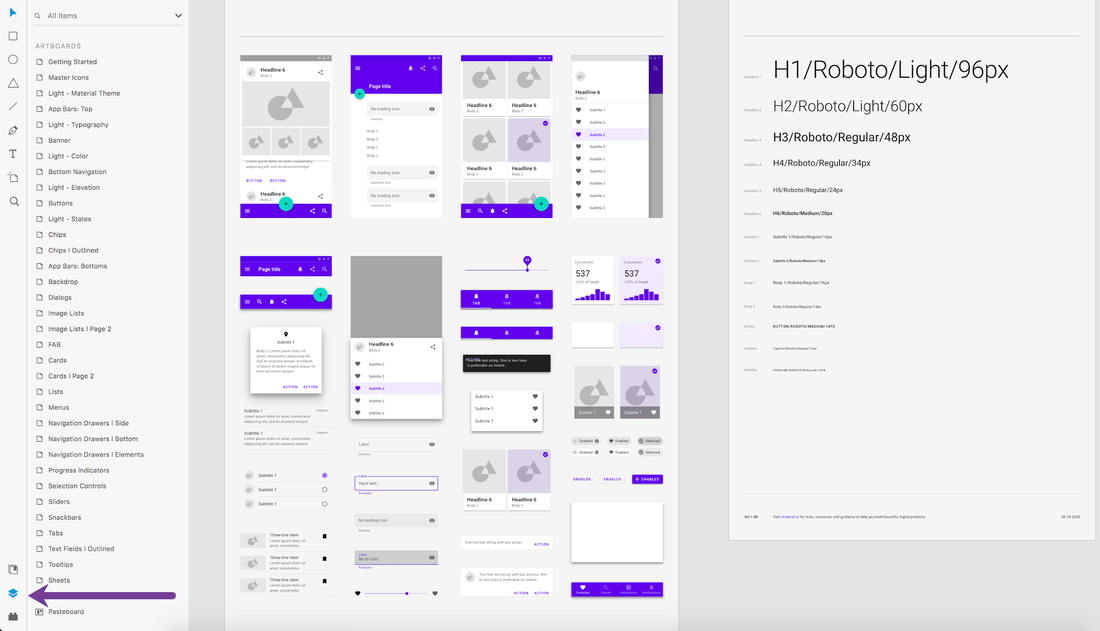
Components can be inspected in detail in the Assets panel.
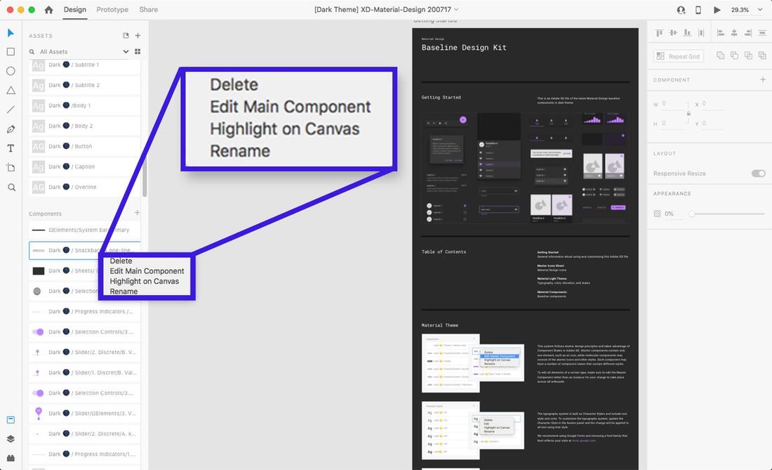
Tip #2- Name Components on Creation
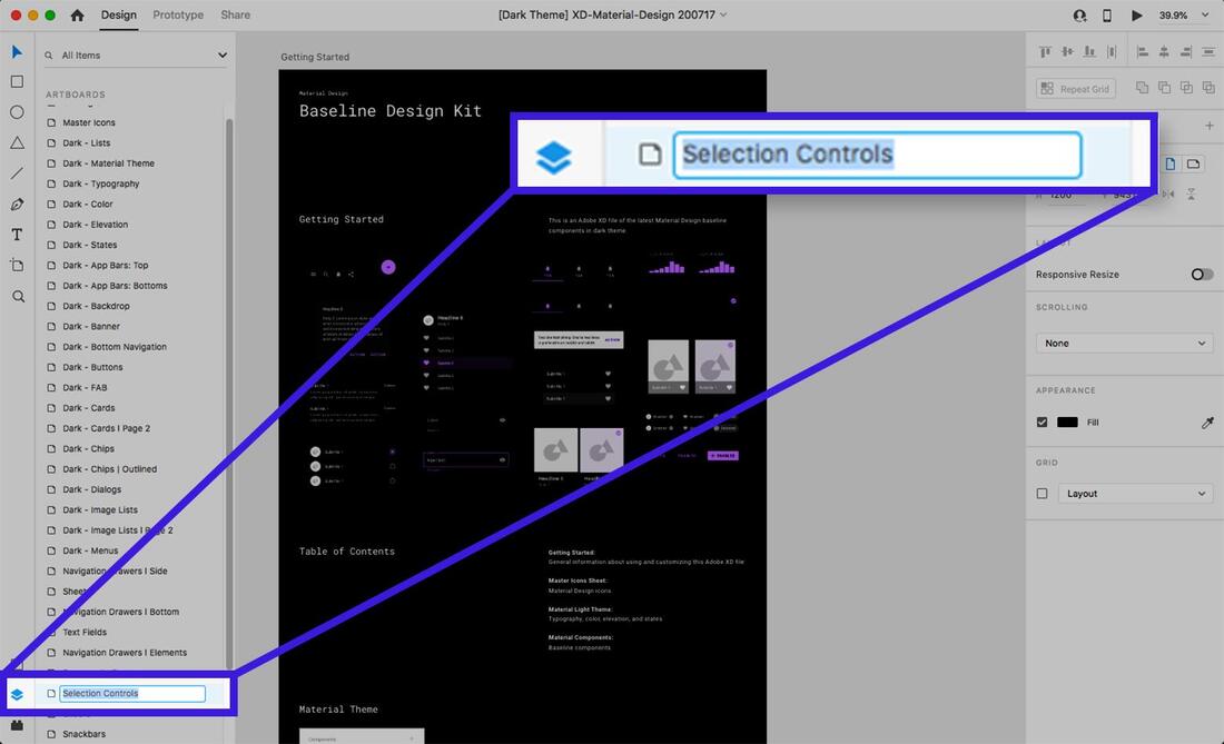
Creating a component (right-click an element, then select “Make Component” in the menu, or press Cmd-K on Mac/Ctrl-K on PC) adds the component to the Assets panel in the left sidebar. XD will give the component a default name of “Component XX” (where “XX” is a number). It isn’t very descriptive, so it would be best to give it a unique, searchable name.
Why do it? As the components list fills up, it will become unwieldy if components all begin with the same default name and a meaningless number. While the “tile view” option helps, it has no text labels, making visual identification slow and challenging. The “list view” with small thumbnails also makes it hard to identify differences between components with indecipherable names. Components can and will get lost. Making them searchable by naming them will save time later.
A recommendation for Adobe: When creating a component, auto-select it and focus the user on the Assets->Components panel to rename it or bring up a naming pop-up. It would also be helpful to make it possible to toggle this feature in Preferences.
XD components can be organized and renamed in the Assets panel.
Tip #3- Keep Main Components Organized
When creating a component, it’s easy to place the Main Component on an artboard by accident. While XD provides tools to find Main Components (either by searching the Assets panel or right-clicking and selecting “Edit Main Component” from a child instance), it’s all too easy to make unintended changes to the Main Component while believing it’s an instance. Doing so may lead to many undesired changes across multiple artboards.
Even if there are only a handful of component instances on an artboard, things can quickly get out of hand once an artboard is cloned. An inadvertent change to the Main Component can add up to cleanup time that could have been avoided.
It’s best to get into the habit of moving Main Components away from design artboards immediately upon creation. An ideal way to do this would be to place Main Components on the pasteboard in the XD file or on clearly labeled, dedicated Artboards. Doing so will make things more efficient later.
A recommendation for Adobe: Consider a prompt when making changes to the Main Component so designers are warned that the changes might propagate to child instances.
Naming layers carefully is vital as using Auto-Animate transitions are heavily dependent on it.
Tip #4- Stay Organized with the Layers Panel
It’s easy to try out ideas on the artboard and get in the flow of grouping/ungrouping components and changing component states’ properties. There might be a strong temptation to minimize the left sidebar to have more working space. However, there’s a good chance that component states and transitions won’t behave as expected in the flurry of iteration. This may occur because the organization and grouping of sub-elements (such as shapes, vectors, or text) have drifted away from what they needed to be for the transitions to work correctly.
The Layer view provides 100% transparency into the hierarchy and naming of elements, and its airtight organization is vital. Using XD’s powerful Auto-Animate transition between states requires elements to have the same name and position in a component’s layer hierarchy. Otherwise, the transition will default to a fade instead of an appealing Auto-Animation.
At times, it may be desirable to suppress a property from interpolation when Auto-Animating transitions. To achieve this, designers can rename an element in a different component state or artboard to break the name-based link.
In either case, the Layers view can be used to troubleshoot when unexpected problems arise. It should be the first step when debugging prototyping issues, whether it’s a transition between component states or between artboards.
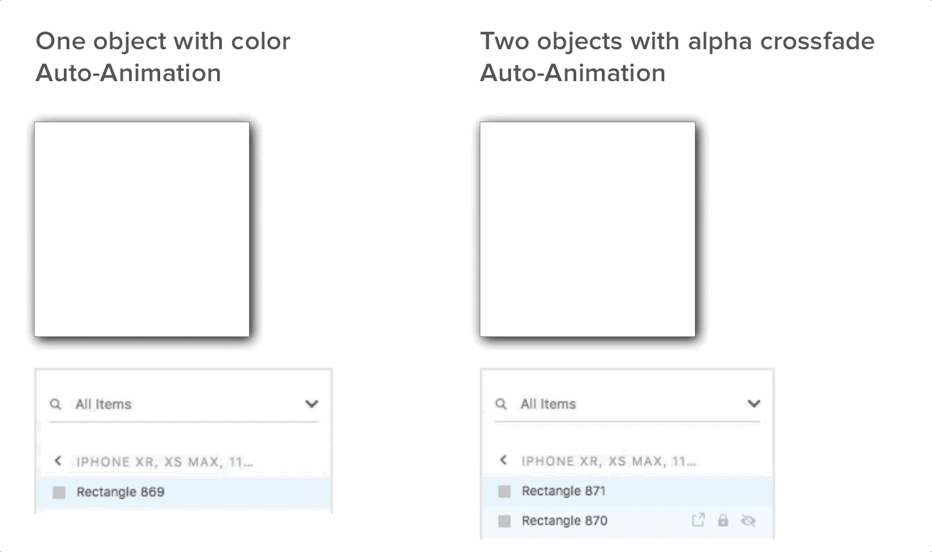
How to crossfade colors correctly using Auto-Animation in XD.
Tip #5- Use Alpha Fading to Interpolate Colors
Auto-Animate is an excellent addition to XD but comes with limitations and idiosyncrasies. One of these quirks becomes apparent when changing an element’s color between two component states or artboards using Auto-Animate. Instead of a smooth interpolation between the two colors, it changes abruptly when tested.
The current workaround is slightly awkward and has ramifications for how Main Component states should be organized. It involves adding two objects with different colors instead of one and then crossfading the alphas on the two objects in both states to achieve a smooth transition. The default fade transition may work, but if interpolating shapes and sizes with Auto-Animate, a fade may not suffice.
Tip #6- Leverage Components in a Repeat Grid
The Repeat Grid is another excellent timesaving feature in XD that makes it easy to organize and maintain arrays of similar elements. Like components, Repeat Grids have a hierarchical relationship where the first element in the grid’s top left corner is the “parent” that defines properties for the “child” elements. (There are exceptions to this: bitmaps can be unique for a child element, as can text strings, but not text properties.)
However, when using components within Repeat Grids, things change.
When working with Repeat Grids normally, changes made to the parent propagate to its children immediately. However, Main Component changes only propagate to the children in a Repeat Grid if there are no local property overrides. In other words, changing a component’s property in the grid “locks” it from changes propagating from the Main Component.
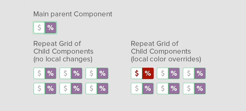
A local color property is locked within a child instance component in a Repeat Grid, but not the size.
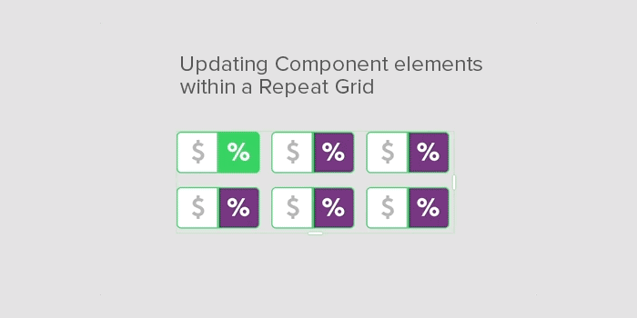
To propagate changes from a parent that is also a component in a Repeat Grid, resize the grid down to the parent only. This removes its children. Then, drag the handles back out to the desired dimensions to update the children.
Once designers can work around the peculiarities of components and Repeat Grids, combining them can be powerful.
Tip #7 – Assume Time-based Component State Transitions Don’t Exist (For Now)
When applying transitions between artboards using time-based delays (not based on input), it’s natural to assume that the same is available between component states. Unfortunately, this is not the case. All component-based state changes have to be based on user input or interactions in prototype mode, not time.
A recommendation for Adobe: Add a time-based transition option to components so their states can animate independently of user input.
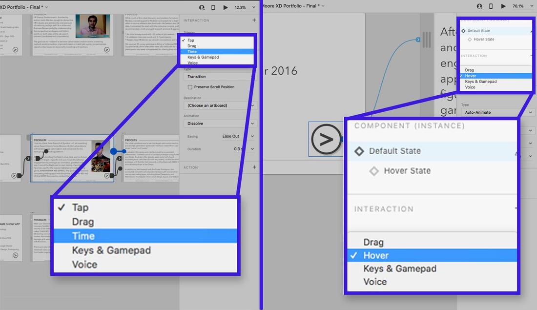
Time-based transitions exist only between artboards, not between component states.
Tip #8 – Be Thorough when Cloning Main Component Hierarchies
This last tip is more of an edge-case that XD designers may not often encounter but should be aware of.
Let’s assume a scenario where the Main Component needs a variation that still retains the “one-to-many” quality of children inheriting properties but doesn’t affect any existing child components. To create a new parent component hierarchy, an instanced component must be ungrouped and rebuilt from scratch. Ungrouping components will also lose all the states and transition properties set up in Prototype mode. Here’s a workaround:
- Clone an instance of the component for each state in the component.
- Set each instance’s state to a different state.
- Go through and ungroup each component instance.
- Start making desired tweaks and changes to each component instance.
- Recreate the new Main Component.
- Go into prototype mode and recreate the interactions and transition types that were set up before.
Prototyping with Adobe XD Components: Takeaways for Success
Adobe XD has made significant improvements in functionality and utility in the past few years. It has grown into a worthy, competitive alternative to Sketch and other established prototyping tools. Based on how the tool has evolved since its debut, many more improvements are likely on the way.
In particular, the Adobe XD component system has excellent potential to improve and expand upon the types of interactions designers can create.
Here are some key takeaways to keep in mind:
- Understand how changes propagate between Main Components and child instances.
- Be aware of how components interact with Adobe XD’s other features, such as Auto-Animate and the Repeat Grid.
- Strive to adopt consistent workflow practices to save time, such as naming components and maintaining a separate Main Component pasteboard area in the XD file.


 RSS Feed
