Amped-UX
  • Welcome
  • About
    • Endorsements
  • Portfolio
    • HD Game UX Design >
      • Star Wars: Jedi Fallen Order
      • Battlefield V
      • Lost Planet 3
      • Sonic Boom: Rise of Lyric
    • VR & AR UX Design >
      • Starblood Arena
      • World War Toons
      • Fire Escape
    • Web & Mobile UX Design >
      • Precision Digital Health
      • Stacks! Live Streaming Game Show App
      • Smart Events Mobile App
      • Vyndica Mobile Trading App
  • Media
  • Blog

THE AMPED-UX BLOG

THOUGHTS ON UX DESIGN, GAMIFICATION, & VR/AR in LOS ANGELES

MINIMAL  VIABLE  USER  EXPERIENCE:  UX  FOR  START-UPS  (PART  TWO)

5/30/2016

Comments

 
Welcome back to Part Two of Amped-UX’s “Minimal Viable User Experience - UX for Start-ups” series.  In the last part of this series, we described a high level overview of what User Experience is and talked about the importance of several concepts and "flavors" of UX, such as Usability, User Research, and Content Strategy.   For this installment we’re going to take a look at the practices of Information Architecture, UX Design, and UX Prototyping.

WHAT  IS  INFORMATION  ARCHITECTURE?

Picture
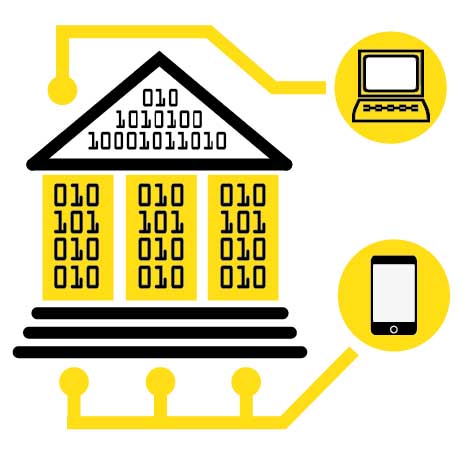
When a big building is made of bits and bytes, there's often more than one UX design that flows through it, and they don't serve the same end users.
Information architecture (IA) is a fancy word for the process of designing multiple end-user experiences or "environments" that are all intended to share or access a similar base of information.  At its core it is the process of tackling a big complex problem (consisting of all the data, requirements, and features that a product or platform needs to support) and organizing a plan to distill it into smaller, more discrete, and more manageable chunks.  Each of these chunks may be  focused on the needs of multiple yet dissimilar end-users who all need access to the same source of information.
 Sounds important, doesn’t it?  It sure is!  Truth be told, I dislike the term "IA" as good UX is about promoting clarity and reducing confusion, so it’s ironic that this term is less immediately obvious than others, but it's arguably the most complex part of UX.  A helpful metaphor I picked up is that information architecture is the design of a holistic structure of a building, like a museum, including the public galleries as well as all the wiring, lighting, plumbing, security, and AC system.   One user's experience may entail following one path through the front-door of this metaphorical museum where they see the latest public exhibits, but much of the underlying complexity remains hidden.   Another user experience defines how an electrician or plumber accesses and interacts with the museum, which entails both more "under-the-hood" information and complexity that offers a  completely different experience from what   public users see.
 IA, then, is a form of research, but unlike content strategy and user research which focuses on the needs and behaviors of external customers and how best to reach them, IA focuses more on the technical needs and constraints  of internal resources with a greater emphasis on information technology and engineering.   An information architect not only needs to think about the needs of multiple end-user needs as uncovered by user research, but they have to balance those against internal needs and resource/technical constraints  when making important architecture decisions ​.

Why  is  Information  Architecture  Important?

Coding is hard, mentally taxing work.  Software projects don’t have unlimited funds, good programmers are expensive, and development almost always takes longer than you expect.  If you have bad IA or are lacking in it, then like a house built with no plans, you risk building something that lacks durability, cohesion, or structure.  As your startup operation grows and you add weight and pressure to this house beyond what it was designed to handle, it will start to strain under the pressure.  This manifests itself as confusing UX, friction, or unmet end-user needs.  It may lead your engineers to implement band-aid fixes or temporary work-arounds, when what is really needed is to start from scratch and architect a new, robust solution to handle more complex needs.
"If you have bad IA ... you risk building something that lacks durability, cohesion, or structure ... This manifests itself as confusing, poor UX, friction, and unmet end-user needs ...What is really needed is to start from scratch and architect a new, robust solution to handle more complex needs."
Also, if insufficient time is spent on information architecture, you may find that you’ve overlooked critical tools or that other end-users on your team or your client needs to do their job effectively.   For example, a content marketing team for a big e-commerce site might need a web-based CMS tool to upload photos and videos onto your site to promote new item releases or promotions, while your customer service end-users need back-end tools to track and document complaints or associate them with specific orders.  Good information architecture boils all these requirements and data into the simpler, more actionable plans, anticipates as many of the unexpected use-cases and exceptions as possible so that a large-scale software can deliver holistic value to all your end-users most efficiently.

When  Should  I  Use  Information  Architecture?

Picture
Not every startup needs an Information Architect, but if you do, use IA early. Under certain circumstances you may have to wind it back up post-launch to support different end-user types as your startup grows.
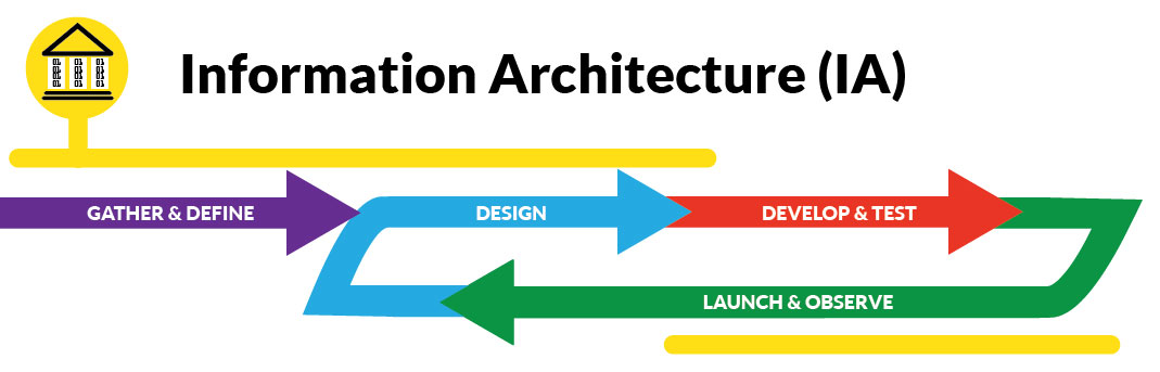
The short answer is that it depends! There is a natural overlap between UX Designers and Information Architects, as both roles entail asking effective questions to uncover  end-user needs, internal constraints, and making decisions based on those findings. Some projects are sufficiently simple that hiring an official, formal Information Architect separate from a UX Designer may not be necessary (for example, a simple mobile game).  Other projects have massive amounts of information to sift through, such as websites that can be accessed from mobile or desktop in multiple languages, and have teams or other departments that are not customer-facing.   If your project is likely to have a large team of engineers or multiple end-user personas to support, or large distributed teams and departments, then Information Architecture is likely to be something you’ll need to front-load as much as possible before any major coding or development efforts begin.  It should also occur in parallel with User Research and Content Strategy and should precede or run in parallel with UX Design.  
If you'd like to learn more about some more in-depth Information Architecture books and resources for further review, check out this helpful  article from UX Matters.

What  is  User  Experience  Design?

Picture
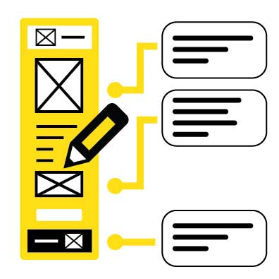
UX Design is the process of taking the all the requirements, features, and constraints informed by other UX practices and starting the official process of organizing information, and features into a form that defines the moment-to-moment experience of moving through your software. This can take the form of rudimentary sketches, flowcharts, screen mockups, and diagrams called wireframes.  The purpose of these materials is to detail step-by-step how the software guides users to experience and interact with functions and information, and how all the pieces of the UX puzzle start to fit together.  Sometimes these diagrams can be large and intricate, other times interactions are chopped up into smaller flows.  Often it’s necessary to annotate UX Design materials with notes that may convey additional details or information for developers.  This can be especially important if the team is distributed or the UX Designer may not be immediately accessible to relevant stakeholders.  While there’s plenty of dedicated tools out there for creating UX Design materials, some also believe that good old-fashioned pencils and paper can be best.

WHY  IS  USER  EXPERIENCE  DESIGN  IMPORTANT

For the other user experience practices, usability is of general, but not necessarily primary importance.  For example, a User Researcher gathers quantitative and qualitative data from users, or produces analysis documentation or persona sheets, but they’re not creating usability just yet.  The same applies to an Information Architect: they may have to understand both internal and external needs and constraints and come up with a high-level plan showing how to organize all the relevant information systems in an abstract sense.   While they don’t want to propose solutions that are unusable, they are not directly responsible for producing usability on a tactical, moment-to-moment level.  
"UX Design materials can outline a holistic, detailed, and comprehensive blueprint for a product, but it’s useless unless it’s used to spark conversation and to build consensus amongst stakeholders, so that other developers down the line ... can understand what it is that they are expected to create. "
However, this is not the case for the User Experience designer.   The Designer has to take all of the findings from the User Research, think about the Information Architecture requirements (if the project is complex), how the Content Strategy will position the product, and start producing screen layouts and flows in an organized way that is intuitive and promotes usability.  In my experience, UX Design materials can outline a holistic, detailed, and comprehensive blueprint for a product, but it’s useless unless it’s used to spark conversation and to build consensus amongst stakeholders.  This helps other developers down the line, such as Visual/Interaction Designers and programmers, understand what they are expected to create.  Thus, UX Design provides the foundation from which later phases of development stand upon.  
While some UX wireframes and flows do closely resemble what your final software looks like, they are still just assumptions, and there are lots of twists and turns on the path to development.  Also note that UX Design materials can support ongoing user research and usability testing.  UX Designers are just as liable to make incorrect assumptions about what’s best for users, so if you can add this to your process, especially for uncertain or contentious aspects of your UX design materials, it can help validate that your project is staying on-course, saving time and money.  

When  Should  I  Use  User  Experience  Design?

Picture
UX Design is most effective after some initial end-user research is done and tends to taper off as development proceeds and features get made (assuming things go smoothly)
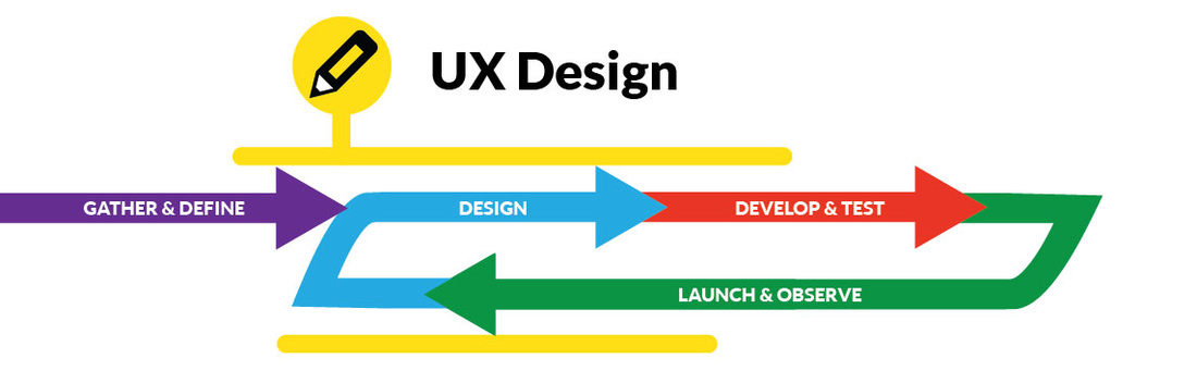
In general, UX Design should always run ahead of functional development or programming, but ideally should take place after some inital end-user research has been done (and information architecture, if it's needed).  However, you may encounter a school of thought that wireframes should be as quick as possible, or even something that you skip over.  You may hear about “designing in the browser,” this refers to skipping over creating traditional UX Design going straight into implementation using HTML, CSS, or Javascript.   I think it's important to make a distinction that this doesn't mean that you skip over UX Design, it's just that it takes a different form.
​For example, I love getting caught up in the creative momentum of clarifying a strategic and visual plan using wireframes, mockups, and flows as much as anybody, but I didn’t create any when building Amped-UX.com (maybe this is obvious...you tell me!)  My goal was to revamp my online branding and presence as quickly as possible to learn as much as possible.  I knew that if I chose to make wireframes, it could easily add weeks to the process.  Weeks where my site would not be up and running.  So in my case,  there wasn’t any external pressure or deadlines,  so it made sense to skip wireframes and "design in the browser" so to speak.
"You may encounter a school of UX thought that wireframes should be as quick as possible, or even something that you skip over... I think it's important to make the distinction that this doesn't mean that you skip over UX Design, it's just that it takes a different form."
It all depends on your situation and how effectively the UX Design can be communicated to other relevant parties and stakeholders.  In general, I wouldn’t advise skipping wireframes for large or complex projects, if there’s signficant Information Architecture needs, or if external enterprise clients are involved.   The budgets for these projects can be quite large, and there’s a lot riding on them, so if there is time and resources allocated for wireframes and the client is paying for it or expecting it, I wouldn’t short-change it.  
 This doesn't meant that wireframes are the best way to do UX design - they are static and in some instances it can be challenging for stakeholders to understand dynamic elements, how the user experience changes or flows over time, or how your UX Design might look on web, versus mobile, versus tablet.     If you choose to streamline wireframes, replace it with other forms of UX Design.   Take the time to consider the risks, benefits, and potential outcomes of all the approaches at your disposal, then you can make an informed choice that makes sense for your project. 

To learn more about this debate within UX Design and some pros and cons (well, mostly pros) to the "No Wireframes" approach, check out this article from  Zurb.com.

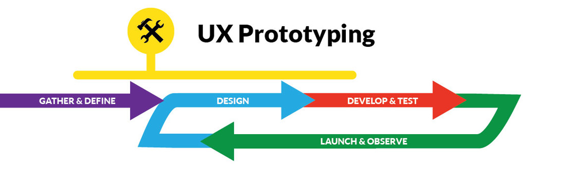
What  is  UX  Prototyping?

Picture
UX Prototyping is a specialized user experience design practice where UX Designers take initial ideas for user experiences and implement them into an interactive form in a fast, efficient way.  Wireframes, mockups, and flows can be great for clarifying the big picture, but to an untrained eye they can be difficult for assessing usability.  While knowing how to program using HTML or CSS can be an effective prototyping method, the good news is that you don’t need to know how to program to create UX Prototypes.  There are a variety of dedicated tools for interactive prototyping, like Pixate, Invision, or Sketch, that enable you to quickly create beautiful animated prototypes that replicate the superficial look and feel for real apps without writing a single line of code.   Or you could get old-school simple and bust out the crayons, scissors, glue, and table, and make paper prototypes of screens or target  sub-portions of your product.     

WhY  is  UX  Prototyping  Important?

If there are differing ideas or assumptions about what product features are important, useful, or intuitive for your end-users, prototyping, in conjunction with user/usability research, can save your start-up a ton of money and time.  Also, if a UX feature is innovative, there’s a good chance that it may be quite different from what end-users are used to, and potentially confusing.  Prototyping with User Research can take ideas out of the realm of the theoretical and get them in front of actual users and stakeholders for further testing, evaluation, and decision-making.  This can validate innovative features and reduce the potential for confusion.  This is critical to mitigate risks in the fast-paced start-up world, as once you code a feature or implement a portion of your product for real, it becomes crazy expensive and risky to make changes in code if you discover your assumptions were incorrect. 

When  Should  I  Use  or  Do  UX  Prototyping?

Picture
Prototyping is another practice that should occur in earlier phases of the project and it's important to consider doing it if you’ve decided to bypass some of the more traditional UX Design materials (like mockups and wireframes).  Like information architecture, it should definitely precede the bulk of development and programming,  but it has the most potential to be useful when it's done in conjunction with usability research.   

Just be aware that UX prototyping is not the same as development!  The purpose of a prototype is to learn things from your users as fast as possible, then be ready throw it away.  Remember when we said that bad Information Architecture is like building an unstable house?   If you are not using a dedicated prototyping tool  and you are using an HTML framework or doing actual coding for prototyping, be wary of the temptation to continue to build on a the foundation of a hastily built prototype for actual development.  I'm not saying this is always the case, but sometimes when making code prototypes, you'll cut corners just to get it done as quickly as possible, and this makes it risky or unstuitable for longer-term development.  Once you’ve learned what you need to learn from a prototype, carefully consider the pros and cons of moving forward with it versus starting development from a clean slate.  
"The purpose of a prototype is to learn things from your users as fast as possible, then be ready throw it away... Be wary of the temptation to continue to build on a the foundation of a hastily built prototype for actual development... "

LET'S  TALK  ABOUT  YOUR  USER  EXPERIENCE  CHALLENGES

Thanks for continuing to read our Minimal Viable UX Series.   Do you feel like you're getting a better idea of what kind of UX practices could benefit your start-up team best?  Describe your challenges or thoughts in the comments.   I’d love to share further insights with you to help you solve your UX problems.

​ And don't forget to come back for Part Three, where I'll go over Interaction Design, Visual Design, and Gamification.
Comments

MINIMAL  VIABLE  USER  EXPERIENCE:  UX  FOR  START-UPS (PART  ONE)

5/17/2016

Comments

 
If you are an entrepreneur working in tech, when you think about how you want your customers to feel when they interact with your service or product, do you want them to experience feelings of frustration, aggravation, or worse, make them feel kind of stupid or dumb?  Of course not, and yet, it still happens with surprising frequency.   Consider the following: ​

  • Roberta is on a long  flight from San Francisco to Buenos Aires for a business trip.  While there’s plenty of in-flight movies, music, and games to choose from, the touch-screen controls are too finicky and she has to try three or four times just to select the damn one she wants.
  • Martin and his startup team working on a legal learning app  felt they deeply understood their end-users, because all his co-founders   went to   law school, just like their target audience.  During  development they decided they   could save time and money by cutting down on the extensive   focus testing, but  now  the app   is underperforming relative to their initial  projections.  What happened?
  • Vanessa spent a ton of time on a clean and responsive landing page design for her online trading site, but after looking at Google Analytics, she doesn’t understand why nobody is signing up for her newsletter.
While these may be three different people with different backgrounds and situations, the one thing they share in common (aside from being victims of first-world problems) is that they are all experiencing effects of bad user experience design practices.  I’m sure none of them had the intention to cause this, but somewhere along the way, it still happened.  Why?
"In today’s high-speed, socially connected world, the distinguishing factor between business success and failure often boils down to who has the better UX. ​"
The good news is that 99% of the time it’s not the users’ fault, as all of these problems can be averted with a little dash of good user experience design  practices, making these people’s lives more enjoyable, saving time, and hopefully making sure your company can keep the lights on! 
While almost all people would say good UX design is desirable,  how exactly can you achieve good UX if you don’t fully understand what it is, how it works, or what’s appropriate to your situation?  As an entrepreneur, you might be looking at job descriptions, portfolios, trying to find a solution, but sometimes you see so many terms and names and buzzwords it just makes your head spin - you just want someone who understands your problem to fix it!
To help address these concerns, in this three-part blog series we’re going to take a high-level look at what UX is, explore some of its different components, demystify terminology, and explain both why and when it’s important for your business to leverage UX effectively.

Picture
"Good UX is clinically proven to help users like you grow arms!"

What  Is  User  Experience?  

User Experience is the holistic experience of real people interacting with your startup's brand and software, encompassing the design, distribution, organization, and implementation of information and interactions to serve both the emotional needs of real people and an organization’s objectives.  It’s a complex and fascinating field that touches a variety of disciplines, processes, and practices, including psychology, art, technology, marketing, business, finance, and more.  All practices within the UX spectrum promote clarity and increased levels of positive user emotions (such as engagement and delight), strive to reduce negative friction, and increase the chance of building great products that reach audiences and fulfill business objectives.​   In today’s high-speed, socially connected world, the distinguishing factor between business success and failure often boils down to who has the better UX. ​

What  Are  the  Different  Types  of  UX?

​As a professional pursuit related to technology, UX can appear complex and ever-changing.  UX is like a toolbox with many subcomponents that UX professionals apply judiciously over the lifecycle of software product development.  Some UX’ers are specialists and provide one or two types of services really well, like Visual Design or Research, while others are generalists with less extensive but broader applicable skillsets who can follow problems and adapt to changing needs.   
  • In the first part of this blog, we will explore the concepts, practices, and processes of Usability, User Research, and Content Strategy.  
  • Part Two will go over Information Architecture, UX Design, and UX Prototyping. 
  • ​Finally, in Part Three we’ll cover Visual Design, Interaction Design, and Gamification.  
If you are a start-up owner or entrepreneur, chances are you're strapped for cash or resources.  If this sounds like you, then you'll may be best served by a UX generalist who can  provide a variety of UX services.  Although, after going through this blog series, you'll  might come to the alternate conclusion that a specialist might best serve your business.  This is cool too!  
When thinking about your needs, one thing  you should note is that the boundaries between the various UX practices are not set in stone!  In fact, responsibilities, roles, decisions, actions taken in one UX phase or practice often overlap with other parts (this may be more true if you are working with a UX generalist) and this is ok!  UX is a fluid, ever-evolving process of iteration and organic collaboration between many disciplines and individuals.  Try not to get too hung up on it, and let’s get started!

Picture
This smartphone app is so happy because it's highly usable!

What  is  Usability?

Let's begin with a definition.  Usability is less of a process or phase of UX development than it is a fundamental quality that all UX products should strive to achieve and uphold.  It is the measure of the utility and ergonomics of a product (ie - how intuitive or easy it is to use) and reflects the emotional appeal and end-user quality of a UX product.  ​
Nobody wants to deal with cumbersome tools, clunky interfaces, or confusing interactions.  A product or service with poor or low usability is more likely to produce user frustration, confusion, or friction, which is when users struggle or are impeded or slowed down from fulfilling a specific goal.   Why does this happen?  Usually because one or more of the UX practices are overlooked, which, sad to say, can happen quite easily!   Developers or entrepreneurs sometimes overlook good UX because they can be strapped for resources.  Sometimes they can make inadvertently self-defeating UX design decisions because they’re thinking about what’s most efficient and easiest to implement instead of what's best for their users.   
In contrast, highly usable software promotes efficiency and user satisfaction, and when you have a product that is used by thousands or even millions of people every day, that adds up to big gains in the appeal and utility of your product.  All practices in the UX spectrum are intended to generate and promote usability, but attaining it is easier said than done!  Let’s take a look at the practices that promote and support this. 

Picture
"What I'd need is an app that helps me grow double jointed arms..."

What  is  User  Research?

User research is the process of talking to real people to collect data about the emotional needs and responses of your target users when they might interact with your product or service.  Who are your customers and what makes them tick?  What kinds of devices do they prefer to use?  What are the problems they’re having that you could solve for them, making their lives better?  These are just a sampling of questions that go into user research.  A common goal of this process is to form a fictional model of a typical end-user, known as a persona.  Another goal for User Research is to create a "user journey maps", which outline the emotional phases  and actions a fictional persona might go through as they learn about and interact with a brand or product.  
User research and persona formation also provide guidelines for what types of real people your organization should recruit to participate in usability testing during development.  This entails observation and analysis of how real users interact with your software product.    ​

Why  is  User  Research  Important?

User research should be the foundation of any UX endeavor, for how can you have great user experiences without really understanding your users?  Without a firm mental model of who you’re really making a product or service for, how people react to what you’ve created, or how well it meets users’ emotional needs, you’re courting unnecessary risk.     Unbiased user testing and research helps ensure that your organization or business doesn’t stray too far from its original purpose and stays focused on providing continuous value that speaks to genuine user wants and needs.   
"User research should be the foundation of any UX endeavor, for how can you have great user experiences without really understanding your users?"
Ongoing user research in development can moderate the influence of overly-subjective opinions and perspectives on the decision making process, using metrics and quantitative data in conjunction with written or verbal qualitative feedback to focus efforts on real user needs and emotions.   

​When  Should  I  Use  or  Do  User  Research?

Picture
Research is one of the most important flavors of UX practice across the entire Product Lifecycle?
Ideally, all the time, if you can, but only if your organization is ready to put what you learn from it to good use.   User research should be a "feedback loop" that's up and running through all phases of the software development lifecycle, not just up-front when you’re making a persona or a user journey.  Some organizations bypass the persona formation but there is always risk that you or other internal stakeholders on your team may assume incorrect things, overlook critical user needs, or inadvertently make decisions about what is good for yourselves instead of your audience.  And I've seen more than a few times when  shortchanging the usability research during the middle or later phases of product development  has resulted in self-defeating product failures.  Don't do it!
    No matter when you apply User Research, it's important to "get out of the office" and talk to real potential customers  who match your target market or demographic.   Researchers have a lot of tools they use to achieve their objectives, including interviews, online & offline surveys, card-sorting, analysis tools, and much more.  Another common misconception is that the research is expensive to do.  This is not the case, as  this great article from UXBooth  goes into more extensive detail about how to conduct user research without breaking the piggy bank.  
"No matter when you apply User Research, it's important to "get out of the office" and talk to real potential customers  who match your target market or demographic. " 
​Once you release your product out in the wild, also keep in mind you still need user research to monitor performance in the real world, understand user issues, and collect information for future releases and features.  So no matter where you are with your product's development, get out there and talk to your users!

Picture
There's a whole lot of Wingdings going on in this image...

What  is  Content  Strategy?

I'm sure you've heard the phrase, "Content is King," right?  If you haven't maybe you haven't been hanging around with enough marketing people!  Content Strategy is another broad category of practice that can be hard to nail down.  It’s the practice of looking at categories of data or information, such as text, images, graphics, audio, and video, across different delivery channels, such as blogs, email, social media, and online video sites.  After you've categorized what type of content you're using, you initiate a high-level planning and analysis phase to strategize how to produce and use content and channels to best maximize appeal towards a specific target market or end-users.

​ Examples of content strategy at work include:
  • An digital marketing agency  might initiate an audit of all the videos on a client's Youtube channel to remove clips that convey an outdated or inappropriate message that is “off-brand.”  
  • A popular but old blog might need to revamp all the formatting of its articles to support an upcoming initiative to make the site look and feel better on mobile devices, or to be compiled into a format to support publication of all the blog articles as an e-book.
  • Another site might need to rework the filenaming conventions and resolution of all its images to optimize loading times on mobile and improve Google search rankings.
Another way of looking at content strategy is this: if you think about  empty screens and interactions in your app or website as a skeleton, content strategy illustrates how the "connective tissue" should be filled out to connect your startups service to your customers in an engaging way.  Content strategy is also critical when  you are thinking about how to initially acquire or retain your users or inform them of new developments in your startup's product or service.   Analytics is an important component of Content Strategy as you have to monitor how different types of content perform and best serve your needs.  This is where Content Strategy may overlap with User Research somewhat.     UX Writing is also an emerging form of Content Strategy that emphasizes almost programmer-like rigor and consistency  on how text and copy are used to support content strategy goals. 

Why is Content Strategy Important?

Consider what might happen if you have the wrong type of videos or articles on your site or in your app.  While this is an extreme example, imagine if you went to a gardening blog, and found articles about car parts, or worse, the discography of Phil Collins. That might be a bad user experience for some people!
An ill-formed content strategy (or none at all) can hurt the digital presence of a company online or undermine critical business performance metrics like conversion rates or sales (a real concern for e-commerce sites).     Because of this, content strategy is one of the parts of the UX spectrum that overlaps the most with marketing and branding, and it’s crucial to deepen the appeal of a product or service to specific end-users.  Good content strategy aligns the efforts of marketing and content teams to UX and business objectives, ensuring that you reach and engage end-users, fulfilling both customer and business expectations.       This is why it’s important part of UX strategy to evangelize and inform who the end-users are so everyone in the organization, from development to marketing, feels invested and can align their efforts to support highly engaging user experiences.
"Imagine if you went to a gardening blog, and found articles about auto parts, or worse, the discography of Phil Collins. That might be a bad user experience for some people! "

When  Should  I  Use  or  Do  Content  Strategy?

Picture
Since Content Strategy governs and influences your marketing, (and you need to be selling all the time) Content Strategy is important through all phases of the Software Lifecycle.
Dwight Eisenhower once famously said that “plans are useless, but planning is invaluable.”  And that’s what content strategy should be, a continuous cycle of planning, execution, and evaluation.  Content strategy is effective before development, especially if you’re doing User Research on Personas and you want to learn about what social media, marketing channels, or types of content connect most effectively for them.  It can happen during development when you need to produce content for your app, website, or product, which you can also use to build a community and anticipation for an upcoming release.   And finally, it's super-critical during and after launch once your product goes live and you need to monitor the effectiveness of how your content is performing, or use new content to communicate changes or new features as they are developed.

If you'd like to learn some more handy pointers about Content Strategy (and why it's simpler than you think), check out this helpful article from the Harvard Business Review.  

WHAT  UX  PROBLEMS  ARE  YOU  HAVING?

That’s all the time we have for today.  Did this help you start to the about what kind of UX your startup might need?  Feel free to comment below and describe a challenge you're facing related to one of the UX concepts we’ve gone over today.   Or, if you have a different opinion or an interesting viewpoint or anecdote to share, let's hear it!  And please come back for Part Two - where we'll go over Information Architecture, UX Prototyping, and  UX Design.  
Comments

HOW  TO  FIX  TRANSFORMERS: DEVASTATION'S  UX  DESIGN  (PART  TWO)

5/3/2016

Comments

 
Picture
Welcome back to everyone who has been patiently waiting for Part Two!  Last time, I described six fixes to TRANSFORMERS: DEVASTATION (TF:D)’s UX Design that would address the game's “bad friction" (ie -players  having to deal with lots of micro-managing and busywork when dealing with a UI that wasn't designed to handle large quantities of objects).   It’s an unfortunate UX design flaw, as the weapons crafting systems provide genuine depth that players need to leverage to surpass challenges on higher difficulties (ie - “good friction").   There really is a lot to like and enjoy about this game, as it gets the hard things right and is clearly built with a ton of love for the TRANSFORMERS franchise and history.   Let’s wrap things up six more UX fixes for TF:D.  

Unintuitive  Character  Switching

I’ll admit this first one is a total nit-pick, but the functional order of switching between Autobots in the "Ark" interface matches a small row of facial icons in the lower right, not the actual line-up of the Autobot character models in the physical space (as seen in the background).  This creates some minor  friction when switching characters, because the  large 3D characters generate a more prominent mental representation of order in the user's head than the little icons, making character swapping more unpredictable than necessary.   A simple  change in the order of the icons would address this, but this, combined with some arbitrary reworking of prompts, is emblematic of a lack of rigor and attention to  UX design  detail.  Rough corners  like this add up!  

CommunicatE  the  Importance  of  the  Lab

Another thing that gets lost in the shuffle of systems within the Ark is the “Lab” where you buy and sell weapons and undesirable items.  First off, “Shop” would be a better term because a “Lab” is where you research or create things (you know...like the T.E.C.H. chip upgrades).  “Shop” better describes a place where you buy and sell stuff.  Also, the game floods players with low-quality weapons during regular gameplay, so it’s likely that players don’t perceive the need to go shopping for more.  One crucial but not immediately obvious detail is that the “Lab” (ugh!) is the BEST place to buy the rarest, highest rank, highest quality weapons, and the inventory changes periodically so that new stuff appears often.  Because high-rank shop weapons are the most expensive things to invest money into (aside from Synthesis), it  strengthens the reason for the rest of the economy to exist, helping completing a key player-compulsion loop.  Better terminology, giving the user some extra feedback (like a reminder or notification when new or rare weapons are in-stock), or even putting the "Shop" closer to the top of the Ark Menu would be more intuitive and would better reflect how its importance to the player's chances of success.  Improving discoverability and awareness is never a bad thing.
Picture
You'd be hard-pressed to learn how important the Lab is based on how the UI presents it.

Better  Filtering  and  Sorting

Picture
Don't mind me channeling my inner Dinobot monologues...
"Adding relevant filtering options...would remove a cognitive degree of separation that forces users to think more about getting what they want than necessary."
The Difference between a weapon’s Rank and Level is never really explained, but they’re the only sorting options you get on most weapon screens.  Attack Power and Sell Value are more relevant to players (and are directly proportional to Rank) so adding relevant filtering options for this would remove a cognitive degree of separation that forces users to think more about getting what they want than necessary.  Also, when equipping weapons, the interface will display items on the list that a character can’t equip.  This is just unnecessary and makes it more tedious for users to sift through an already overwhelming list.  Other sorts, like the ability to sort alphabetically by name, if the item is new, or even if an item is equipped by a certain character (which, oddly, is removed from the Sell screens weapon list) would be helpful.  For selling T.E.C.H. chips in the Lab, sorting them by quality and type would also improve functionality.

ALLOW  PLAYERS  TO  MANAGE  WEAPONS  EN-MASSE

Because of the high frequency of weapon drops and sheer volume of items players deal with, interacting with the menus inside the “Ark” quickly gets unwieldy.  The only way for get rid of items is to manually sell or fuse (aka “synthesize”) weapons one by one.  Being able to hit checkboxes  on a whole batch of weapons to sell or fuse them en-masse (or put them into a special sub-section or box for later disposal) would save users a lot time and busy work of micro-managing their inventory.   A more visual, grid layout (versus a list) would reduce the amount of time it takes to navigate through items, but the UX design would need to handle this carefully to not overwhelm users.

​Synthesis  Improvements

Synthesis is the process of paying money to fuse two weapons together to make them stronger or instill perk-like properties from one weapon to another.   This a pretty essential component of the player's toolbox  to make progress in the game, but there are a number of missteps here that sabotage its utility.  To synthesize weapons, you have to dive into the deep end of the weapons list and search for the weapons you want to fuse.  They try to band-aid this by putting a default sort on the list by what's equipped when the player first enters it, but if you use the other sort functions, your equipped items become lost in the shuffle, because there’s no user-initiated sort for what’s equipped.  It’s a safe assumption that the weapons you’ve already got equipped are the most desirable, so what would help quite a bit if allowing players to access Synthesis from the Equip Screen.   The game  already does something similar with the "Lab" shop interface - you can just press L2/R2 to switch between Buy and Sell modes.  Applying a similar degree of functional  consistency would reduce a lot of "backing in and out" of menus to do what you want.
"A well-designed interface shouldn't permit users to make errors...more "top-down" thought about what end-users really want to do (or need to avoid)...would improve the UX quite a bit."
 Also, the order in which you chose two items to fuse has a bearing on the outcome.  For example, if I pick an “A” weapon first, then select a “C” weapon, then A levels up.  If you pick C first, C levels up.  This is never explained, and it’s totally possible to level up a crap weapon by sacrificing a high-quality one.   A well-designed  interface shouldn't permit users to make errors, so  some sort of warning if you are about to botch a synthesis would reduce the potential for user-initiated error.  
Picture
Synthesizing old weapons to make newer, more powerful ones makes for a strong compulsion loop, but with all the complex factors involved in this system, the UX Design needs can't be shoehorned into existing screens.
Other improvements could go a long way to improving synthesis usability.  You don't get prompted to equip a new weapon once its been synthesized, it gets tossed back into the huge list for you to sift through and relocate (perhaps it builds character?)   Adding this prompt would decrease friction. 
 Better still would be giving players the ability to search for an "ingredient" weapon for synthesis based on the perks they want to add to an existing, highly desired weapon.  For example, if the player wants to increase health regeneration when equipping a S-Rank Energon Hammer, the game should let the player search for potential ingredient weapons that have that property,  instead of forcing them to sift through tons of trash loot and trying to toggle subscreens and interpret abbreviations.   A little more "top-down" thought centered on what end-users really want to do (or need to avoid) versus "bottoms-up" iteration on existing functionality would improve the UX quite a bit.  

Auto-Equip

​A quick button prompt or dropdown to “Auto-Equip”  the gear with the most Attack Power (or possibly a few other desirable criteria, such as certain perks or bonuses) would cut a massive amount of busy work out of the game and broaden its appeal to more casual audiences.  This type of streamlining might even be useful, on occasion, for the more hardcore players who enjoy the tinkering aspects, while not sacrificing the depth of gameplay possibilities that makes leveraging the weapon systems compelling.  

CONCLUSION

​All of these proposed changes would not sacrifice the depth or the “good friction” of the customization systems lying underneath the bad UX design.  Many of these fixes would reduce the bad friction and complexity that haunts common or frequent tasks, broadening appeal to users that feel obstructed from enjoying the faster-paced aspects of the game because of clunky menu organization and arbitrary or poor design choices.   Hopefully with a bigger budget and more time (and some more thought put into end-user experience), Platinum can address these flaws in potential follow-up games.  
Picture
Farewell, old friend. I hope I see you again... with a better UX Design.
If you’ve read this far, thanks for taking the time to check out my blog!  I hope that you, like me,  want to see Platinum continue to make the best character-action games in the industry (and more awesomely nostalgic and successful Transformers games).    What other aspects of TF:D’s UI worked well (or not so well) for you?    Share your thoughts and comments below!  
Comments
    Picture
    ​EDWARD MOORE

    UX Design & Gamification Consultant

    RSS Feed

    Categories

    All
    Entrepreneurship
    Freelancing
    Gaming
    Tech
    UX
    VR

    Archives

    July 2021
    March 2017
    February 2017
    December 2016
    June 2016
    May 2016
    December 2015
    November 2015
    August 2015
    July 2015
    June 2015
    May 2015

Powered by Create your own unique website with customizable templates.