Amped-UX
  • Welcome
  • About
    • Endorsements
  • Portfolio
    • HD Game UX Design >
      • Star Wars: Jedi Fallen Order
      • Battlefield V
      • Lost Planet 3
      • Sonic Boom: Rise of Lyric
    • VR & AR UX Design >
      • Starblood Arena
      • World War Toons
      • Fire Escape
    • Web & Mobile UX Design >
      • Precision Digital Health
      • Stacks! Live Streaming Game Show App
      • Smart Events Mobile App
      • Vyndica Mobile Trading App
  • Media
  • Blog

THE AMPED-UX BLOG

THOUGHTS ON UX DESIGN, GAMIFICATION, & VR/AR in LOS ANGELES

FIVE UX DESIGN FIXES FOR ZELDA: BREATH OF THE WILD

3/25/2017

Comments

 
Picture
Nintendo's latest chapter in the classic action-role-playing LEGEND OF ZELDA saga, ​BREATH OF THE WILD (BOTW)  has garnered deserved praise for presenting users with an immense, emergent open-world full of discovery, surprise, and charm.  If you're reading this, and you're anything like me, spending time in the fantasy realm of Hyrule consumes both  your thoughts and free time. However, as I've been digging deeper into the game, I started to notice some areas that could benefit from a few quick  user experience (UX) design improvements  to reduce some  bad friction and busywork. I wanted to share these thoughts today as I believe these  changes would result in  a more fluid and intuitive user experience.

STREAMLINE EQUIPMENT MANAGEMENT

BOTW offers a much  wider variety of  equipment than    ZELDA  games in the past, but the weapons and bows can break after extended usage. While there has been some online controversy about the wisdom of this decision, I'm not questioning it.  In fact, I think it works because in the context of a much larger world to explore, players need a continuous feed of new and interesting weapons and choices to try, as this provides tactical variety and supports longer-term mechanical engagement.
"...if you don't have any space, it tells you you're out of room, and nothing more. This is an error, and good UX designs don't permit users to make errors, they handle them."
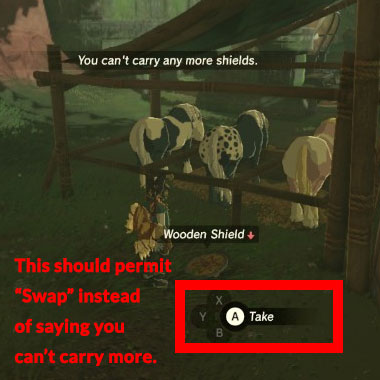
The problem starts when the player walks over a dropped weapon and a UI button cluster prompt appears on-screen to pick it up. If you have space in your limited weapon inventory, no problem. However, if you don't have any space, it tells you you're out of room, and nothing more. This is an error, and good ux designs don't permit users to make errors, they handle them. This happens often because users tend to horde weapons.  

To get around this, users have to press Start, navigate into the weapons tab, search for a weapon they don't want, select it, then navigate to the "Drop" item in a sub-menu.   This problem with full weapon management is made worse when a new weapon is inside a treasure chest, since the chest closes when the user doesn't have enough space to pick up the weapon inside. This  requires the user to re-open the chest after going through the previous routine of clearing out weapon inventory space.
One of the ways I work around this clunky  method is to press the Right Bumper to throw the  undesired weapon away (which can be used as an attack move, such as to throw spears). This works for melee weapons, but bow and arrow weapons can't be thrown away, nor can shields. In this case, if you have full bows or shields, you have to  browse through the equipment menu again to drop something.  
Because you are dropping and switching equipment in the UI with greater frequency, users will likely encounter unnecessary friction. The best fix to avoid this clunky experience would simply be to  add a context-sensitive "Swap" option that only appears when the user tries to pick up a weapon or open a chest when the weapon inventory is full. This would no longer force users to go through this frequent and tedious routine,  making weapon inventory management more fluid and keeping users focused on the adventure and exploration, not futzing with menus.
Picture
Users shouldn't be left hanging and have to see this.

GIVE USERS Shortcuts tO Food

Picture
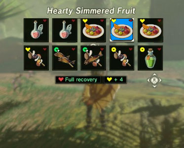
Shortcuts to Food would make combat more fluid and fast-paced.
One of the  more consistent hallmarks of UI design in the ZELDA franchise, even since the 16-bit era,  has been the ability to remap the button functions to use different items. With  BOTW​ we now have a system of magic rune powers that gives users agency over the game's physics systems, and an  ingredient and cooking system  that allows users to create different food items and elixirs to restore health  and/or grant status benefits, like increased damage or resistances.
While you can select from the magic runes by pressing and holding DPad Up (more on this in a bit), there is no quick access to food items.  Instead, users have to press the Start button, browse  to the Food tab, sort through several sub-pages, then sift through  an item matrix  to read and evaluate which dish or elixir confers the desired status effect and/or restores the right  amount of health (too much health would waste the food's benefit, too little and the user has to eat multiple items).
This UI song-and-dance routine wouldn't be so bad if it didn't happen all the time, but combat tends to be less forgiving and more lethal in this new  ZELDA  than previous entries in the franchise.  Even within the first several dozen hours of play it's quite common for enemies to nearly kill you  in one hit, requiring frequent pauses during  combat  to sift through menus and evaluate healing/buff items.
"...frequent pauses during combat to sift through menus and evaluate healing/buff items ... puts quite a crimp of the pacing and fluidity of combat."
This puts quite a crimp on the pacing and fluidity of combat, so one possible solution would be to clear up one of the DPad directions for a list of user-configured  Food shortcuts to better support personalized, predetermine playstyles and introduce more of an element of planning versus clunky reactiveness. Here are two potential solutions, both of which would involve a number of cascading changes to  the UI to make it work.
  • Relocate the Horse Whistle -  Pressing DPad Down makes the player character ("Link") whistle to  summon his current horse. While it's a semi-frequently used function, an acceptable tradeoff to place this one or two steps away. It could be grouped within the Rune Magic functions, or contextualized as a special item like a whistle or ocarina and placed within the Start Menu.  Many times the horse can't reach the user anyway (due to distance or obstacles), so  this is another instance of UX design permitting bad friction by allowing uncertain or undesired outcomes.  
Picture
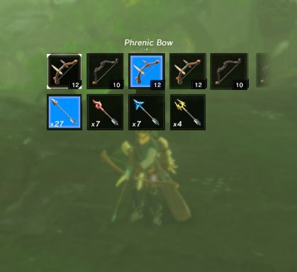
There's no reason you couldn't browse bows and arrows in a 2D matrix versus a linear row.
  • Relocate the Arrow and Shield Switching functions - Pressing DPad Left brings up an auxiliary menu that permits users to select shields or arrow types, depending on the primary  weapon type the  user has  currently selected. In my experience with the game so far, the frequency that I need to switch my shield or arrows  is either moderate  or infrequent , so these functions could be relocated.  Expanding the primary weapon selection (on DPad Right) from a  linear row of weapon selections to a matrix of 2 rows would achieve this. In the case of the melee weapon selection,  the top row would be weapons, while the bottom row would be shields (which would be greyed out if the player selects a two-handed weapon). If the user draws their  bow, then the top row becomes bows, while the bottom becomes  the arrow types. 
Regardless of the solution used, users would also  need an additional submenu item added when selecting food items to "Add to Shortcuts" or "Remove from Shortcuts." There may need to be some additional constraints around the number of food shortcuts users can  add, but I don't see a reason why the food shortcut UI couldn't be a unlimited 2d matrix instead of  a linear list, or it could be contextualized as a limited but upgradeable quantity, much like the weapon capacity upgrades users find later in the game. 
Learn how UX design makes videogames better! Subscribe to our quarterly newsletter for your FREE Minimal Viable UX PDF!

MAKE RUNE MAGIC SELECTION MORE FLUID

Another solution to free up one of the DPad buttons for Food Shortcuts  would be to revamp  or streamline the Rune Magic selection interface. Selecting a specific Rune is a little clunky - users have to press DPad Up to bring up the Rune selection UI, then use  the Right Analog stick to browse through the linear list, release DPad Up, then hold the Left Bumper to activate the Rune power, which usually requires another few steps, such as  aiming with the Right Stick, then throwing or dropping one of two bomb runes or activating the power  with the "A" Button.  

What makes the Rune selection process slightly clunky is that if you hold the Left Bumper to  enter the Rune mode, and you have the wrong power selected, you have to back out and go through the Selection process again.
A more fluid solution would be to change the function of the DPad  during Rune Magic mode so that it overrides the weapon  selectors. Users  can't use weapons, shields, or arrows, during Rune Magic mode anyway, because the mode  tends to be used more for  solving physics puzzles (though not always).  Because there is less of  a pressing need to configure weapons in Rune Magic mode, changing powers on the DPad would enable users to  swap between the different Rune magics more fluidly without the need to fiddle with backing in and out of the current Rune Magic UI to find the power you want.

WARN USERS THAT FOOD STATUS BUFFS DON't StACK

During a recent session, I had just washed down a roasted fish and mushroom skewer with a speed elixir to take out an ancient  guardian robot, when I discovered that many food buffs don't stack. Instead, the effect of one food item overrides the other. While I  would've preferred to err on the side of greater user agency and allow stats to stack, especially in a game that emphasizes player freedom and agency over saying "no" to the player, I can understand that it might make combat too easy.  

​What I would  prefer to see would be some warning or confirmation prompt that you're about to replace and lose your previous buff.  This would be especially helpful if you just consumed a rare, high value, or powerful food item and was about to wipe it out with a weaker one, preventing user error. 
UPDATE - looks like this is conveyed in a tooltip in the loading screen. While this helps somewhat, this feedback is out of context because the tool tips are randomized. The feedback would be better conveyed at the point of interaction.

GIVE USERS BETTER Item SORTS

Picture
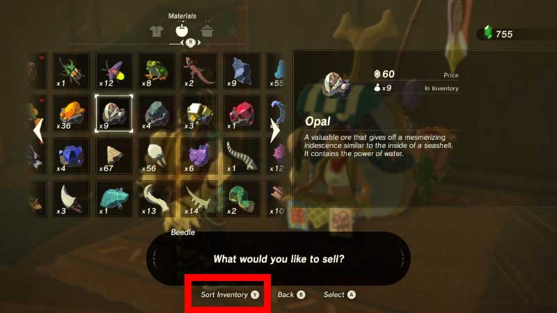
LOTS of items, one sort...
When you sort items, like ingredients for cooking or crafting, there is one sort type and it doesn't really tell  you much  about the method it chooses to sort by. It seems to be by a general type (such as fruit, plants, meats, critter, mineral, for ingredients, and then by effect type for food).  But in some instances, this enigmatic sort is not helpful. What if you're talking to a merchant and you want to sort the items by worth to find out what's the most valuable item? Nope! You have to sift through items one by one to see how much you can sell them for.  How about sorting them by what you have the most number of items? Ditto, no can do.
This fix is pretty simple - just enable the sort button "Y" to cycle through a few additional sort types and adding a few text labels ("Sort by Value", "Sort by Amount", etc..) to improve usability and alleviate inventory busywork.

CONCLUSIONS

It may seem a little nit-picky to call these UI design issues  out in a game that succeeds at significantly changing  up stale aspects of the ZELDA  formula and achieving what Nintendo set out to do - creating a truly emergent and enthralling world to explore. But there's always room for improvement, and who knows, maybe someone at Nintendo will read this and think about it for future patches.  What do you think? Are there other things about ZELDA ​'s UX design that could be done better ?  Please share your thoughts in the comments. Thanks for reading!
Comments

HOW  TO  FIX  TRANSFORMERS: DEVASTATION'S  UX  DESIGN  (PART  ONE)

12/8/2015

Comments

 
AMPED-UX-DECONSTRUCTION-TRANSFORMERS-DEVASTATION-BANNER
UX Design for Video Games is tricky business.  Typically, “friction” in UX design represents obstacles between what users want to do with your software, versus what the user interface permits them to do.  For most software development projects, friction is bad and should be removed.  For video game UX design, you need the right amount of “good” friction to provide challenging obstacles so players feel satisfaction from victory or from figuring things out (here’s a neat article from UX Magazine that goes into more detail on this).  

"Once you take off the powerful nostalgia goggles, UX design flaws emerge...The systems seem designed for smaller numbers of objects...Once developers  inflated the inventory...cracks in the  UX design start to show..."
Recently, I purchased and completed TRANSFORMERS: DEVASTATION (TF:D), a new character action video game developed by Japanese action game developer Platinum Games and published by Los Angeles-based publisher, Activision.  It’s an incredibly fluid yet carefully crafted love letter to the iconic 80’s cartoon era of the franchise, complete with the same voice actors, musicians from the 1986 movie, and subtle nods and references.
Once you take off the powerful nostalgia goggles, UX design flaws emerge with the weapon fusion, inventory, and crafting systems.  These underlying systems provide a surprising amount of depth and tools for customization. Using these systems to overcome the obstacles of the game (which provides “good” friction) can feel awesome and satisfying.  On the other hand, the inventory and crafting systems seem designed for smaller numbers of objects at a time.  Once the developers inflated the inventory with tons of randomized weapon loot, cracks in the UX design start to show, resulting in clunky, “bad friction” user experiences, such as fussing around with menus and busywork.  This puts a real drag on the pacing.
In the first part of this article we’ll analyze what’s not working with TF:D’s user experience and discuss specific UX design improvements for Activision and Platinum to consider for future projects. ​

IMPROVE  PACING  OF  ONBOARDING  &  TUTORIALS  FOR  THE  ARK

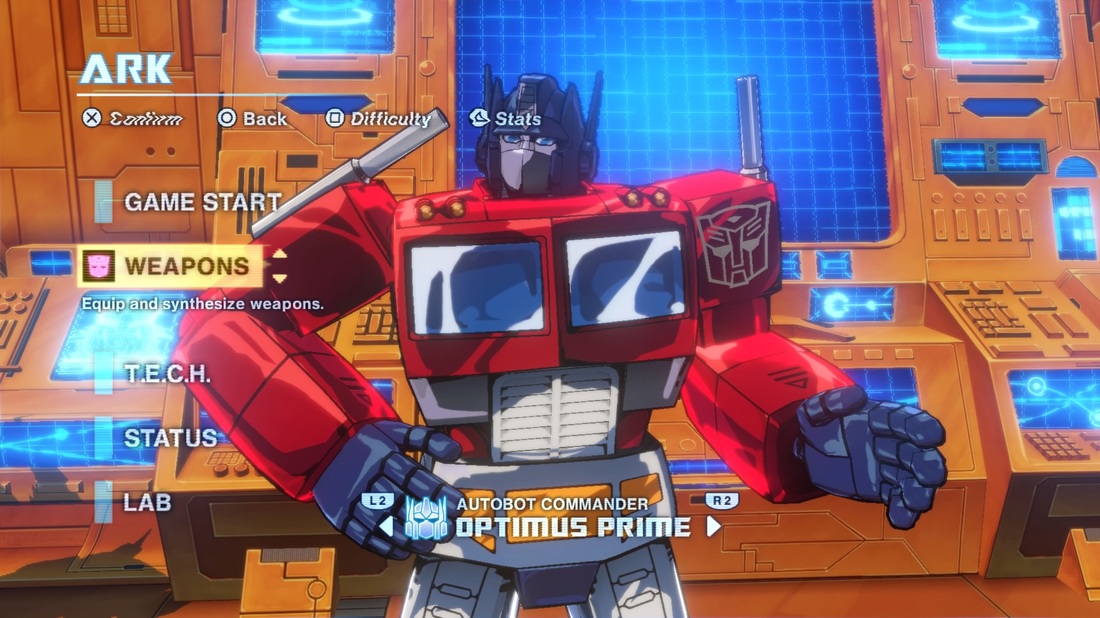
In between missions, players return to an in-game base called “The Ark.”  It’s here where players can fuse or “synthesize” weapons to create more powerful ones, develop “T.E.C.H” upgrades, and configure gear for the five Autobot heroes.  While the first level does a decent enough job of teaching the moment-to-moment gameplay systems and rules, once you get to the Ark, the game dumps several major systems on you at once, and all the handholding goes out the window.  A better option would be to temporarily disable some of the systems, then “breadcrumb” or introduce them one-by-one as missions progress with some brief, targeted feedback on how it works or why it’s useful.  This reduces the number of new things players need get used to at a time, reducing the potential for overwhelming stress and confusion.
AMPED-UX-DECONSTRUCTION-TRANSFORMERS-DEVASTATION-MAIN-MENU
Optimus Prime...you'll always be my hero, but your main menu has too many systems introduced all at once. (PRESS TO ZOOM)

T.E.C.H.  SYSTEM  UX  DESIGN  IMPROVEMENTS

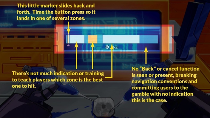
AMPED-UX-DECONSTRUCTION-TRANSFORMERS-DEVASTATION-MINIGAME-UX-DESIGN-ISSUES
This is the T.E.C.H. Chip crafting minigame. (PRESS TO ZOOM).
"Changing the mapping of buttons and functions ... with no visual feedback or prior warning feels like the game is pulling the rug out from under the user."
The "T.E.C.H.” system allows players to invest money into a little timed button input mini-game to develop computer chips to install in the various Autobot heroes.   The different “zones” aren’t fully explained the first time you develop a chip, and I put in almost 20 hours into the game before it dawned on me that the look of the T.E.C.H. icons indicates the amount of money you gambled on the chip. This wouldn’t be an issue if not for the fact that the timing-based nature of the mini-game permits you to fail, resulting in low-quality chips with defects.  When equipping and selling chips, there’s no immediately obvious visual feedback on the quality of the chip, even though this information is now more relevant than the amount of money you initially gambled on it.  Also, once you pick a tier to invest money in, if you decide to change your mind, you can’t back out of the mini-game (by pressing Circle on the PS4 controller which is the standard mapping for cancel).  Changing the mapping of buttons and functions like that with no visual feedback or prior warning feels like the game is pulling the rug out from under the user, so the minigame should let you back out of it (as it does with every other screen in virtually every other game)

Use Consistent Color Coding Across Weapons and T.E.C.H.

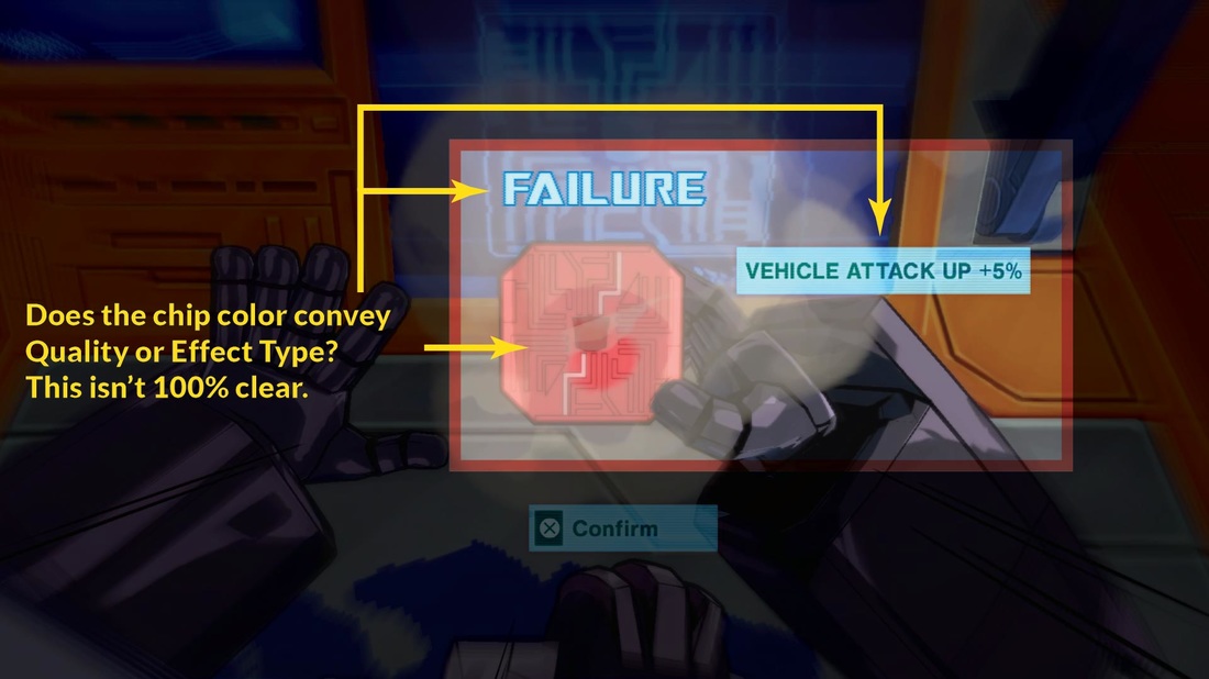
AMPED-UX DECONSTRUCTION - TRANSFORMERS:DEVASTATION - T.E.C.H. Minigame
Aspects of the T.E.C.H. minigame can be confusing and aren't applied consistently (PRESS TO ZOOM)
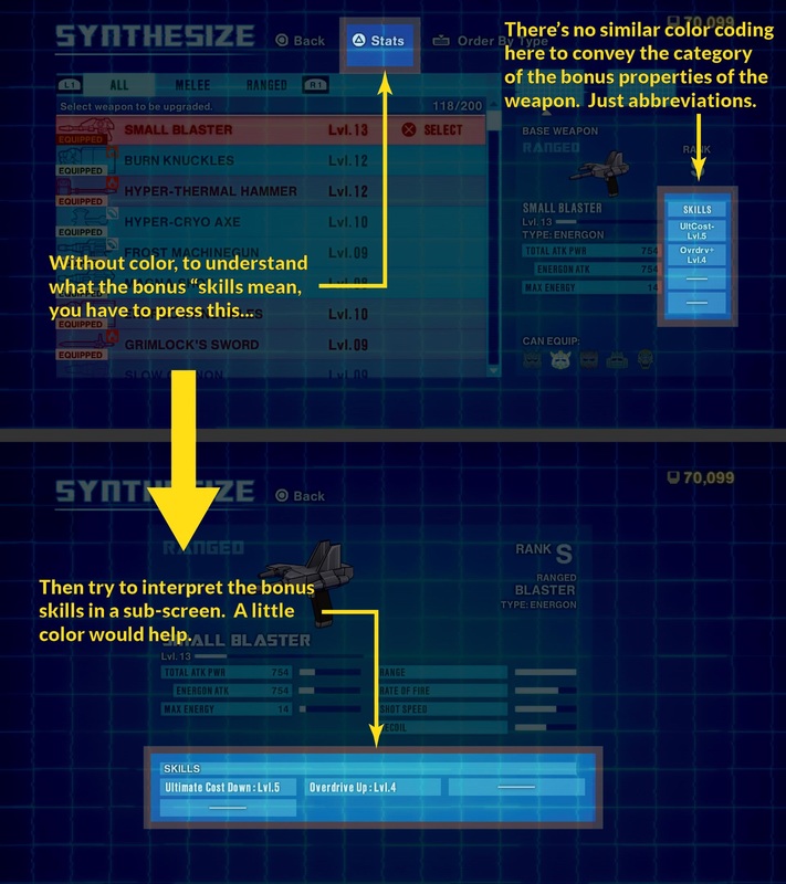
One of the things I do like about the T.E.C.H. system is that it uses color-coding to categorize some of the perks (Red chips, for example, are attack-oriented).  It’s not perfect, however.  When creating the chips, the game doesn’t explain that “red equals attack.”  In fact, during the mini-game, it’s possible that users may equate colors as a reflection of chip quality, which would be a false association.  Also, the game uses both Green and Yellow under the “Support” category (for things like getting bonus experience or money).  They don’t explain what yellow means versus green, but even these lapses aren’t the main issue.  The issue is that the weapons that you find during gameplay also have most of the same benefits.  Because both systems confer almost identical bonuses, the color-coding scheme could be applied equally, but the game only uses color coding for the T.E.C.H. chips.  
AMPED-UX-DECONSTRUCTION-TRANSFORMERS-DEVASTATION-SKILLS-ABBREVIATION-ISSUES
Without color, abbreviations can be hard to interpret and require digging into sub-screens. (PRESS TO ZOOM)
Instead, they expect you to dig through sub-menus to uncover what the abbreviated bonuses on weapons mean.  A more unifying use of color-coding across screens (such as a little tab, line, or splash) and providing feedback to guide color associations would improve usability.

PROMOTE  CONSISTENT  BUTTON  PROMPTS

AMPED-UX-DECONSTRUCTION-TRANSFORMERS-DEVASTATION-PROMPT-CONSISTENTCY-ISSUES
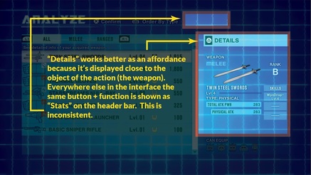
Why is the same function moved elsewhere only for the "Analyze" screen? (PRESS TO ZOOM)
This is more of global issue then something that is confined any one part of the UX, but many button prompts exhibit consistency issues in presence, position, and terminology.  Players switch Autobots in the Ark by pressing the lower shoulder buttons on Playstation 4 controller (“L2” and “R2”).  This visual affordance migrates from screen-to-screen, nor is it available in some of the sub-screens, even though it might make sense or aid navigation.  Also, when examining a weapon’s characteristics with the Triangle button, on one screen, it describes this function as “Details” and the prompt is in a good position relative to the weapons panel.  However, on most screens, the same function is described as “Stats” and is displayed elsewhere.  Sometimes it’s really difficult to promote rigor and consistency throughout a UX Design (especially under tight, high pressure development deadlines), but minor deviations like this increase users’ cognitive load and add to perceptions of the UX being rushed and unpolished.

STREAMLINE  RARITY  OUT  OF  THE  UX  DESIGN

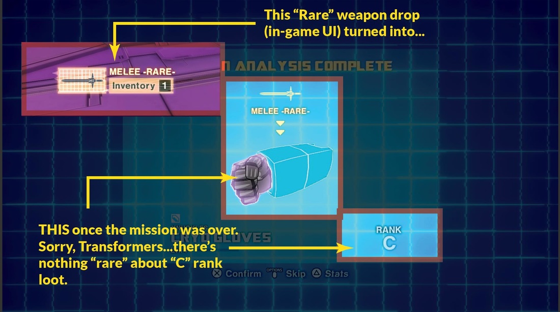
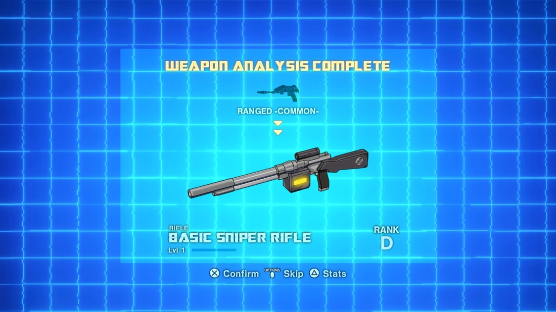
During missions, the game provides basic feedback on a found weapon’s Rarity (Common, Uncommon, and Rare).  Once you return to the Ark to identify your weapons, the whole notion of Rarity becomes meaningless as the game assigns every weapon a Rank (D, C, B, A, S, SS).  Often, you can get a Rare weapon, only to uncover that it’s a low-rank (ie - low power) weapon.  This creates dissonance between the expectations (“I got a Rare...I bet it’ll be good!”) and the outcome, (“WTF - why do I need another D weapon?”)  There’s already a direct correlation between high Rank items being much rarer than low-rank ones, but with only three tiers of rarity with little to no functional significance, the whole concept of rarity could be streamlined out of the design with negligible negative impact to the user.
AMPED-UX-DECONSTRUCTION-TRANSFORMERS-DEVASTATION-RARITY-ISSUES
Rarity has no functional significance compared to Rank and is not necessary. (PRESS TO ZOOM)

REVAMP  THE  POST-MISSION  REWARD  SEQUENCE

AMPED-UX-DECONSTRUCTION-TRANSFORMERS-DEVASTATION-REWARD-SEQUENCE
Get used to this screen, you'll see it. A LOT.
AMPED-UX-DECONSTRUCTION-TRANSFORMERS-DEVASTATION-REWARD-SUMMARY-ISSUES
The "Analyze" Summary screen has a number of issues. (PRESS TO ZOOM)
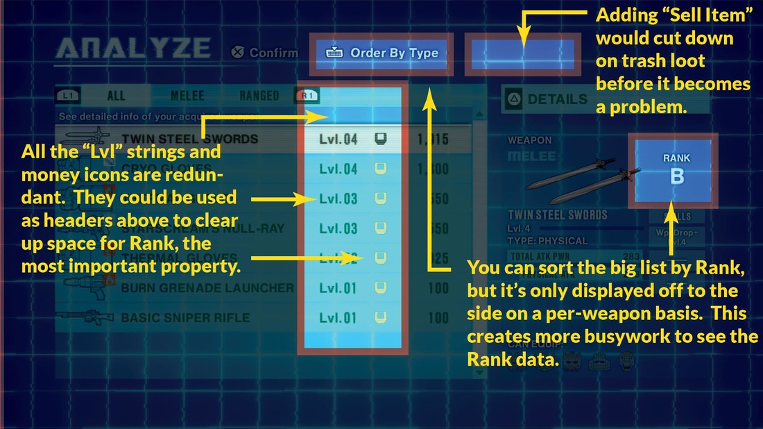
 Upon returning to the Ark, players are inundated with a flood-like sequence of all the weapons they’ve found.  While there’s kind of a fun, anticipatory “unwrapping the presents” quality to this sequence, after the first few times, you realize that most of it is C-D Rank trash loot and just mash the button to get through it.   Fortunately a "Skip" option will take you to an "Analyze" summary which provides a better at-a-glance view, but even this screen has problems.  You can sort by Level,  Rank, and Type, but only Level and Value is in the summary list.   In fact, there's a whole column that could be used for Rank, but instead it's used for a money icon.    These icons and the multiple "Lvl" text strings  are redundant; they would be better used as table headers, clearing out space to display Ranks to match the available sorting fucnction.   Better yet, this screen could  allow players to immediately sell weapons  to nip inventory clutter problems in the bud.    Losing the overly long presentation, taking users right to the summary, and making these improvements would go a long way to cut down on bad friction.

Are there any TF:D  fans out there who feel differently?  Is this too nitpicky, and should hardcore players just suck it up?  What did I miss, or what do you think?   Contribute to the discussion by leaving a comment below, and stay tuned for Part Two, where I'll present more UX Design improvements for TRANSFORMERS: DEVASTATION.
Comments

THE  "INDIEAPOCALYPSE" AND  THE  PULP  FICTION  USER  EXPERIENCE

11/21/2015

Comments

 
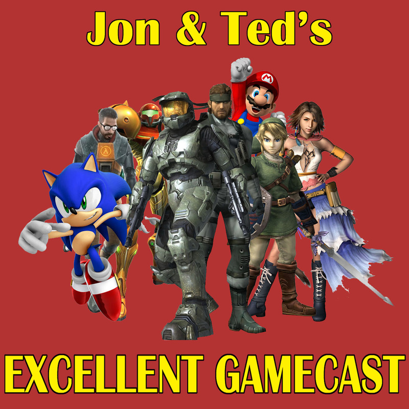
TALKING  UX  DESIGN  AND  HOW TO SURVIVE AS AN INDIE ON JON  &  TED'S  EXCELLENT GAMECAST
I recently  made a new friend via the LA Indie Game Developers Meetup.  His name is Ted Edwards from Raptorcow and he invited me to be a guest on his  podcast - "The Jon & Ted's Excellent Gamecast."  Ted and Jon seemed like cool guys and we talked about a number of fun topics.  Notable highlights include:
  • 11:17 - What's the outlook for VR now that the $99 Samsung Gear VR   is available for pre-order?
  • 1:10:42 - How does somebody   get involved in User Interface (UI) & User Experience (UX) Design for games and why is it important?
  • 1:13:04 - What is the REAL  difference between UI  and UX?
  • 1:28:28 - Why is good UX Design in demand and how can it benefit your software development project?
  • 1:45:39 - What is the  "Indieapocalypse" and what can you do to avoid it as an independent game developer?
Press the Jon & Ted's Gamecast Logo Image to navigate to the podcast,  and don't forget to leave a comment here if you thoughts on the discussion!  Thanks!
Picture
PRESS HERE!
Comments

Four  Ways  Microsoft's  Hololens  Might  "Beat"  VR

6/23/2015

Comments

 
PRESS THE HEADLINE TO COMMENT
Well, we survived E3-2015 in Los Angeles this year, and it was impossible not to  talk about Virtual Reality.   Microsoft's HoloLens made a big splash, and  here's four reasons why they might be onto something:
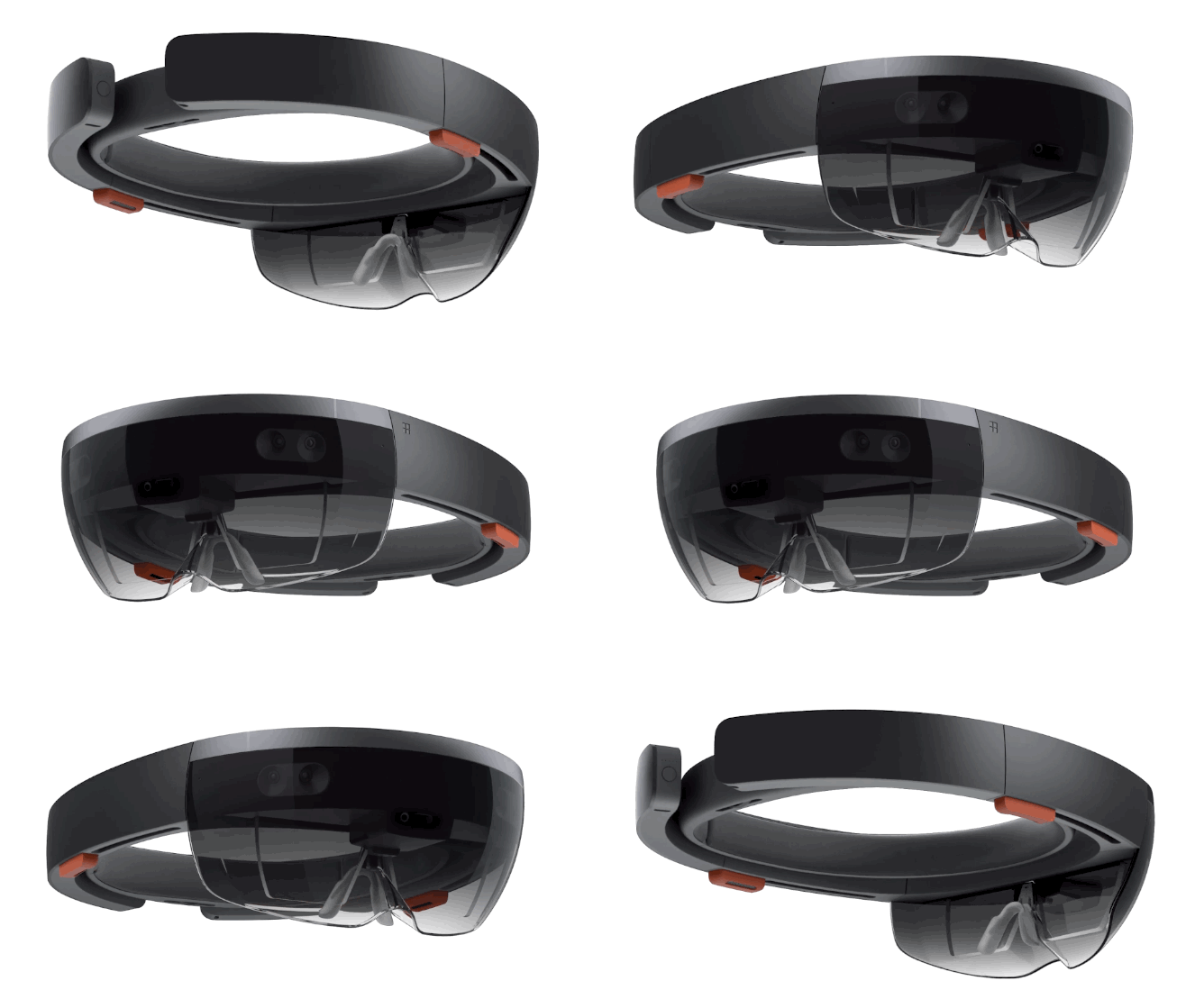
Microsoft's HoloLens Augmented Reality Headset
MICROSOFT'S HOLOLENS AUGMENTED REALITY HEADSET

The Price/Form Factor - As a standalone unit,  Hololens  isn't  tethered to an expensive $1000 - $1500 PC or a $400 Playstation 4.  We don't know the Hololens's price yet, and it may be unfair to compare since it's got a smaller field of view and different tech goals and  capabilities.  I believe  VR won't really pick up momentum until the form factor looks more inviting, like a lightweight pair of sunglasses or ski goggles that you're not  embarrassed to wear in public.   This ideal form factor may still be many years away, but for now, HoloLens looks  more like it.   Combined with a potentially lower price, it may  drive mainstream adoption faster and  beyond just the hardcore gamer/tech geek crowd.   
Augmented vs. Virtual Reality    -  We're big fans of differentiation, disruption, and "blue ocean" as UX product strategies here at AMPED-UX.   All the existing or planned VR platforms put users in a "replacement reality" that cuts them off from the outside world.   That's fine - I'm a predominantly "wanderer/immersion-seeking" type of  gamer that loves escapist experiences, but even with introducing some multi-player features, VR still strikes me as kind of an "anti-social" UX value proposition.   HoloLens blends the virtual and the actual, so parents will know that their kids are looking at something that augments their existing  environment.   This is a strong market differentiator that could increase parents' comfort level and awareness of what their kids are experiencing with the technology.   More importantly, if parents approve the tech, retailers will be more likely to carry it, driving sales and adoption.     
Voice Recognition  - Even though I struggle to do anything useful with Siri besides phone calls and texting, I think Voice Recognition will only grow as a natural input method over time.   Although Sony could theoretically integrate Voice into its Morpheus VR strategy,  there's little indication anyone other than HoloLens is doing so.  With two generations of Kinect technology under their belt, Microsoft may be in a unique position to leverage their expertise in this area to provide a more intuitive, natural user experience. 
Picture
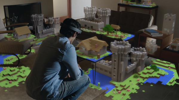
This could be your kid next year (or you!)
Minecraft -  Showcasing HoloLens with Minecraft might be one of the shrewdest, clutch marketing moves of E3-2015.   Remember, consumers  bought the original Nintendo Wii as a Wii Sports box to play with Grandpa over Thanksgiving.  While I don't doubt that VR will produce an amazing variety of super-immersive  user experiences,  all Microsoft needs to do is brand Hololens as the "MINECRAFT  2" headset and they'd have the next kid-centric killer-app phenomenon  on their hands.    The mainstream mega-marketability of the Minecraft brand  easily dwarfs the combined appeal of all current VR efforts combined.
So, do you think HoloLens is onto something, or is it the next Kinect?  
Comments
    Picture
    ​EDWARD MOORE

    UX Design & Gamification Consultant

    RSS Feed

    Categories

    All
    Entrepreneurship
    Freelancing
    Gaming
    Tech
    UX
    VR

    Archives

    July 2021
    March 2017
    February 2017
    December 2016
    June 2016
    May 2016
    December 2015
    November 2015
    August 2015
    July 2015
    June 2015
    May 2015

Powered by Create your own unique website with customizable templates.