Welcome back to everyone who has been patiently waiting for Part Two! Last time, I described six fixes to TRANSFORMERS: DEVASTATION (TF:D)’s UX Design that would address the game's “bad friction" (ie -players having to deal with lots of micro-managing and busywork when dealing with a UI that wasn't designed to handle large quantities of objects). It’s an unfortunate UX design flaw, as the weapons crafting systems provide genuine depth that players need to leverage to surpass challenges on higher difficulties (ie - “good friction"). There really is a lot to like and enjoy about this game, as it gets the hard things right and is clearly built with a ton of love for the TRANSFORMERS franchise and history. Let’s wrap things up six more UX fixes for TF:D.
Unintuitive Character Switching
| I’ll admit this first one is a total nit-pick, but the functional order of switching between Autobots in the "Ark" interface matches a small row of facial icons in the lower right, not the actual line-up of the Autobot character models in the physical space (as seen in the background). This creates some minor friction when switching characters, because the large 3D characters generate a more prominent mental representation of order in the user's head than the little icons, making character swapping more unpredictable than necessary. A simple change in the order of the icons would address this, but this, combined with some arbitrary reworking of prompts, is emblematic of a lack of rigor and attention to UX design detail. Rough corners like this add up! | |
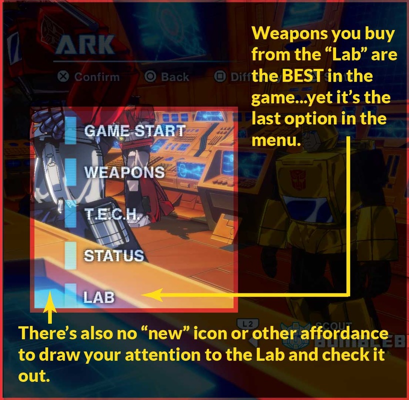
CommunicatE the Importance of the LabAnother thing that gets lost in the shuffle of systems within the Ark is the “Lab” where you buy and sell weapons and undesirable items. First off, “Shop” would be a better term because a “Lab” is where you research or create things (you know...like the T.E.C.H. chip upgrades). “Shop” better describes a place where you buy and sell stuff. Also, the game floods players with low-quality weapons during regular gameplay, so it’s likely that players don’t perceive the need to go shopping for more. One crucial but not immediately obvious detail is that the “Lab” (ugh!) is the BEST place to buy the rarest, highest rank, highest quality weapons, and the inventory changes periodically so that new stuff appears often. Because high-rank shop weapons are the most expensive things to invest money into (aside from Synthesis), it strengthens the reason for the rest of the economy to exist, helping completing a key player-compulsion loop. Better terminology, giving the user some extra feedback (like a reminder or notification when new or rare weapons are in-stock), or even putting the "Shop" closer to the top of the Ark Menu would be more intuitive and would better reflect how its importance to the player's chances of success. Improving discoverability and awareness is never a bad thing. |
Better Filtering and Sorting
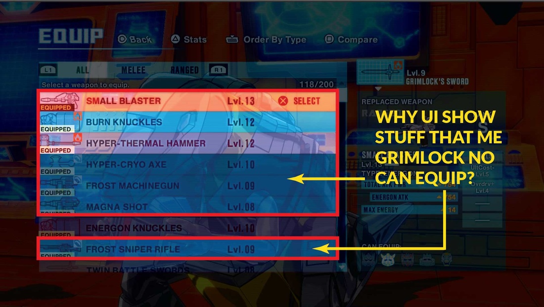
The Difference between a weapon’s Rank and Level is never really explained, but they’re the only sorting options you get on most weapon screens. Attack Power and Sell Value are more relevant to players (and are directly proportional to Rank) so adding relevant filtering options for this would remove a cognitive degree of separation that forces users to think more about getting what they want than necessary. Also, when equipping weapons, the interface will display items on the list that a character can’t equip. This is just unnecessary and makes it more tedious for users to sift through an already overwhelming list. Other sorts, like the ability to sort alphabetically by name, if the item is new, or even if an item is equipped by a certain character (which, oddly, is removed from the Sell screens weapon list) would be helpful. For selling T.E.C.H. chips in the Lab, sorting them by quality and type would also improve functionality.
ALLOW PLAYERS TO MANAGE WEAPONS EN-MASSE
Because of the high frequency of weapon drops and sheer volume of items players deal with, interacting with the menus inside the “Ark” quickly gets unwieldy. The only way for get rid of items is to manually sell or fuse (aka “synthesize”) weapons one by one. Being able to hit checkboxes on a whole batch of weapons to sell or fuse them en-masse (or put them into a special sub-section or box for later disposal) would save users a lot time and busy work of micro-managing their inventory. A more visual, grid layout (versus a list) would reduce the amount of time it takes to navigate through items, but the UX design would need to handle this carefully to not overwhelm users.
Synthesis Improvements
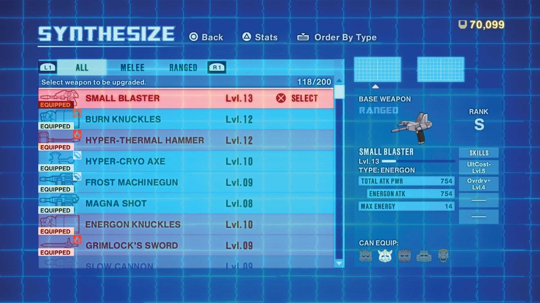
| Synthesis is the process of paying money to fuse two weapons together to make them stronger or instill perk-like properties from one weapon to another. This a pretty essential component of the player's toolbox to make progress in the game, but there are a number of missteps here that sabotage its utility. To synthesize weapons, you have to dive into the deep end of the weapons list and search for the weapons you want to fuse. They try to band-aid this by putting a default sort on the list by what's equipped when the player first enters it, but if you use the other sort functions, your equipped items become lost in the shuffle, because there’s no user-initiated sort for what’s equipped. It’s a safe assumption that the weapons you’ve already got equipped are the most desirable, so what would help quite a bit if allowing players to access Synthesis from the Equip Screen. The game already does something similar with the "Lab" shop interface - you can just press L2/R2 to switch between Buy and Sell modes. Applying a similar degree of functional consistency would reduce a lot of "backing in and out" of menus to do what you want. | "A well-designed interface shouldn't permit users to make errors...more "top-down" thought about what end-users really want to do (or need to avoid)...would improve the UX quite a bit." |
Also, the order in which you chose two items to fuse has a bearing on the outcome. For example, if I pick an “A” weapon first, then select a “C” weapon, then A levels up. If you pick C first, C levels up. This is never explained, and it’s totally possible to level up a crap weapon by sacrificing a high-quality one. A well-designed interface shouldn't permit users to make errors, so some sort of warning if you are about to botch a synthesis would reduce the potential for user-initiated error.
| Other improvements could go a long way to improving synthesis usability. You don't get prompted to equip a new weapon once its been synthesized, it gets tossed back into the huge list for you to sift through and relocate (perhaps it builds character?) Adding this prompt would decrease friction. Better still would be giving players the ability to search for an "ingredient" weapon for synthesis based on the perks they want to add to an existing, highly desired weapon. For example, if the player wants to increase health regeneration when equipping a S-Rank Energon Hammer, the game should let the player search for potential ingredient weapons that have that property, instead of forcing them to sift through tons of trash loot and trying to toggle subscreens and interpret abbreviations. A little more "top-down" thought centered on what end-users really want to do (or need to avoid) versus "bottoms-up" iteration on existing functionality would improve the UX quite a bit. |
Auto-Equip
A quick button prompt or dropdown to “Auto-Equip” the gear with the most Attack Power (or possibly a few other desirable criteria, such as certain perks or bonuses) would cut a massive amount of busy work out of the game and broaden its appeal to more casual audiences. This type of streamlining might even be useful, on occasion, for the more hardcore players who enjoy the tinkering aspects, while not sacrificing the depth of gameplay possibilities that makes leveraging the weapon systems compelling.
CONCLUSION
| All of these proposed changes would not sacrifice the depth or the “good friction” of the customization systems lying underneath the bad UX design. Many of these fixes would reduce the bad friction and complexity that haunts common or frequent tasks, broadening appeal to users that feel obstructed from enjoying the faster-paced aspects of the game because of clunky menu organization and arbitrary or poor design choices. Hopefully with a bigger budget and more time (and some more thought put into end-user experience), Platinum can address these flaws in potential follow-up games. |
If you’ve read this far, thanks for taking the time to check out my blog! I hope that you, like me, want to see Platinum continue to make the best character-action games in the industry (and more awesomely nostalgic and successful Transformers games). What other aspects of TF:D’s UI worked well (or not so well) for you? Share your thoughts and comments below!

 RSS Feed
