Amped-UX
  • Welcome
  • About
    • Endorsements
  • Portfolio
    • HD Game UX Design >
      • Star Wars: Jedi Fallen Order
      • Battlefield V
      • Lost Planet 3
      • Sonic Boom: Rise of Lyric
    • VR & AR UX Design >
      • Starblood Arena
      • World War Toons
      • Fire Escape
    • Web & Mobile UX Design >
      • Precision Digital Health
      • Stacks! Live Streaming Game Show App
      • Smart Events Mobile App
      • Vyndica Mobile Trading App
  • Media
  • Blog

THE AMPED-UX BLOG

THOUGHTS ON UX DESIGN, GAMIFICATION, & VR/AR in LOS ANGELES

Productive XD Prototyping – An Adobe XD Components Tutorial

7/27/2021

Comments

 
 Originally published on theToptal Design Blog and edited by the Toptal editorial team.
Adobe XD’s component system empowers designers with powerful features to prototype digital products. However, it’s not without quirks and needs special care. Utilizing smart shortcuts and following best practices will enable designers to streamline their XD prototyping workflows.
​

Since its official public rollout in late 2017, Adobe XD has made great strides towards becoming a highly competitive wireframing and prototyping tool for UX designers. In particular, its new component system expands the type of interactions with which designers can experiment. Still, components are not without quirks and drawbacks. When working with XD components it’s helpful to adopt a set of workflow practices to avoid busywork and harness the system’s full potential.
Picture
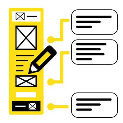
The addition of Components expands Adobe XD’s prototyping capabilities.
Familiarity with Adobe XD Is Recommended

Designers with a fair degree of familiarity with Adobe XD will gain the most benefit from the following tips and suggestions. To get a head start, download the Adobe XD Design Kit from Google’s Material Design home page. The kit will provide an Adobe XD component set to experiment with and deconstruct.

Tip #1- Consider all States Before Creating a Component

​When creating a component with states for the first time, designers should understand how potential changes to a component may affect other instances. To illustrate, let’s consider a dropdown menu with several states:
  • The default state: the menu is collapsed
  • A hover state: the outline color might change when the cursor is over it
  • An expanded, clicked state: the dropdown menu options are shown
Picture
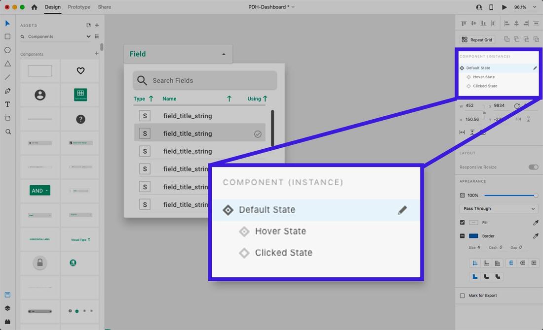
Creation, naming, and selection of component states in the Sidebar.
When editing the default state of a child instance of a dropdown, those changes will not propagate to the hover or clicked states. Changes must be made to the default state in the Main Component to update the hover or clicked states of all instances.

While it can be tempting to jump in and start iterating on Main Components, sometimes unexpected issues happen due to the differences in how parent and child components behave.

A good practice is to consider and anticipate everything needed in the Main Component’s default state before adding other states or instantiating the component—even going as far as laying out the different states side by side.

Designers should also bear in mind that they can add and change elements in non-default states of the Main Component or child instances without affecting the default state, but the reverse isn’t true.
​
A recommendation for Adobe: Give component states a lock feature so designers can keep non-default states intact and prevent changes to the Main Component’s default state from propagating.
Picture
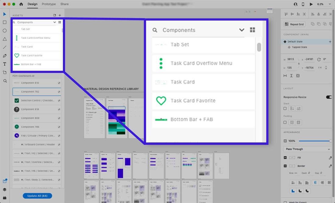
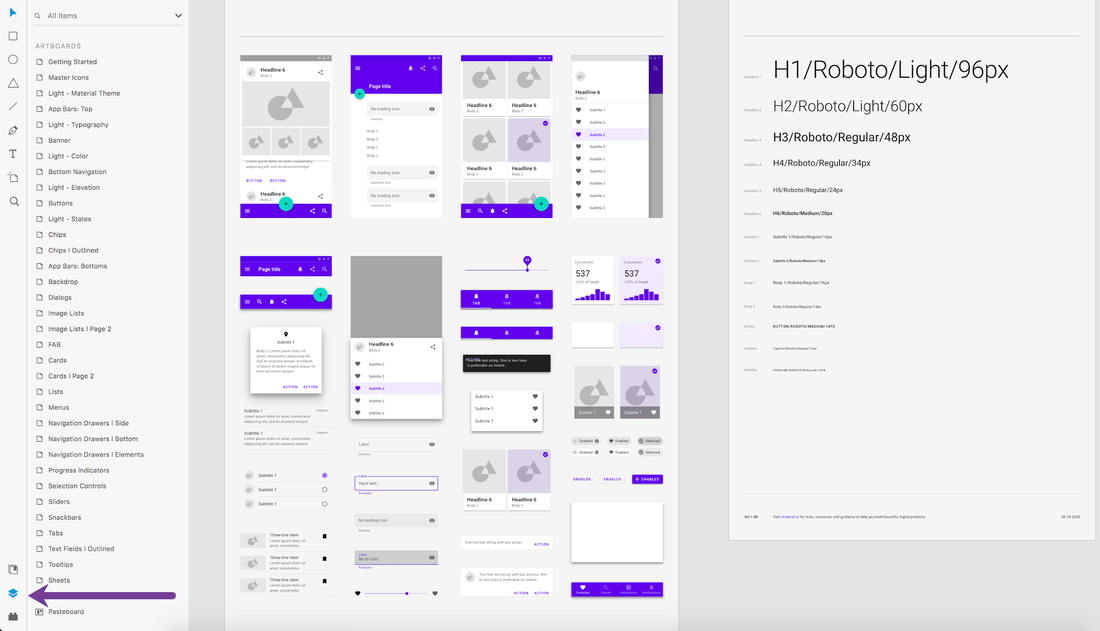
Components can be inspected in detail in the Assets panel.
Tip #2- Name Components on Creation

Creating a component (right-click an element, then select “Make Component” in the menu, or press Cmd-K on Mac/Ctrl-K on PC) adds the component to the Assets panel in the left sidebar. XD will give the component a default name of “Component XX” (where “XX” is a number). It isn’t very descriptive, so it would be best to give it a unique, searchable name.

Why do it? As the components list fills up, it will become unwieldy if components all begin with the same default name and a meaningless number. While the “tile view” option helps, it has no text labels, making visual identification slow and challenging. The “list view” with small thumbnails also makes it hard to identify differences between components with indecipherable names. Components can and will get lost. Making them searchable by naming them will save time later.

A recommendation for Adobe: When creating a component, auto-select it and focus the user on the Assets->Components panel to rename it or bring up a naming pop-up. It would also be helpful to make it possible to toggle this feature in Preferences.
Picture
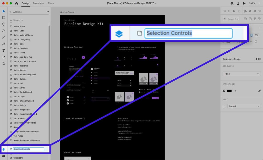
XD components can be organized and renamed in the Assets panel.
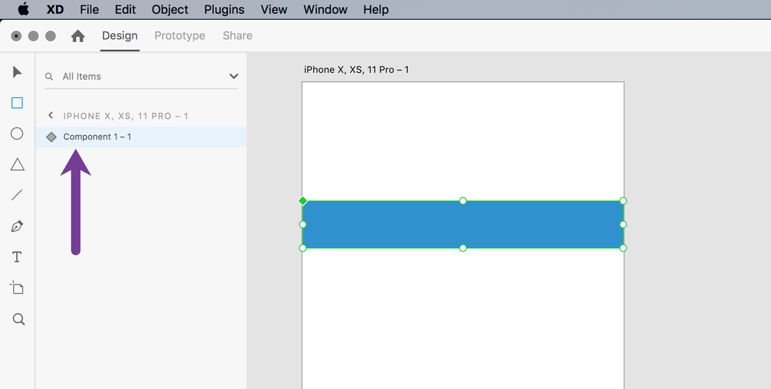
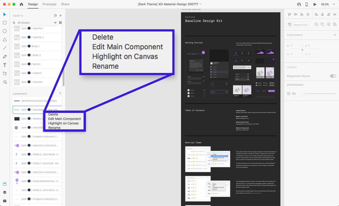
Tip #3- Keep Main Components Organized

When creating a component, it’s easy to place the Main Component on an artboard by accident. While XD provides tools to find Main Components (either by searching the Assets panel or right-clicking and selecting “Edit Main Component” from a child instance), it’s all too easy to make unintended changes to the Main Component while believing it’s an instance. Doing so may lead to many undesired changes across multiple artboards.

Even if there are only a handful of component instances on an artboard, things can quickly get out of hand once an artboard is cloned. An inadvertent change to the Main Component can add up to cleanup time that could have been avoided.

It’s best to get into the habit of moving Main Components away from design artboards immediately upon creation. An ideal way to do this would be to place Main Components on the pasteboard in the XD file or on clearly labeled, dedicated Artboards. Doing so will make things more efficient later.
​
A recommendation for Adobe: Consider a prompt when making changes to the Main Component so designers are warned that the changes might propagate to child instances.
Picture
Naming layers carefully is vital as using Auto-Animate transitions are heavily dependent on it.
Tip #4- Stay Organized with the Layers Panel

It’s easy to try out ideas on the artboard and get in the flow of grouping/ungrouping components and changing component states’ properties. There might be a strong temptation to minimize the left sidebar to have more working space. However, there’s a good chance that component states and transitions won’t behave as expected in the flurry of iteration. This may occur because the organization and grouping of sub-elements (such as shapes, vectors, or text) have drifted away from what they needed to be for the transitions to work correctly.

The Layer view provides 100% transparency into the hierarchy and naming of elements, and its airtight organization is vital. Using XD’s powerful Auto-Animate transition between states requires elements to have the same name and position in a component’s layer hierarchy. Otherwise, the transition will default to a fade instead of an appealing Auto-Animation.

At times, it may be desirable to suppress a property from interpolation when Auto-Animating transitions. To achieve this, designers can rename an element in a different component state or artboard to break the name-based link.
​
In either case, the Layers view can be used to troubleshoot when unexpected problems arise. It should be the first step when debugging prototyping issues, whether it’s a transition between component states or between artboards.

Picture
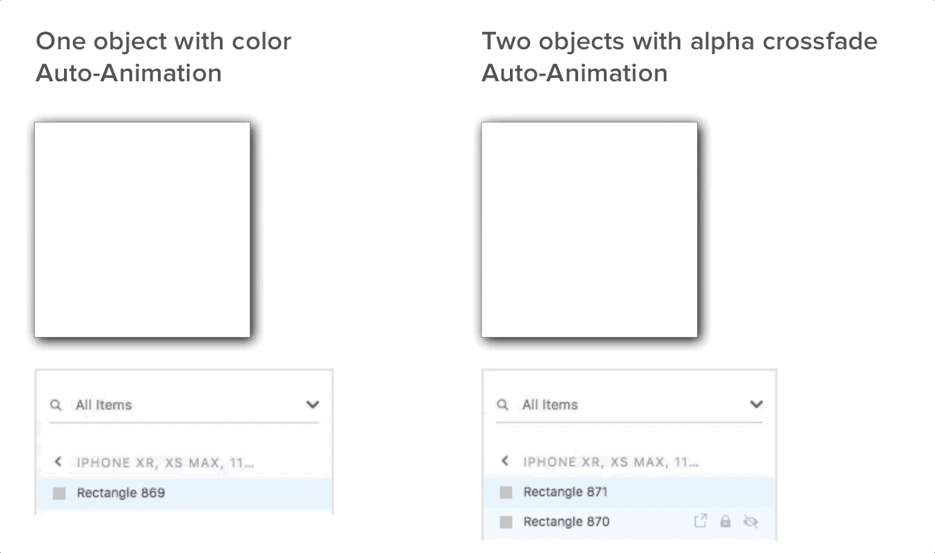
How to crossfade colors correctly using Auto-Animation in XD.
Tip #5- Use Alpha Fading to Interpolate Colors

​Auto-Animate is an excellent addition to XD but comes with limitations and idiosyncrasies. One of these quirks becomes apparent when changing an element’s color between two component states or artboards using Auto-Animate. Instead of a smooth interpolation between the two colors, it changes abruptly when tested.

The current workaround is slightly awkward and has ramifications for how Main Component states should be organized. It involves adding two objects with different colors instead of one and then crossfading the alphas on the two objects in both states to achieve a smooth transition. The default fade transition may work, but if interpolating shapes and sizes with Auto-Animate, a fade may not suffice.
Picture
Tip #6- Leverage Components in a Repeat Grid

The Repeat Grid is another excellent timesaving feature in XD
 that makes it easy to organize and maintain arrays of similar elements. Like components, Repeat Grids have a hierarchical relationship where the first element in the grid’s top left corner is the “parent” that defines properties for the “child” elements. (There are exceptions to this: bitmaps can be unique for a child element, as can text strings, but not text properties.)
However, when using components within Repeat Grids, things change.
​
When working with Repeat Grids normally, changes made to the parent propagate to its children immediately. However, Main Component changes only propagate to the children in a Repeat Grid if there are no local property overrides. In other words, changing a component’s property in the grid “locks” it from changes propagating from the Main Component.
Picture
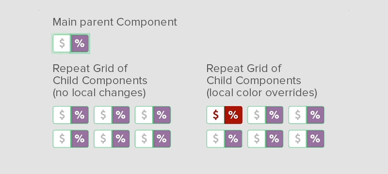
A local color property is locked within a child instance component in a Repeat Grid, but not the size.

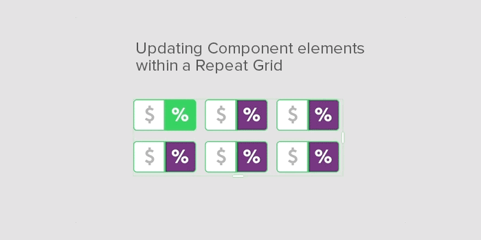
​To propagate changes from a parent that is also a component in a Repeat Grid, resize the grid down to the parent only. This removes its children. Then, drag the handles back out to the desired dimensions to update the children.
Picture
Once designers can work around the peculiarities of components and Repeat Grids, combining them can be powerful.
Tip #7 – Assume Time-based Component State Transitions Don’t Exist (For Now)
When applying transitions between artboards using time-based delays (not based on input), it’s natural to assume that the same is available between component states. Unfortunately, this is not the case. All component-based state changes have to be based on user input or interactions in prototype mode, not time.
​

A recommendation for Adobe: Add a time-based transition option to components so their states can animate independently of user input.
Picture
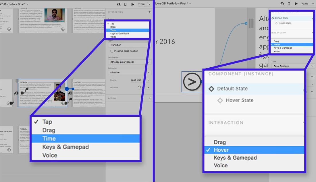
Time-based transitions exist only between artboards, not between component states.
Tip #8 – Be Thorough when Cloning Main Component Hierarchies 
​This last tip is more of an edge-case that XD designers may not often encounter but should be aware of.
Let’s assume a scenario where the Main Component needs a variation that still retains the “one-to-many” quality of children inheriting properties but doesn’t affect any existing child components. To create a new parent component hierarchy, an instanced component must be ungrouped and rebuilt from scratch. Ungrouping components will also lose all the states and transition properties set up in Prototype mode. Here’s a workaround:
  • Clone an instance of the component for each state in the component.
  • Set each instance’s state to a different state.
  • Go through and ungroup each component instance.
  • Start making desired tweaks and changes to each component instance.
  • Recreate the new Main Component.
  • Go into prototype mode and recreate the interactions and transition types that were set up before.
A recommendation for Adobe: When right-clicking the Main Component in the Assets panel, provide a “duplicate” menu option.
Picture
Prototyping with Adobe XD Components: Takeaways for Success
Adobe XD has made significant improvements in functionality and utility in the past few years. It has grown into a worthy, competitive alternative to Sketch and other established prototyping tools. Based on how the tool has evolved since its debut, many more improvements are likely on the way.
​
In particular, the Adobe XD component system has excellent potential to improve and expand upon the types of interactions designers can create.

Here are some key takeaways to keep in mind:
  • Understand how changes propagate between Main Components and child instances.
  • Be aware of how components interact with Adobe XD’s other features, such as Auto-Animate and the Repeat Grid.
  • Strive to adopt consistent workflow practices to save time, such as naming components and maintaining a separate Main Component pasteboard area in the XD file.
Being mindful of the idiosyncrasies of working with Adobe XD components, while maintaining a disciplined workflow, will maximize design productivity. It will avoid unnecessary cleanup and maintenance and give XD designers an efficiency edge when prototyping digital products.
Comments

FIVE UX DESIGN FIXES FOR ZELDA: BREATH OF THE WILD

3/25/2017

Comments

 
Picture
Nintendo's latest chapter in the classic action-role-playing LEGEND OF ZELDA saga, ​BREATH OF THE WILD (BOTW)  has garnered deserved praise for presenting users with an immense, emergent open-world full of discovery, surprise, and charm.  If you're reading this, and you're anything like me, spending time in the fantasy realm of Hyrule consumes both  your thoughts and free time. However, as I've been digging deeper into the game, I started to notice some areas that could benefit from a few quick  user experience (UX) design improvements  to reduce some  bad friction and busywork. I wanted to share these thoughts today as I believe these  changes would result in  a more fluid and intuitive user experience.

STREAMLINE EQUIPMENT MANAGEMENT

BOTW offers a much  wider variety of  equipment than    ZELDA  games in the past, but the weapons and bows can break after extended usage. While there has been some online controversy about the wisdom of this decision, I'm not questioning it.  In fact, I think it works because in the context of a much larger world to explore, players need a continuous feed of new and interesting weapons and choices to try, as this provides tactical variety and supports longer-term mechanical engagement.
"...if you don't have any space, it tells you you're out of room, and nothing more. This is an error, and good UX designs don't permit users to make errors, they handle them."
The problem starts when the player walks over a dropped weapon and a UI button cluster prompt appears on-screen to pick it up. If you have space in your limited weapon inventory, no problem. However, if you don't have any space, it tells you you're out of room, and nothing more. This is an error, and good ux designs don't permit users to make errors, they handle them. This happens often because users tend to horde weapons.  

To get around this, users have to press Start, navigate into the weapons tab, search for a weapon they don't want, select it, then navigate to the "Drop" item in a sub-menu.   This problem with full weapon management is made worse when a new weapon is inside a treasure chest, since the chest closes when the user doesn't have enough space to pick up the weapon inside. This  requires the user to re-open the chest after going through the previous routine of clearing out weapon inventory space.
One of the ways I work around this clunky  method is to press the Right Bumper to throw the  undesired weapon away (which can be used as an attack move, such as to throw spears). This works for melee weapons, but bow and arrow weapons can't be thrown away, nor can shields. In this case, if you have full bows or shields, you have to  browse through the equipment menu again to drop something.  
Because you are dropping and switching equipment in the UI with greater frequency, users will likely encounter unnecessary friction. The best fix to avoid this clunky experience would simply be to  add a context-sensitive "Swap" option that only appears when the user tries to pick up a weapon or open a chest when the weapon inventory is full. This would no longer force users to go through this frequent and tedious routine,  making weapon inventory management more fluid and keeping users focused on the adventure and exploration, not futzing with menus.
Picture
Users shouldn't be left hanging and have to see this.

GIVE USERS Shortcuts tO Food

Picture
Shortcuts to Food would make combat more fluid and fast-paced.
One of the  more consistent hallmarks of UI design in the ZELDA franchise, even since the 16-bit era,  has been the ability to remap the button functions to use different items. With  BOTW​ we now have a system of magic rune powers that gives users agency over the game's physics systems, and an  ingredient and cooking system  that allows users to create different food items and elixirs to restore health  and/or grant status benefits, like increased damage or resistances.
While you can select from the magic runes by pressing and holding DPad Up (more on this in a bit), there is no quick access to food items.  Instead, users have to press the Start button, browse  to the Food tab, sort through several sub-pages, then sift through  an item matrix  to read and evaluate which dish or elixir confers the desired status effect and/or restores the right  amount of health (too much health would waste the food's benefit, too little and the user has to eat multiple items).
This UI song-and-dance routine wouldn't be so bad if it didn't happen all the time, but combat tends to be less forgiving and more lethal in this new  ZELDA  than previous entries in the franchise.  Even within the first several dozen hours of play it's quite common for enemies to nearly kill you  in one hit, requiring frequent pauses during  combat  to sift through menus and evaluate healing/buff items.
"...frequent pauses during combat to sift through menus and evaluate healing/buff items ... puts quite a crimp of the pacing and fluidity of combat."
This puts quite a crimp on the pacing and fluidity of combat, so one possible solution would be to clear up one of the DPad directions for a list of user-configured  Food shortcuts to better support personalized, predetermine playstyles and introduce more of an element of planning versus clunky reactiveness. Here are two potential solutions, both of which would involve a number of cascading changes to  the UI to make it work.
  • Relocate the Horse Whistle -  Pressing DPad Down makes the player character ("Link") whistle to  summon his current horse. While it's a semi-frequently used function, an acceptable tradeoff to place this one or two steps away. It could be grouped within the Rune Magic functions, or contextualized as a special item like a whistle or ocarina and placed within the Start Menu.  Many times the horse can't reach the user anyway (due to distance or obstacles), so  this is another instance of UX design permitting bad friction by allowing uncertain or undesired outcomes.  
Picture
There's no reason you couldn't browse bows and arrows in a 2D matrix versus a linear row.
  • Relocate the Arrow and Shield Switching functions - Pressing DPad Left brings up an auxiliary menu that permits users to select shields or arrow types, depending on the primary  weapon type the  user has  currently selected. In my experience with the game so far, the frequency that I need to switch my shield or arrows  is either moderate  or infrequent , so these functions could be relocated.  Expanding the primary weapon selection (on DPad Right) from a  linear row of weapon selections to a matrix of 2 rows would achieve this. In the case of the melee weapon selection,  the top row would be weapons, while the bottom row would be shields (which would be greyed out if the player selects a two-handed weapon). If the user draws their  bow, then the top row becomes bows, while the bottom becomes  the arrow types. 
Regardless of the solution used, users would also  need an additional submenu item added when selecting food items to "Add to Shortcuts" or "Remove from Shortcuts." There may need to be some additional constraints around the number of food shortcuts users can  add, but I don't see a reason why the food shortcut UI couldn't be a unlimited 2d matrix instead of  a linear list, or it could be contextualized as a limited but upgradeable quantity, much like the weapon capacity upgrades users find later in the game. 
Learn how UX design makes videogames better! Subscribe to our quarterly newsletter for your FREE Minimal Viable UX PDF!

MAKE RUNE MAGIC SELECTION MORE FLUID

Another solution to free up one of the DPad buttons for Food Shortcuts  would be to revamp  or streamline the Rune Magic selection interface. Selecting a specific Rune is a little clunky - users have to press DPad Up to bring up the Rune selection UI, then use  the Right Analog stick to browse through the linear list, release DPad Up, then hold the Left Bumper to activate the Rune power, which usually requires another few steps, such as  aiming with the Right Stick, then throwing or dropping one of two bomb runes or activating the power  with the "A" Button.  

What makes the Rune selection process slightly clunky is that if you hold the Left Bumper to  enter the Rune mode, and you have the wrong power selected, you have to back out and go through the Selection process again.
A more fluid solution would be to change the function of the DPad  during Rune Magic mode so that it overrides the weapon  selectors. Users  can't use weapons, shields, or arrows, during Rune Magic mode anyway, because the mode  tends to be used more for  solving physics puzzles (though not always).  Because there is less of  a pressing need to configure weapons in Rune Magic mode, changing powers on the DPad would enable users to  swap between the different Rune magics more fluidly without the need to fiddle with backing in and out of the current Rune Magic UI to find the power you want.

WARN USERS THAT FOOD STATUS BUFFS DON't StACK

During a recent session, I had just washed down a roasted fish and mushroom skewer with a speed elixir to take out an ancient  guardian robot, when I discovered that many food buffs don't stack. Instead, the effect of one food item overrides the other. While I  would've preferred to err on the side of greater user agency and allow stats to stack, especially in a game that emphasizes player freedom and agency over saying "no" to the player, I can understand that it might make combat too easy.  

​What I would  prefer to see would be some warning or confirmation prompt that you're about to replace and lose your previous buff.  This would be especially helpful if you just consumed a rare, high value, or powerful food item and was about to wipe it out with a weaker one, preventing user error. 
UPDATE - looks like this is conveyed in a tooltip in the loading screen. While this helps somewhat, this feedback is out of context because the tool tips are randomized. The feedback would be better conveyed at the point of interaction.

GIVE USERS BETTER Item SORTS

Picture
LOTS of items, one sort...
When you sort items, like ingredients for cooking or crafting, there is one sort type and it doesn't really tell  you much  about the method it chooses to sort by. It seems to be by a general type (such as fruit, plants, meats, critter, mineral, for ingredients, and then by effect type for food).  But in some instances, this enigmatic sort is not helpful. What if you're talking to a merchant and you want to sort the items by worth to find out what's the most valuable item? Nope! You have to sift through items one by one to see how much you can sell them for.  How about sorting them by what you have the most number of items? Ditto, no can do.
This fix is pretty simple - just enable the sort button "Y" to cycle through a few additional sort types and adding a few text labels ("Sort by Value", "Sort by Amount", etc..) to improve usability and alleviate inventory busywork.

CONCLUSIONS

It may seem a little nit-picky to call these UI design issues  out in a game that succeeds at significantly changing  up stale aspects of the ZELDA  formula and achieving what Nintendo set out to do - creating a truly emergent and enthralling world to explore. But there's always room for improvement, and who knows, maybe someone at Nintendo will read this and think about it for future patches.  What do you think? Are there other things about ZELDA ​'s UX design that could be done better ?  Please share your thoughts in the comments. Thanks for reading!
Comments

WATCH THE AMPED-UX YOUTUBE CHANNEL

2/23/2017

Comments

 
Picture
Howdy kids, I'm excited to unveil our  own AMPED-UX Youtube channel!  We're kicking things off with a 9-part  presentation of my "Frontiers of Virtual Reality User Experience" talk from SoCal UX Camp last summer, conveniently sliced and diced into bite-sized 5-7 minute chunks for you to enjoy. 

Check out my sick moves (as well as  useful tactics, insights, and best practices on  VR UX Design) by clicking/tapping my happy dance gif or the button below.  

​Enjoy it, would love to hear your feedback and thoughts!
Watch AMPED-UX on Youtube
Comments

STARBLOOD  ARENA  ANNOUNCED  FOR  PLAYSTATION  VR

12/5/2016

Comments

 
 I wanted to  extend a quick congrats to our friends over at White Moon Dreams for the recent announcement of  STARBLOOD ARENA    for Playstation VR.  Last year, AMPED-UX collaborated with the team at White Moon Dreams to assist with UX design and research for  this multiplayer shooting game.  We're excited to see it finally revealed to the public at the recent Playstation Experience event in Anaheim!  Check out the video below, and if you're interested in UI, UX design, or research services  for your VR or gaming project, hit me up in the comments or contact us today!

PRESS TO WATCH
Comments

MINIMAL  VIABLE  USER  EXPERIENCE:  UX  FOR  STARTUPS  (PART  THREE)

6/8/2016

Comments

 
Welcome back to our third and final part of our Minimal Viable UX article series.  In Part One, we outlined a high-level definition for UX, what Usability is, and presented the first "flavors" of UX practice, namely User Research and Content Strategy.  

In Part Two, we continued exploring the concepts of Information Architecture, UX Design, and Prototyping.  

​In this article, we'll wrap things up by discussing Visual Design, Interaction Design, and finally, Gamification.  Let's begin!

Picture
Visual Design is in the eye of the beholder.

WHAT  IS  VISUAL  DESIGN?

Often referred to as “Graphic Design,” or more confusingly “User Interface Design” or “UI Design,” Visual Design is the process of using fonts, typography, color theory, composition, and iconography to establish or reinforce a product’s visual aesthetic and emotional appeal.  Visual design directly supports a product’s given Content Strategy and is a crucial component of branding.  Graphic Designers create “mood boards,” “style guides”, or “pattern libraries” to establish conventions and standards for what all the widgets and interactive elements will look like across all parts of a product.
Since it’s visual, it’s also the part of UX design that is often the most apparent to end-users once it’s implemented.  A lot of people believe that Visual Design is what you’re talking about when you talk about UX.  It’s not an entirely wrong conclusion to make, but it’s missing the big picture of what UX really is.  To highlight how confusing this can be, I’ve had more than one prospective client ask me “what’s the difference between UI and UX anyway?” to which I reply, “UI is just manifestation of an intended strategic user experience strategy...yada yada...buzzword buzzword.” Once the eyes begin to glaze and the nodding starts, we move on! ​
"People believe that Visual Design is what you’re talking about when you talk about UX.  It’s not an entirely wrong conclusion to make, but it’s missing the big picture of what UX really is."

WHY  IS  VISUAL  DESIGN  IMPORTANT?

UX Design and Visual Design are two sides of the same coin.  It is entirely possible for a product to have great Visual Design with amazing looking icons, slick animated transitions, and perfectly vivid colors, but if the underlying UX design is not sound, using your product will still frustrate and annoy your users.  On the flip side, purely functional user experiences can look totally dry and boring, or feel like they are meant to appeal to no one.  Great, attractive visual design spices things up and makes your product pleasing to look at and use, and without it, you risk sabotaging your product’s potential emotional appeal, as well as its ability to connect to your target market.
"If you've invested in sound, underlying Information Architecture and UX Design, with some market research, a rebranding in Visual Design and Content Strategy, and a few UX tweaks, you could  shift the focus of your product to a totally different demographic..."
Also consider the power of how your startup can leverage Visual Design in conjunction with Content Strategy to appeal to different target markets.  Let’s say that you’ve built an intuitive, functional, and beautiful e-commerce app or website on top of a robust back-end architecture, selling apparel and accessories for automotive racing enthusiasts.  You’re looking at your analytics and your revenues, and it turns out that this target market just isn’t as lucrative as your team had hoped.   Instead of shutting down your startup, if you've invested in sound, underlying Information Architecture and UX Design, with some market research, a rebranding in Visual Design and Content Strategy, and a few UX tweaks, you could  shift the focus of your product to a totally different demographic, such as  selling pet supplies and accessories for gamers.  Same functionality, but with a new aesthetic approach to appeal to a different, and perhaps, unserved demographic.  Visual Design is not just a superficial coat of paint, kids.

WHEN  SHOULD  I  USE  VISUAL  DESIGN?

Picture
The timing for Visual Design can be more flexible than other UX practices, as it is entirely possible to create mood boards, style guides, or other visual branding materials before UX Design begins or to do so in parallel with it.  For example, you may know that you’re going to need certain basic interactions like buttons, checkboxes, or carousels for a mobile app, long before the wireframes and flows get made up, and you can begin to have early conversations about typography, color schemes, or general art direction for iconography.  Visual Design should still happen after some basic User Research occurs (so you know who you're making your product for and and have an idea of what  aesthetic choices best appeal to your users) and also align with bothearly and ongoing Content Strategy efforts, as you still need to produce visual content to promote and market your product online after it launches.
On the flip side, a bad time to begin Visual Design would be later during Development or during the Launch and Observe phase.  In this instance, Visual Design should be supporting Content Strategy and marketing, not necessarily development.    There’s a reason why “programmer art” is not viewed in an entirely positive light (apologies to any programmers out there) so don’t short-change one of the most critical parts of your product’s lifecycle with something that looks unattractive or placeholder.  This could curtail or undermine your carefully crafted product’s appeal or professional perception, and first impressions count.  ​
To learn more about Visual/Graphic Design and how it can help your startup, here is  a link to  an helpful article on Design For Founders  that's chock full of links and resources for how your startup can improve it's Visual Design.

Picture

WHAT  IS  INTERACTION  DESIGN?

 You may hear the term “Interaction Design” and wonder how it relates to the other flavors of UX.   It can get confusing to talk about all these different terms, but like Prototyping, Interaction Design (IxD) is a specialized subset of UX Design, informed by visual design, that deals with making user inputs and moments of interaction as useful and emotionally resonant as possible.     Interaction Designers achieve this using animations, audio, visual effects, or other forms of feedback to enhance interactions, making them more pleasing and delightful.  
Consider this metaphor to distinguish between UX Design and Interaction Design.  A Disneyland ride, say like Pirates of the Carribean or It’s a Small World, is definitely a User Experience.   You're intended to see and hear different types of information, experience feeling and sensory feedback at key moments along a linear progression of events.  You see animatronic characters talk, dance, or sing, see flashes of light, or feel moments of laughter, surprise, or even fear.   But there is little to no input or interaction, aside from getting in and out of the boat.  So there's almost no Interaction Design involved.
To put it another way, if you’re planning cross-country roadtrip with your best friends, the UX Designer would come up with the list of cities to visit and the directions to follow in between them (assume it’s the 90’s and Google Maps doesn’t exist yet, kids).  The Interaction Designer, on the other hand, would implement a perfect evening by getting front-row tickets to a concert or show, followed by reservations for dinner in one of the best restaurants in town.
Therefore, the role of the UX Designer tends to be more big-picture or strategic, while the Interaction Designer serves a more specialized, tactical purpose, much like a Prototyper.  But how does this manifest itself in actual product development?  Interaction Design does overlap with Visual Design in terms of how interactive elements should look and feel, and uses many of the same tools as Prototyping.   Unlike Prototyping which focuses on early state disposables or throw-away work made with the intent to learn, Interaction Design builds on firmer foundations as it is the process of making Visual Designs come alive (within the context of a larger User Experience designs) and is meant for use in a product that's about to enter the launch phase.
Also consider the realm of Industrial Product Design where a company produces some form of physical goods or hardware, such a producing a dishwasher or microwave.   The role or functions of a  visual designer may not be present on the team, but  Interaction Design thinking would determine how pressing buttons is pleasant and gives user sufficient feedback.
"The role of the UX Designer tends to be more big-picture or strategic, while the Interaction Designer serves a more specialized, tactical purpose..."

WHY  IS  INTERACTION  DESIGN  IMPORTANT?

Good Interaction Design, in alignment with Visual Design, can make a product delightfully responsive to user inputs and provide users with the feedback and information they need to make informed decisions and continue meaningful interactions with the product.  For every input, there may be one or more outcomes or outputs.  When entering data into a form, there are correct and incorrect outcomes, and both need to be communicated to the user.  Without a good Interaction Design and feedback, users might be left feeling confused, disconnected, or may experience friction.  Sometimes strategic UX Designers can overlook these “edge-cases” or don't design the product to  handle errors as elegantly as possible - this is where good Interaction Design can come into play and fill in the blanks.     Like Visual Design, good interaction design enhances and deepens emotional connection and appeal between users and products, reduces friction, and promotes usability through polished experiences.

WHEN  SHOULD  I  USE  INTERACTION  DESIGN?

Picture
Unlike UX or Visual Design, Interaction Design tends to come later in the Product Lifecycle, when there is greater certainty about the functional need to develop an interaction within an established visual, aesthetic style.  It may make less sense, for example, to invest time and money into developing refined button animations, pop-ups, or screen transitions if you’re still in the Gathering/Definition phase, or if you’ve developed a throw-away prototype.  It’s also possible that a UX Designer or a Visual Designer on your team can fulfill your Interaction Design needs using many of the dedicated UX design tools  for wireframing and prototyping.  It depends on the scope of the project, the tools you use, and the abilities of the people on your team.   Having someone who has an instinct for motion, animation, audio, or other forms of feedback to make interactions more effective and delightful, is worth considering and pursuing.
To learn more about Interaction Design, check out this helpful article on UXBooth that goes into detail on the history of IxD,  tools, organizations, and  prominent authors and influencers in the field.

Picture

WHAT  IS  GAMIFICATION?

Gamification is not necessarily a component of all UX projects, but it bears mentioning here as it’s a very specialized and unique part of the toolset of some UX designers (like yours truly!)  Gamification is the process of adding elements of game design or game theory into a product or service’s feature set to recognize and reward desired patterns of behavior.  Such elements often include typical features like “leveling up” with “experience points” or earning rewards like “trophies” or “badges” for maintaining habits and engagement over time.  But they can also utilize elements of choice-making, customization, and goal-setting so users feel more deeply invested and motivated to interact with your product.  
​

WHY  IS  GAMIFICATION  IMPORTANT?

While gamification UX design techniques could be used in less than savory ways to encourage addictive or compulsive behaviors, for health, learning, or lifestyle products intended to help users develop new habits with tangible, real-life benefits, it’s a powerful game-changer (yes, cheesy pun intended)!  For example, Duolingo is an app that’s been clinincally proven to be effective at teaching people how to learn foreign languages, thanks to it’s playful visual design, different types of language exercises, and gamified elements.  Codecademy is a website that teaches people how to code, using gamification to help keep users motivated and understand how much progress they’ve made when learning programming languages.  Careful use of gamification not only boosts user retention and long-term engagement (and in turn, amplifies your startup's performance), it also makes apps and products just more fun!  What’s not to like about that?

WHEN  SHOULD  I  USE  GAMIFICATION?

Picture
Like other forms of UX design, Gamification is most effective when it is integrated early into the Product Development Cycle.  If your User Research during the Requirement Gathering and Problem Definition phases have identified a potential opportunity for the habit-forming and engagement boosting benefits of gamification, then it helps to integrate it into your UX Design and, to a lesser extent, your Information Architecture.  The reason for this is that to implement a Gamification strategy, you need to first identify the patterns of interactions and behavior your product needs to recognize, then how you reward them.  This involves understanding what types of data and information you will track about users on the back-end, and how this information gets filtered to the user.  You may also need to design and develop an interface for the Gamification designer to tune these systems and add content, such as unlockable rewards.  This interface may not be customer-facing, so that’s why Gamification may  have some bearing on Information Architecture.
Also, Gamification may need to coincide with ongoing User Research during later parts of the Product Lifecycle to asses how the tuning of the Gamification systems affects end-user feelings of achievement, progress, and connection.  If the product doesn’t recognize and reward user habits frequently enough, then the level of user engagement may be adversely affected.  It’s a careful balance to achieve and works most effectively when a Gamification specialist has a User Research feedback loop or process in place to get data on refinements and adjustments.  ​
For further information on Gamification and how it can help your startup, here's an article from Mashable  that talks to entrepreneurs (like you) about  how gamification benefitted their company.    Enjoy!

WHAT  ARE  YOUR  MINIMAL  VIABLE  UX  NEEDS?

Thank you for checking out this blog series.  Now that we’ve gone over all different components of UX, do you have an idea of what your problems are and what kinds of solutions you need for your startup?  Share your thoughts and describe the type of UX challenges you’re facing.   Or, write a comment below with your thoughts and opinions if you’d like to chip in your $.02 or share a counterpoint, if I’ve said something you disagree with.  This likely isn’t an exhaustive or definitive list, as User Experience, like everything in tech, continues to evolve and change as time goes on. ​
Comments

MINIMAL  VIABLE  USER  EXPERIENCE:  UX  FOR  START-UPS  (PART  TWO)

5/30/2016

Comments

 
Welcome back to Part Two of Amped-UX’s “Minimal Viable User Experience - UX for Start-ups” series.  In the last part of this series, we described a high level overview of what User Experience is and talked about the importance of several concepts and "flavors" of UX, such as Usability, User Research, and Content Strategy.   For this installment we’re going to take a look at the practices of Information Architecture, UX Design, and UX Prototyping.

WHAT  IS  INFORMATION  ARCHITECTURE?

Picture
When a big building is made of bits and bytes, there's often more than one UX design that flows through it, and they don't serve the same end users.
Information architecture (IA) is a fancy word for the process of designing multiple end-user experiences or "environments" that are all intended to share or access a similar base of information.  At its core it is the process of tackling a big complex problem (consisting of all the data, requirements, and features that a product or platform needs to support) and organizing a plan to distill it into smaller, more discrete, and more manageable chunks.  Each of these chunks may be  focused on the needs of multiple yet dissimilar end-users who all need access to the same source of information.
 Sounds important, doesn’t it?  It sure is!  Truth be told, I dislike the term "IA" as good UX is about promoting clarity and reducing confusion, so it’s ironic that this term is less immediately obvious than others, but it's arguably the most complex part of UX.  A helpful metaphor I picked up is that information architecture is the design of a holistic structure of a building, like a museum, including the public galleries as well as all the wiring, lighting, plumbing, security, and AC system.   One user's experience may entail following one path through the front-door of this metaphorical museum where they see the latest public exhibits, but much of the underlying complexity remains hidden.   Another user experience defines how an electrician or plumber accesses and interacts with the museum, which entails both more "under-the-hood" information and complexity that offers a  completely different experience from what   public users see.
 IA, then, is a form of research, but unlike content strategy and user research which focuses on the needs and behaviors of external customers and how best to reach them, IA focuses more on the technical needs and constraints  of internal resources with a greater emphasis on information technology and engineering.   An information architect not only needs to think about the needs of multiple end-user needs as uncovered by user research, but they have to balance those against internal needs and resource/technical constraints  when making important architecture decisions ​.

Why  is  Information  Architecture  Important?

Coding is hard, mentally taxing work.  Software projects don’t have unlimited funds, good programmers are expensive, and development almost always takes longer than you expect.  If you have bad IA or are lacking in it, then like a house built with no plans, you risk building something that lacks durability, cohesion, or structure.  As your startup operation grows and you add weight and pressure to this house beyond what it was designed to handle, it will start to strain under the pressure.  This manifests itself as confusing UX, friction, or unmet end-user needs.  It may lead your engineers to implement band-aid fixes or temporary work-arounds, when what is really needed is to start from scratch and architect a new, robust solution to handle more complex needs.
"If you have bad IA ... you risk building something that lacks durability, cohesion, or structure ... This manifests itself as confusing, poor UX, friction, and unmet end-user needs ...What is really needed is to start from scratch and architect a new, robust solution to handle more complex needs."
Also, if insufficient time is spent on information architecture, you may find that you’ve overlooked critical tools or that other end-users on your team or your client needs to do their job effectively.   For example, a content marketing team for a big e-commerce site might need a web-based CMS tool to upload photos and videos onto your site to promote new item releases or promotions, while your customer service end-users need back-end tools to track and document complaints or associate them with specific orders.  Good information architecture boils all these requirements and data into the simpler, more actionable plans, anticipates as many of the unexpected use-cases and exceptions as possible so that a large-scale software can deliver holistic value to all your end-users most efficiently.

When  Should  I  Use  Information  Architecture?

Picture
Not every startup needs an Information Architect, but if you do, use IA early. Under certain circumstances you may have to wind it back up post-launch to support different end-user types as your startup grows.
The short answer is that it depends! There is a natural overlap between UX Designers and Information Architects, as both roles entail asking effective questions to uncover  end-user needs, internal constraints, and making decisions based on those findings. Some projects are sufficiently simple that hiring an official, formal Information Architect separate from a UX Designer may not be necessary (for example, a simple mobile game).  Other projects have massive amounts of information to sift through, such as websites that can be accessed from mobile or desktop in multiple languages, and have teams or other departments that are not customer-facing.   If your project is likely to have a large team of engineers or multiple end-user personas to support, or large distributed teams and departments, then Information Architecture is likely to be something you’ll need to front-load as much as possible before any major coding or development efforts begin.  It should also occur in parallel with User Research and Content Strategy and should precede or run in parallel with UX Design.  
If you'd like to learn more about some more in-depth Information Architecture books and resources for further review, check out this helpful  article from UX Matters.

What  is  User  Experience  Design?

Picture
UX Design is the process of taking the all the requirements, features, and constraints informed by other UX practices and starting the official process of organizing information, and features into a form that defines the moment-to-moment experience of moving through your software. This can take the form of rudimentary sketches, flowcharts, screen mockups, and diagrams called wireframes.  The purpose of these materials is to detail step-by-step how the software guides users to experience and interact with functions and information, and how all the pieces of the UX puzzle start to fit together.  Sometimes these diagrams can be large and intricate, other times interactions are chopped up into smaller flows.  Often it’s necessary to annotate UX Design materials with notes that may convey additional details or information for developers.  This can be especially important if the team is distributed or the UX Designer may not be immediately accessible to relevant stakeholders.  While there’s plenty of dedicated tools out there for creating UX Design materials, some also believe that good old-fashioned pencils and paper can be best.

WHY  IS  USER  EXPERIENCE  DESIGN  IMPORTANT

For the other user experience practices, usability is of general, but not necessarily primary importance.  For example, a User Researcher gathers quantitative and qualitative data from users, or produces analysis documentation or persona sheets, but they’re not creating usability just yet.  The same applies to an Information Architect: they may have to understand both internal and external needs and constraints and come up with a high-level plan showing how to organize all the relevant information systems in an abstract sense.   While they don’t want to propose solutions that are unusable, they are not directly responsible for producing usability on a tactical, moment-to-moment level.  
"UX Design materials can outline a holistic, detailed, and comprehensive blueprint for a product, but it’s useless unless it’s used to spark conversation and to build consensus amongst stakeholders, so that other developers down the line ... can understand what it is that they are expected to create. "
However, this is not the case for the User Experience designer.   The Designer has to take all of the findings from the User Research, think about the Information Architecture requirements (if the project is complex), how the Content Strategy will position the product, and start producing screen layouts and flows in an organized way that is intuitive and promotes usability.  In my experience, UX Design materials can outline a holistic, detailed, and comprehensive blueprint for a product, but it’s useless unless it’s used to spark conversation and to build consensus amongst stakeholders.  This helps other developers down the line, such as Visual/Interaction Designers and programmers, understand what they are expected to create.  Thus, UX Design provides the foundation from which later phases of development stand upon.  
While some UX wireframes and flows do closely resemble what your final software looks like, they are still just assumptions, and there are lots of twists and turns on the path to development.  Also note that UX Design materials can support ongoing user research and usability testing.  UX Designers are just as liable to make incorrect assumptions about what’s best for users, so if you can add this to your process, especially for uncertain or contentious aspects of your UX design materials, it can help validate that your project is staying on-course, saving time and money.  

When  Should  I  Use  User  Experience  Design?

Picture
UX Design is most effective after some initial end-user research is done and tends to taper off as development proceeds and features get made (assuming things go smoothly)
In general, UX Design should always run ahead of functional development or programming, but ideally should take place after some inital end-user research has been done (and information architecture, if it's needed).  However, you may encounter a school of thought that wireframes should be as quick as possible, or even something that you skip over.  You may hear about “designing in the browser,” this refers to skipping over creating traditional UX Design going straight into implementation using HTML, CSS, or Javascript.   I think it's important to make a distinction that this doesn't mean that you skip over UX Design, it's just that it takes a different form.
​For example, I love getting caught up in the creative momentum of clarifying a strategic and visual plan using wireframes, mockups, and flows as much as anybody, but I didn’t create any when building Amped-UX.com (maybe this is obvious...you tell me!)  My goal was to revamp my online branding and presence as quickly as possible to learn as much as possible.  I knew that if I chose to make wireframes, it could easily add weeks to the process.  Weeks where my site would not be up and running.  So in my case,  there wasn’t any external pressure or deadlines,  so it made sense to skip wireframes and "design in the browser" so to speak.
"You may encounter a school of UX thought that wireframes should be as quick as possible, or even something that you skip over... I think it's important to make the distinction that this doesn't mean that you skip over UX Design, it's just that it takes a different form."
It all depends on your situation and how effectively the UX Design can be communicated to other relevant parties and stakeholders.  In general, I wouldn’t advise skipping wireframes for large or complex projects, if there’s signficant Information Architecture needs, or if external enterprise clients are involved.   The budgets for these projects can be quite large, and there’s a lot riding on them, so if there is time and resources allocated for wireframes and the client is paying for it or expecting it, I wouldn’t short-change it.  
 This doesn't meant that wireframes are the best way to do UX design - they are static and in some instances it can be challenging for stakeholders to understand dynamic elements, how the user experience changes or flows over time, or how your UX Design might look on web, versus mobile, versus tablet.     If you choose to streamline wireframes, replace it with other forms of UX Design.   Take the time to consider the risks, benefits, and potential outcomes of all the approaches at your disposal, then you can make an informed choice that makes sense for your project. 

To learn more about this debate within UX Design and some pros and cons (well, mostly pros) to the "No Wireframes" approach, check out this article from  Zurb.com.

What  is  UX  Prototyping?

Picture
UX Prototyping is a specialized user experience design practice where UX Designers take initial ideas for user experiences and implement them into an interactive form in a fast, efficient way.  Wireframes, mockups, and flows can be great for clarifying the big picture, but to an untrained eye they can be difficult for assessing usability.  While knowing how to program using HTML or CSS can be an effective prototyping method, the good news is that you don’t need to know how to program to create UX Prototypes.  There are a variety of dedicated tools for interactive prototyping, like Pixate, Invision, or Sketch, that enable you to quickly create beautiful animated prototypes that replicate the superficial look and feel for real apps without writing a single line of code.   Or you could get old-school simple and bust out the crayons, scissors, glue, and table, and make paper prototypes of screens or target  sub-portions of your product.     

WhY  is  UX  Prototyping  Important?

If there are differing ideas or assumptions about what product features are important, useful, or intuitive for your end-users, prototyping, in conjunction with user/usability research, can save your start-up a ton of money and time.  Also, if a UX feature is innovative, there’s a good chance that it may be quite different from what end-users are used to, and potentially confusing.  Prototyping with User Research can take ideas out of the realm of the theoretical and get them in front of actual users and stakeholders for further testing, evaluation, and decision-making.  This can validate innovative features and reduce the potential for confusion.  This is critical to mitigate risks in the fast-paced start-up world, as once you code a feature or implement a portion of your product for real, it becomes crazy expensive and risky to make changes in code if you discover your assumptions were incorrect. 

When  Should  I  Use  or  Do  UX  Prototyping?

Picture
Prototyping is another practice that should occur in earlier phases of the project and it's important to consider doing it if you’ve decided to bypass some of the more traditional UX Design materials (like mockups and wireframes).  Like information architecture, it should definitely precede the bulk of development and programming,  but it has the most potential to be useful when it's done in conjunction with usability research.   

Just be aware that UX prototyping is not the same as development!  The purpose of a prototype is to learn things from your users as fast as possible, then be ready throw it away.  Remember when we said that bad Information Architecture is like building an unstable house?   If you are not using a dedicated prototyping tool  and you are using an HTML framework or doing actual coding for prototyping, be wary of the temptation to continue to build on a the foundation of a hastily built prototype for actual development.  I'm not saying this is always the case, but sometimes when making code prototypes, you'll cut corners just to get it done as quickly as possible, and this makes it risky or unstuitable for longer-term development.  Once you’ve learned what you need to learn from a prototype, carefully consider the pros and cons of moving forward with it versus starting development from a clean slate.  
"The purpose of a prototype is to learn things from your users as fast as possible, then be ready throw it away... Be wary of the temptation to continue to build on a the foundation of a hastily built prototype for actual development... "

LET'S  TALK  ABOUT  YOUR  USER  EXPERIENCE  CHALLENGES

Thanks for continuing to read our Minimal Viable UX Series.   Do you feel like you're getting a better idea of what kind of UX practices could benefit your start-up team best?  Describe your challenges or thoughts in the comments.   I’d love to share further insights with you to help you solve your UX problems.

​ And don't forget to come back for Part Three, where I'll go over Interaction Design, Visual Design, and Gamification.
Comments

MINIMAL  VIABLE  USER  EXPERIENCE:  UX  FOR  START-UPS (PART  ONE)

5/17/2016

Comments

 
If you are an entrepreneur working in tech, when you think about how you want your customers to feel when they interact with your service or product, do you want them to experience feelings of frustration, aggravation, or worse, make them feel kind of stupid or dumb?  Of course not, and yet, it still happens with surprising frequency.   Consider the following: ​

  • Roberta is on a long  flight from San Francisco to Buenos Aires for a business trip.  While there’s plenty of in-flight movies, music, and games to choose from, the touch-screen controls are too finicky and she has to try three or four times just to select the damn one she wants.
  • Martin and his startup team working on a legal learning app  felt they deeply understood their end-users, because all his co-founders   went to   law school, just like their target audience.  During  development they decided they   could save time and money by cutting down on the extensive   focus testing, but  now  the app   is underperforming relative to their initial  projections.  What happened?
  • Vanessa spent a ton of time on a clean and responsive landing page design for her online trading site, but after looking at Google Analytics, she doesn’t understand why nobody is signing up for her newsletter.
While these may be three different people with different backgrounds and situations, the one thing they share in common (aside from being victims of first-world problems) is that they are all experiencing effects of bad user experience design practices.  I’m sure none of them had the intention to cause this, but somewhere along the way, it still happened.  Why?
"In today’s high-speed, socially connected world, the distinguishing factor between business success and failure often boils down to who has the better UX. ​"
The good news is that 99% of the time it’s not the users’ fault, as all of these problems can be averted with a little dash of good user experience design  practices, making these people’s lives more enjoyable, saving time, and hopefully making sure your company can keep the lights on! 
While almost all people would say good UX design is desirable,  how exactly can you achieve good UX if you don’t fully understand what it is, how it works, or what’s appropriate to your situation?  As an entrepreneur, you might be looking at job descriptions, portfolios, trying to find a solution, but sometimes you see so many terms and names and buzzwords it just makes your head spin - you just want someone who understands your problem to fix it!
To help address these concerns, in this three-part blog series we’re going to take a high-level look at what UX is, explore some of its different components, demystify terminology, and explain both why and when it’s important for your business to leverage UX effectively.

Picture
"Good UX is clinically proven to help users like you grow arms!"

What  Is  User  Experience?  

User Experience is the holistic experience of real people interacting with your startup's brand and software, encompassing the design, distribution, organization, and implementation of information and interactions to serve both the emotional needs of real people and an organization’s objectives.  It’s a complex and fascinating field that touches a variety of disciplines, processes, and practices, including psychology, art, technology, marketing, business, finance, and more.  All practices within the UX spectrum promote clarity and increased levels of positive user emotions (such as engagement and delight), strive to reduce negative friction, and increase the chance of building great products that reach audiences and fulfill business objectives.​   In today’s high-speed, socially connected world, the distinguishing factor between business success and failure often boils down to who has the better UX. ​

What  Are  the  Different  Types  of  UX?

​As a professional pursuit related to technology, UX can appear complex and ever-changing.  UX is like a toolbox with many subcomponents that UX professionals apply judiciously over the lifecycle of software product development.  Some UX’ers are specialists and provide one or two types of services really well, like Visual Design or Research, while others are generalists with less extensive but broader applicable skillsets who can follow problems and adapt to changing needs.   
  • In the first part of this blog, we will explore the concepts, practices, and processes of Usability, User Research, and Content Strategy.  
  • Part Two will go over Information Architecture, UX Design, and UX Prototyping. 
  • ​Finally, in Part Three we’ll cover Visual Design, Interaction Design, and Gamification.  
If you are a start-up owner or entrepreneur, chances are you're strapped for cash or resources.  If this sounds like you, then you'll may be best served by a UX generalist who can  provide a variety of UX services.  Although, after going through this blog series, you'll  might come to the alternate conclusion that a specialist might best serve your business.  This is cool too!  
When thinking about your needs, one thing  you should note is that the boundaries between the various UX practices are not set in stone!  In fact, responsibilities, roles, decisions, actions taken in one UX phase or practice often overlap with other parts (this may be more true if you are working with a UX generalist) and this is ok!  UX is a fluid, ever-evolving process of iteration and organic collaboration between many disciplines and individuals.  Try not to get too hung up on it, and let’s get started!

Picture
This smartphone app is so happy because it's highly usable!

What  is  Usability?

Let's begin with a definition.  Usability is less of a process or phase of UX development than it is a fundamental quality that all UX products should strive to achieve and uphold.  It is the measure of the utility and ergonomics of a product (ie - how intuitive or easy it is to use) and reflects the emotional appeal and end-user quality of a UX product.  ​
Nobody wants to deal with cumbersome tools, clunky interfaces, or confusing interactions.  A product or service with poor or low usability is more likely to produce user frustration, confusion, or friction, which is when users struggle or are impeded or slowed down from fulfilling a specific goal.   Why does this happen?  Usually because one or more of the UX practices are overlooked, which, sad to say, can happen quite easily!   Developers or entrepreneurs sometimes overlook good UX because they can be strapped for resources.  Sometimes they can make inadvertently self-defeating UX design decisions because they’re thinking about what’s most efficient and easiest to implement instead of what's best for their users.   
In contrast, highly usable software promotes efficiency and user satisfaction, and when you have a product that is used by thousands or even millions of people every day, that adds up to big gains in the appeal and utility of your product.  All practices in the UX spectrum are intended to generate and promote usability, but attaining it is easier said than done!  Let’s take a look at the practices that promote and support this. 

Picture
"What I'd need is an app that helps me grow double jointed arms..."

What  is  User  Research?

User research is the process of talking to real people to collect data about the emotional needs and responses of your target users when they might interact with your product or service.  Who are your customers and what makes them tick?  What kinds of devices do they prefer to use?  What are the problems they’re having that you could solve for them, making their lives better?  These are just a sampling of questions that go into user research.  A common goal of this process is to form a fictional model of a typical end-user, known as a persona.  Another goal for User Research is to create a "user journey maps", which outline the emotional phases  and actions a fictional persona might go through as they learn about and interact with a brand or product.  
User research and persona formation also provide guidelines for what types of real people your organization should recruit to participate in usability testing during development.  This entails observation and analysis of how real users interact with your software product.    ​

Why  is  User  Research  Important?

User research should be the foundation of any UX endeavor, for how can you have great user experiences without really understanding your users?  Without a firm mental model of who you’re really making a product or service for, how people react to what you’ve created, or how well it meets users’ emotional needs, you’re courting unnecessary risk.     Unbiased user testing and research helps ensure that your organization or business doesn’t stray too far from its original purpose and stays focused on providing continuous value that speaks to genuine user wants and needs.   
"User research should be the foundation of any UX endeavor, for how can you have great user experiences without really understanding your users?"
Ongoing user research in development can moderate the influence of overly-subjective opinions and perspectives on the decision making process, using metrics and quantitative data in conjunction with written or verbal qualitative feedback to focus efforts on real user needs and emotions.   

​When  Should  I  Use  or  Do  User  Research?

Picture
Research is one of the most important flavors of UX practice across the entire Product Lifecycle?
Ideally, all the time, if you can, but only if your organization is ready to put what you learn from it to good use.   User research should be a "feedback loop" that's up and running through all phases of the software development lifecycle, not just up-front when you’re making a persona or a user journey.  Some organizations bypass the persona formation but there is always risk that you or other internal stakeholders on your team may assume incorrect things, overlook critical user needs, or inadvertently make decisions about what is good for yourselves instead of your audience.  And I've seen more than a few times when  shortchanging the usability research during the middle or later phases of product development  has resulted in self-defeating product failures.  Don't do it!
    No matter when you apply User Research, it's important to "get out of the office" and talk to real potential customers  who match your target market or demographic.   Researchers have a lot of tools they use to achieve their objectives, including interviews, online & offline surveys, card-sorting, analysis tools, and much more.  Another common misconception is that the research is expensive to do.  This is not the case, as  this great article from UXBooth  goes into more extensive detail about how to conduct user research without breaking the piggy bank.  
"No matter when you apply User Research, it's important to "get out of the office" and talk to real potential customers  who match your target market or demographic. " 
​Once you release your product out in the wild, also keep in mind you still need user research to monitor performance in the real world, understand user issues, and collect information for future releases and features.  So no matter where you are with your product's development, get out there and talk to your users!

Picture
There's a whole lot of Wingdings going on in this image...

What  is  Content  Strategy?

I'm sure you've heard the phrase, "Content is King," right?  If you haven't maybe you haven't been hanging around with enough marketing people!  Content Strategy is another broad category of practice that can be hard to nail down.  It’s the practice of looking at categories of data or information, such as text, images, graphics, audio, and video, across different delivery channels, such as blogs, email, social media, and online video sites.  After you've categorized what type of content you're using, you initiate a high-level planning and analysis phase to strategize how to produce and use content and channels to best maximize appeal towards a specific target market or end-users.

​ Examples of content strategy at work include:
  • An digital marketing agency  might initiate an audit of all the videos on a client's Youtube channel to remove clips that convey an outdated or inappropriate message that is “off-brand.”  
  • A popular but old blog might need to revamp all the formatting of its articles to support an upcoming initiative to make the site look and feel better on mobile devices, or to be compiled into a format to support publication of all the blog articles as an e-book.
  • Another site might need to rework the filenaming conventions and resolution of all its images to optimize loading times on mobile and improve Google search rankings.
Another way of looking at content strategy is this: if you think about  empty screens and interactions in your app or website as a skeleton, content strategy illustrates how the "connective tissue" should be filled out to connect your startups service to your customers in an engaging way.  Content strategy is also critical when  you are thinking about how to initially acquire or retain your users or inform them of new developments in your startup's product or service.   Analytics is an important component of Content Strategy as you have to monitor how different types of content perform and best serve your needs.  This is where Content Strategy may overlap with User Research somewhat.     UX Writing is also an emerging form of Content Strategy that emphasizes almost programmer-like rigor and consistency  on how text and copy are used to support content strategy goals. 

Why is Content Strategy Important?

Consider what might happen if you have the wrong type of videos or articles on your site or in your app.  While this is an extreme example, imagine if you went to a gardening blog, and found articles about car parts, or worse, the discography of Phil Collins. That might be a bad user experience for some people!
An ill-formed content strategy (or none at all) can hurt the digital presence of a company online or undermine critical business performance metrics like conversion rates or sales (a real concern for e-commerce sites).     Because of this, content strategy is one of the parts of the UX spectrum that overlaps the most with marketing and branding, and it’s crucial to deepen the appeal of a product or service to specific end-users.  Good content strategy aligns the efforts of marketing and content teams to UX and business objectives, ensuring that you reach and engage end-users, fulfilling both customer and business expectations.       This is why it’s important part of UX strategy to evangelize and inform who the end-users are so everyone in the organization, from development to marketing, feels invested and can align their efforts to support highly engaging user experiences.
"Imagine if you went to a gardening blog, and found articles about auto parts, or worse, the discography of Phil Collins. That might be a bad user experience for some people! "

When  Should  I  Use  or  Do  Content  Strategy?

Picture
Since Content Strategy governs and influences your marketing, (and you need to be selling all the time) Content Strategy is important through all phases of the Software Lifecycle.
Dwight Eisenhower once famously said that “plans are useless, but planning is invaluable.”  And that’s what content strategy should be, a continuous cycle of planning, execution, and evaluation.  Content strategy is effective before development, especially if you’re doing User Research on Personas and you want to learn about what social media, marketing channels, or types of content connect most effectively for them.  It can happen during development when you need to produce content for your app, website, or product, which you can also use to build a community and anticipation for an upcoming release.   And finally, it's super-critical during and after launch once your product goes live and you need to monitor the effectiveness of how your content is performing, or use new content to communicate changes or new features as they are developed.

If you'd like to learn some more handy pointers about Content Strategy (and why it's simpler than you think), check out this helpful article from the Harvard Business Review.  

WHAT  UX  PROBLEMS  ARE  YOU  HAVING?

That’s all the time we have for today.  Did this help you start to the about what kind of UX your startup might need?  Feel free to comment below and describe a challenge you're facing related to one of the UX concepts we’ve gone over today.   Or, if you have a different opinion or an interesting viewpoint or anecdote to share, let's hear it!  And please come back for Part Two - where we'll go over Information Architecture, UX Prototyping, and  UX Design.  
Comments

HOW  TO  FIX  TRANSFORMERS: DEVASTATION'S  UX  DESIGN  (PART  TWO)

5/3/2016

Comments

 
Picture
Welcome back to everyone who has been patiently waiting for Part Two!  Last time, I described six fixes to TRANSFORMERS: DEVASTATION (TF:D)’s UX Design that would address the game's “bad friction" (ie -players  having to deal with lots of micro-managing and busywork when dealing with a UI that wasn't designed to handle large quantities of objects).   It’s an unfortunate UX design flaw, as the weapons crafting systems provide genuine depth that players need to leverage to surpass challenges on higher difficulties (ie - “good friction").   There really is a lot to like and enjoy about this game, as it gets the hard things right and is clearly built with a ton of love for the TRANSFORMERS franchise and history.   Let’s wrap things up six more UX fixes for TF:D.  

Unintuitive  Character  Switching

I’ll admit this first one is a total nit-pick, but the functional order of switching between Autobots in the "Ark" interface matches a small row of facial icons in the lower right, not the actual line-up of the Autobot character models in the physical space (as seen in the background).  This creates some minor  friction when switching characters, because the  large 3D characters generate a more prominent mental representation of order in the user's head than the little icons, making character swapping more unpredictable than necessary.   A simple  change in the order of the icons would address this, but this, combined with some arbitrary reworking of prompts, is emblematic of a lack of rigor and attention to  UX design  detail.  Rough corners  like this add up!  

CommunicatE  the  Importance  of  the  Lab

Another thing that gets lost in the shuffle of systems within the Ark is the “Lab” where you buy and sell weapons and undesirable items.  First off, “Shop” would be a better term because a “Lab” is where you research or create things (you know...like the T.E.C.H. chip upgrades).  “Shop” better describes a place where you buy and sell stuff.  Also, the game floods players with low-quality weapons during regular gameplay, so it’s likely that players don’t perceive the need to go shopping for more.  One crucial but not immediately obvious detail is that the “Lab” (ugh!) is the BEST place to buy the rarest, highest rank, highest quality weapons, and the inventory changes periodically so that new stuff appears often.  Because high-rank shop weapons are the most expensive things to invest money into (aside from Synthesis), it  strengthens the reason for the rest of the economy to exist, helping completing a key player-compulsion loop.  Better terminology, giving the user some extra feedback (like a reminder or notification when new or rare weapons are in-stock), or even putting the "Shop" closer to the top of the Ark Menu would be more intuitive and would better reflect how its importance to the player's chances of success.  Improving discoverability and awareness is never a bad thing.
Picture
You'd be hard-pressed to learn how important the Lab is based on how the UI presents it.

Better  Filtering  and  Sorting

Picture
Don't mind me channeling my inner Dinobot monologues...
"Adding relevant filtering options...would remove a cognitive degree of separation that forces users to think more about getting what they want than necessary."
The Difference between a weapon’s Rank and Level is never really explained, but they’re the only sorting options you get on most weapon screens.  Attack Power and Sell Value are more relevant to players (and are directly proportional to Rank) so adding relevant filtering options for this would remove a cognitive degree of separation that forces users to think more about getting what they want than necessary.  Also, when equipping weapons, the interface will display items on the list that a character can’t equip.  This is just unnecessary and makes it more tedious for users to sift through an already overwhelming list.  Other sorts, like the ability to sort alphabetically by name, if the item is new, or even if an item is equipped by a certain character (which, oddly, is removed from the Sell screens weapon list) would be helpful.  For selling T.E.C.H. chips in the Lab, sorting them by quality and type would also improve functionality.

ALLOW  PLAYERS  TO  MANAGE  WEAPONS  EN-MASSE

Because of the high frequency of weapon drops and sheer volume of items players deal with, interacting with the menus inside the “Ark” quickly gets unwieldy.  The only way for get rid of items is to manually sell or fuse (aka “synthesize”) weapons one by one.  Being able to hit checkboxes  on a whole batch of weapons to sell or fuse them en-masse (or put them into a special sub-section or box for later disposal) would save users a lot time and busy work of micro-managing their inventory.   A more visual, grid layout (versus a list) would reduce the amount of time it takes to navigate through items, but the UX design would need to handle this carefully to not overwhelm users.

​Synthesis  Improvements

Synthesis is the process of paying money to fuse two weapons together to make them stronger or instill perk-like properties from one weapon to another.   This a pretty essential component of the player's toolbox  to make progress in the game, but there are a number of missteps here that sabotage its utility.  To synthesize weapons, you have to dive into the deep end of the weapons list and search for the weapons you want to fuse.  They try to band-aid this by putting a default sort on the list by what's equipped when the player first enters it, but if you use the other sort functions, your equipped items become lost in the shuffle, because there’s no user-initiated sort for what’s equipped.  It’s a safe assumption that the weapons you’ve already got equipped are the most desirable, so what would help quite a bit if allowing players to access Synthesis from the Equip Screen.   The game  already does something similar with the "Lab" shop interface - you can just press L2/R2 to switch between Buy and Sell modes.  Applying a similar degree of functional  consistency would reduce a lot of "backing in and out" of menus to do what you want.
"A well-designed interface shouldn't permit users to make errors...more "top-down" thought about what end-users really want to do (or need to avoid)...would improve the UX quite a bit."
 Also, the order in which you chose two items to fuse has a bearing on the outcome.  For example, if I pick an “A” weapon first, then select a “C” weapon, then A levels up.  If you pick C first, C levels up.  This is never explained, and it’s totally possible to level up a crap weapon by sacrificing a high-quality one.   A well-designed  interface shouldn't permit users to make errors, so  some sort of warning if you are about to botch a synthesis would reduce the potential for user-initiated error.  
Picture
Synthesizing old weapons to make newer, more powerful ones makes for a strong compulsion loop, but with all the complex factors involved in this system, the UX Design needs can't be shoehorned into existing screens.
Other improvements could go a long way to improving synthesis usability.  You don't get prompted to equip a new weapon once its been synthesized, it gets tossed back into the huge list for you to sift through and relocate (perhaps it builds character?)   Adding this prompt would decrease friction. 
 Better still would be giving players the ability to search for an "ingredient" weapon for synthesis based on the perks they want to add to an existing, highly desired weapon.  For example, if the player wants to increase health regeneration when equipping a S-Rank Energon Hammer, the game should let the player search for potential ingredient weapons that have that property,  instead of forcing them to sift through tons of trash loot and trying to toggle subscreens and interpret abbreviations.   A little more "top-down" thought centered on what end-users really want to do (or need to avoid) versus "bottoms-up" iteration on existing functionality would improve the UX quite a bit.  

Auto-Equip

​A quick button prompt or dropdown to “Auto-Equip”  the gear with the most Attack Power (or possibly a few other desirable criteria, such as certain perks or bonuses) would cut a massive amount of busy work out of the game and broaden its appeal to more casual audiences.  This type of streamlining might even be useful, on occasion, for the more hardcore players who enjoy the tinkering aspects, while not sacrificing the depth of gameplay possibilities that makes leveraging the weapon systems compelling.  

CONCLUSION

​All of these proposed changes would not sacrifice the depth or the “good friction” of the customization systems lying underneath the bad UX design.  Many of these fixes would reduce the bad friction and complexity that haunts common or frequent tasks, broadening appeal to users that feel obstructed from enjoying the faster-paced aspects of the game because of clunky menu organization and arbitrary or poor design choices.   Hopefully with a bigger budget and more time (and some more thought put into end-user experience), Platinum can address these flaws in potential follow-up games.  
Picture
Farewell, old friend. I hope I see you again... with a better UX Design.
If you’ve read this far, thanks for taking the time to check out my blog!  I hope that you, like me,  want to see Platinum continue to make the best character-action games in the industry (and more awesomely nostalgic and successful Transformers games).    What other aspects of TF:D’s UI worked well (or not so well) for you?    Share your thoughts and comments below!  
Comments

HOW  TO  FIX  TRANSFORMERS: DEVASTATION'S  UX  DESIGN  (PART  ONE)

12/8/2015

Comments

 
AMPED-UX-DECONSTRUCTION-TRANSFORMERS-DEVASTATION-BANNER
UX Design for Video Games is tricky business.  Typically, “friction” in UX design represents obstacles between what users want to do with your software, versus what the user interface permits them to do.  For most software development projects, friction is bad and should be removed.  For video game UX design, you need the right amount of “good” friction to provide challenging obstacles so players feel satisfaction from victory or from figuring things out (here’s a neat article from UX Magazine that goes into more detail on this).  

"Once you take off the powerful nostalgia goggles, UX design flaws emerge...The systems seem designed for smaller numbers of objects...Once developers  inflated the inventory...cracks in the  UX design start to show..."
Recently, I purchased and completed TRANSFORMERS: DEVASTATION (TF:D), a new character action video game developed by Japanese action game developer Platinum Games and published by Los Angeles-based publisher, Activision.  It’s an incredibly fluid yet carefully crafted love letter to the iconic 80’s cartoon era of the franchise, complete with the same voice actors, musicians from the 1986 movie, and subtle nods and references.
Once you take off the powerful nostalgia goggles, UX design flaws emerge with the weapon fusion, inventory, and crafting systems.  These underlying systems provide a surprising amount of depth and tools for customization. Using these systems to overcome the obstacles of the game (which provides “good” friction) can feel awesome and satisfying.  On the other hand, the inventory and crafting systems seem designed for smaller numbers of objects at a time.  Once the developers inflated the inventory with tons of randomized weapon loot, cracks in the UX design start to show, resulting in clunky, “bad friction” user experiences, such as fussing around with menus and busywork.  This puts a real drag on the pacing.
In the first part of this article we’ll analyze what’s not working with TF:D’s user experience and discuss specific UX design improvements for Activision and Platinum to consider for future projects. ​

IMPROVE  PACING  OF  ONBOARDING  &  TUTORIALS  FOR  THE  ARK

In between missions, players return to an in-game base called “The Ark.”  It’s here where players can fuse or “synthesize” weapons to create more powerful ones, develop “T.E.C.H” upgrades, and configure gear for the five Autobot heroes.  While the first level does a decent enough job of teaching the moment-to-moment gameplay systems and rules, once you get to the Ark, the game dumps several major systems on you at once, and all the handholding goes out the window.  A better option would be to temporarily disable some of the systems, then “breadcrumb” or introduce them one-by-one as missions progress with some brief, targeted feedback on how it works or why it’s useful.  This reduces the number of new things players need get used to at a time, reducing the potential for overwhelming stress and confusion.
AMPED-UX-DECONSTRUCTION-TRANSFORMERS-DEVASTATION-MAIN-MENU
Optimus Prime...you'll always be my hero, but your main menu has too many systems introduced all at once. (PRESS TO ZOOM)

T.E.C.H.  SYSTEM  UX  DESIGN  IMPROVEMENTS

AMPED-UX-DECONSTRUCTION-TRANSFORMERS-DEVASTATION-MINIGAME-UX-DESIGN-ISSUES
This is the T.E.C.H. Chip crafting minigame. (PRESS TO ZOOM).
"Changing the mapping of buttons and functions ... with no visual feedback or prior warning feels like the game is pulling the rug out from under the user."
The "T.E.C.H.” system allows players to invest money into a little timed button input mini-game to develop computer chips to install in the various Autobot heroes.   The different “zones” aren’t fully explained the first time you develop a chip, and I put in almost 20 hours into the game before it dawned on me that the look of the T.E.C.H. icons indicates the amount of money you gambled on the chip. This wouldn’t be an issue if not for the fact that the timing-based nature of the mini-game permits you to fail, resulting in low-quality chips with defects.  When equipping and selling chips, there’s no immediately obvious visual feedback on the quality of the chip, even though this information is now more relevant than the amount of money you initially gambled on it.  Also, once you pick a tier to invest money in, if you decide to change your mind, you can’t back out of the mini-game (by pressing Circle on the PS4 controller which is the standard mapping for cancel).  Changing the mapping of buttons and functions like that with no visual feedback or prior warning feels like the game is pulling the rug out from under the user, so the minigame should let you back out of it (as it does with every other screen in virtually every other game)

Use Consistent Color Coding Across Weapons and T.E.C.H.

AMPED-UX DECONSTRUCTION - TRANSFORMERS:DEVASTATION - T.E.C.H. Minigame
Aspects of the T.E.C.H. minigame can be confusing and aren't applied consistently (PRESS TO ZOOM)
One of the things I do like about the T.E.C.H. system is that it uses color-coding to categorize some of the perks (Red chips, for example, are attack-oriented).  It’s not perfect, however.  When creating the chips, the game doesn’t explain that “red equals attack.”  In fact, during the mini-game, it’s possible that users may equate colors as a reflection of chip quality, which would be a false association.  Also, the game uses both Green and Yellow under the “Support” category (for things like getting bonus experience or money).  They don’t explain what yellow means versus green, but even these lapses aren’t the main issue.  The issue is that the weapons that you find during gameplay also have most of the same benefits.  Because both systems confer almost identical bonuses, the color-coding scheme could be applied equally, but the game only uses color coding for the T.E.C.H. chips.  
AMPED-UX-DECONSTRUCTION-TRANSFORMERS-DEVASTATION-SKILLS-ABBREVIATION-ISSUES
Without color, abbreviations can be hard to interpret and require digging into sub-screens. (PRESS TO ZOOM)
Instead, they expect you to dig through sub-menus to uncover what the abbreviated bonuses on weapons mean.  A more unifying use of color-coding across screens (such as a little tab, line, or splash) and providing feedback to guide color associations would improve usability.

PROMOTE  CONSISTENT  BUTTON  PROMPTS

AMPED-UX-DECONSTRUCTION-TRANSFORMERS-DEVASTATION-PROMPT-CONSISTENTCY-ISSUES
Why is the same function moved elsewhere only for the "Analyze" screen? (PRESS TO ZOOM)
This is more of global issue then something that is confined any one part of the UX, but many button prompts exhibit consistency issues in presence, position, and terminology.  Players switch Autobots in the Ark by pressing the lower shoulder buttons on Playstation 4 controller (“L2” and “R2”).  This visual affordance migrates from screen-to-screen, nor is it available in some of the sub-screens, even though it might make sense or aid navigation.  Also, when examining a weapon’s characteristics with the Triangle button, on one screen, it describes this function as “Details” and the prompt is in a good position relative to the weapons panel.  However, on most screens, the same function is described as “Stats” and is displayed elsewhere.  Sometimes it’s really difficult to promote rigor and consistency throughout a UX Design (especially under tight, high pressure development deadlines), but minor deviations like this increase users’ cognitive load and add to perceptions of the UX being rushed and unpolished.

STREAMLINE  RARITY  OUT  OF  THE  UX  DESIGN

During missions, the game provides basic feedback on a found weapon’s Rarity (Common, Uncommon, and Rare).  Once you return to the Ark to identify your weapons, the whole notion of Rarity becomes meaningless as the game assigns every weapon a Rank (D, C, B, A, S, SS).  Often, you can get a Rare weapon, only to uncover that it’s a low-rank (ie - low power) weapon.  This creates dissonance between the expectations (“I got a Rare...I bet it’ll be good!”) and the outcome, (“WTF - why do I need another D weapon?”)  There’s already a direct correlation between high Rank items being much rarer than low-rank ones, but with only three tiers of rarity with little to no functional significance, the whole concept of rarity could be streamlined out of the design with negligible negative impact to the user.
AMPED-UX-DECONSTRUCTION-TRANSFORMERS-DEVASTATION-RARITY-ISSUES
Rarity has no functional significance compared to Rank and is not necessary. (PRESS TO ZOOM)

REVAMP  THE  POST-MISSION  REWARD  SEQUENCE

AMPED-UX-DECONSTRUCTION-TRANSFORMERS-DEVASTATION-REWARD-SEQUENCE
Get used to this screen, you'll see it. A LOT.
AMPED-UX-DECONSTRUCTION-TRANSFORMERS-DEVASTATION-REWARD-SUMMARY-ISSUES
The "Analyze" Summary screen has a number of issues. (PRESS TO ZOOM)
 Upon returning to the Ark, players are inundated with a flood-like sequence of all the weapons they’ve found.  While there’s kind of a fun, anticipatory “unwrapping the presents” quality to this sequence, after the first few times, you realize that most of it is C-D Rank trash loot and just mash the button to get through it.   Fortunately a "Skip" option will take you to an "Analyze" summary which provides a better at-a-glance view, but even this screen has problems.  You can sort by Level,  Rank, and Type, but only Level and Value is in the summary list.   In fact, there's a whole column that could be used for Rank, but instead it's used for a money icon.    These icons and the multiple "Lvl" text strings  are redundant; they would be better used as table headers, clearing out space to display Ranks to match the available sorting fucnction.   Better yet, this screen could  allow players to immediately sell weapons  to nip inventory clutter problems in the bud.    Losing the overly long presentation, taking users right to the summary, and making these improvements would go a long way to cut down on bad friction.

Are there any TF:D  fans out there who feel differently?  Is this too nitpicky, and should hardcore players just suck it up?  What did I miss, or what do you think?   Contribute to the discussion by leaving a comment below, and stay tuned for Part Two, where I'll present more UX Design improvements for TRANSFORMERS: DEVASTATION.
Comments

THE  "INDIEAPOCALYPSE" AND  THE  PULP  FICTION  USER  EXPERIENCE

11/21/2015

Comments

 
TALKING  UX  DESIGN  AND  HOW TO SURVIVE AS AN INDIE ON JON  &  TED'S  EXCELLENT GAMECAST
I recently  made a new friend via the LA Indie Game Developers Meetup.  His name is Ted Edwards from Raptorcow and he invited me to be a guest on his  podcast - "The Jon & Ted's Excellent Gamecast."  Ted and Jon seemed like cool guys and we talked about a number of fun topics.  Notable highlights include:
  • 11:17 - What's the outlook for VR now that the $99 Samsung Gear VR   is available for pre-order?
  • 1:10:42 - How does somebody   get involved in User Interface (UI) & User Experience (UX) Design for games and why is it important?
  • 1:13:04 - What is the REAL  difference between UI  and UX?
  • 1:28:28 - Why is good UX Design in demand and how can it benefit your software development project?
  • 1:45:39 - What is the  "Indieapocalypse" and what can you do to avoid it as an independent game developer?
Press the Jon & Ted's Gamecast Logo Image to navigate to the podcast,  and don't forget to leave a comment here if you thoughts on the discussion!  Thanks!
Picture
PRESS HERE!
Comments
<<Previous
    Picture
    ​EDWARD MOORE

    UX Design & Gamification Consultant

    RSS Feed

    Categories

    All
    Entrepreneurship
    Freelancing
    Gaming
    Tech
    UX
    VR

    Archives

    July 2021
    March 2017
    February 2017
    December 2016
    June 2016
    May 2016
    December 2015
    November 2015
    August 2015
    July 2015
    June 2015
    May 2015

Powered by Create your own unique website with customizable templates.